J is for Juxtapose
Thursday, September 20th, 2012

J is for Juxtapose, calligraphic illumination by Amy Crook
I wasn’t sure how well I could manage Juxtaposition, but I’m really happy with the contrasts and superimpositions in this piece, from the colors of subtle buff titanium with bright purple and rich teal, to the way the dark purple ink outline of the neat lower J bled through into the messy top letter. The light purple glitter strips in the upper left blend very differently with the background than the dark inked spirals in the lower right, too.
J is for Juxtapose, 5″x5″ mixed media on paper, nfs (sold). If you’d like a J of your own, you can find out how to commission one here.

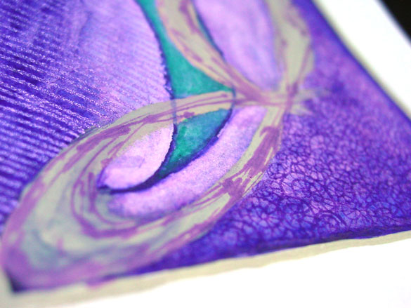
J is for Juxtapose, detail, by Amy Crook
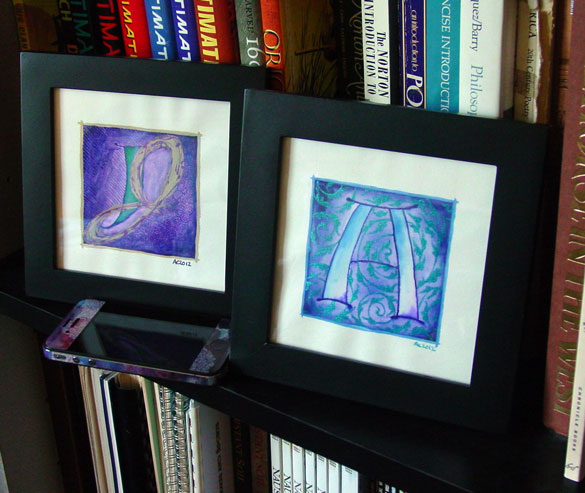
Above, you can see the shine of purple glitter and a close-up of many of the various overlapping styles. Below, the J is hanging out with the A, which shares a similar color scheme but a nicely different feel.

A is for Arabesque & J is for Juxtapose, framed art by Amy Crook
Find more like this:
Categories: Daily Art, Illuminated Alphabet, Series and Books, Whimsical and Strange
Tags: alphabet, buff titanium, calligraphy, glitter gel pen, illumination, nfs, pen and ink, purple, sold, spirals, teal, watercolor
 The Stars Are Right 4 »


