Posts Tagged ‘blue’
I is for Impressionism
Thursday, September 13th, 2012

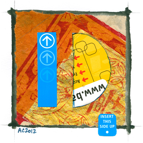
I is for Impressionism, calligraphic illumination by Amy Crook
This one was an interesting challenge, because it’s definitely outside of my usual painting style. The first go was determined to stay firmly at the ass point, but this one came together once I gave it a little more love. I think the bright shine of silver on it is what really makes the piece.
I is for Impressionism, 5″x5″ Japanese watercolor and glitter gel pen on paper.
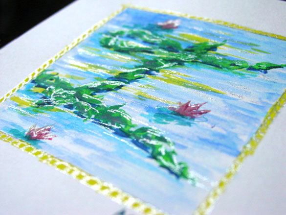
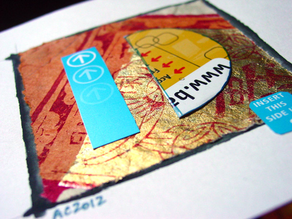
I is for Impressionism, detail, by Amy Crook
Above you can see the silver highlights shining on the page. Below, you can see it in a frame on a bookshelf saying, “HI!” with last week’s H.
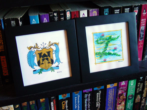
H is for Heraldry & I is for Impressionism, framed art by Amy Crook
Categories: Daily Art, Illuminated Alphabet, Series and Books, Whimsical and Strange
Tags: alphabet, blue, calligraphy, for sale, glitter gel pen, green, illumination, pen and ink, silver, watercolor, yellow
1 Comment »
H is for Heraldry
Thursday, September 6th, 2012
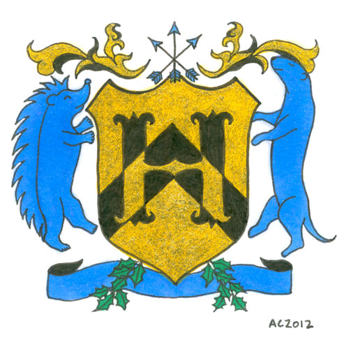
H is for Heraldry, calligraphic illumination by Amy Crook
I have to admit, when deciding on the colors and symbols for this letter with the help of Google, I also enlisted certain fannish friends. That’s how I ended up with Hedgehog Rampant and Otter Rampant as the creatures, making the H secret fan art on top of everything else.
The symbology of the elements of this particular shield are, at least according to Google and artistic intention (which I’m given to understand the latter is more important, anyway):
- Gold/Yellow (Or): generosity
- Blue (Azure): strength, loyalty
- Black (Sable): constancy, grief
- Chevron on the shield: protection, faithful service
- Otter: one who lives life to the fullest
- Hedgehog: provident provider
- Arrows: military readiness
- Holly: truth
H is for Heraldry, 5″x5″ mixed media on paper, nfs (sold). If you’d like an H of your own, you can find out how to commission one here.
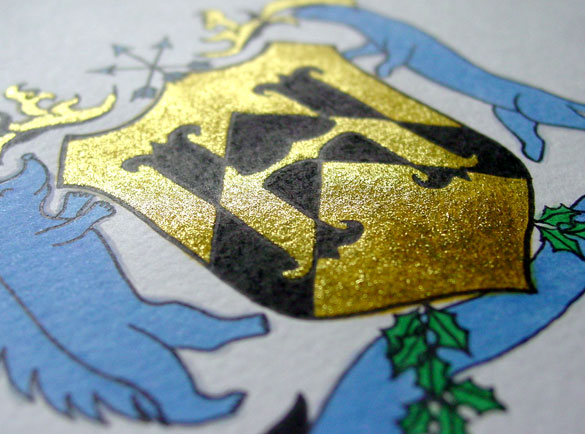
H is for Heraldry, detail, by Amy Crook
Although the glitter looks a bit anemic in the scan, when it catches the light it’s really a lovely bright gold with a nice layer of golden yellow beneath it to add richness. Below, you can see how it looks framed and hanging out on my bookshelf with a little sneak preview of next week’s letter. (HI!)

H is for Heraldry & I is for Impressionism, framed art by Amy Crook
Categories: Daily Art, Illuminated Alphabet, Series and Books, Things I'm a Fan Of, Whimsical and Strange
Tags: alphabet, black, blue, calligraphy, copic marker, glitter gel pen, gold, heraldry, illumination, nfs, pen and ink, sherlock, sherlock holmes, sold
2 Comments »
Hello City
Friday, August 31st, 2012
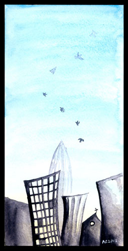
This one’s a bit of an amalgamation of Insomnia City and Seven for a Secret, with the seven crows spiralling up into the endless sky above the funky city. The seventh crow up at the top is dim and distant, barely seen against the vast blue. The city itself is a purplish grey-black with a soft warm yellow glow. This piece would fit nicely into an 8″x10″ frame on a desk, cubicle wall, or in amongst the other art and photos in your home, don’t you think?
Hello City, 4″x8″ watercolor on Fluid watercolor paper.

Hello City, detail, by Amy Crook
Above, you can see the crows fading upward into the bright blue sky, growing harder to see as they become more distant. Below, I’ve temporarily tucked this piece into a frame to show you scale.
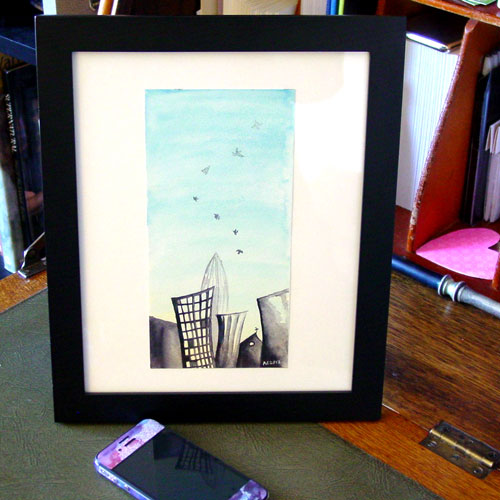
Hello City, framed art by Amy Crook
Categories: Daily Art, Flowers, Trees and Landscapes, Sea Creatures and Other Animals
Tags: blue, city, crow, for sale, sky, watercolor
Tentacle Deeps 40
Tuesday, July 31st, 2012
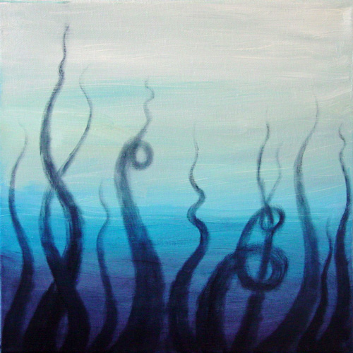
Tentacle Deeps 40 by Amy Crook
These oil paint tentacles were dry brushed onto their canvas so they’d look smokey and insubstantial, the curls deliberately imitating smoke near the tips as they fade into nothingness. The one on the right that’s all curled around makes me think of smoke rings!
Tentacle Deeps 40, 12″x12″ oil paint on gallery-wrapped canvas.
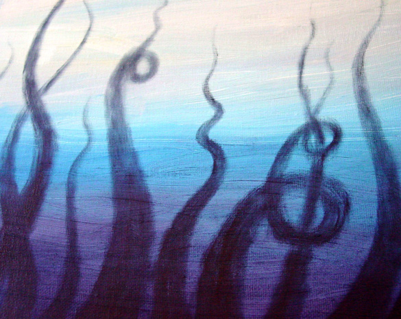
Tentacle Deeps 40, detail, by Amy Crook
Above you can see the tentacles at a different angle, catching more of the clear blue afternoon sunlight. I don’t have a framed shot because this piece is finished on the edges and ready to hang without one, and it’s not dry enough yet to set up with my iPhone.
Categories: Angels, Cthulhu, and Other Myths, Daily Art, Series and Books, Tentacles
Tags: blue, canvas, for sale, oil paint, purple, tentacle deeps, tentacles
Insomnia City
Friday, July 27th, 2012

Insomnia City, watercolor by Amy Crook
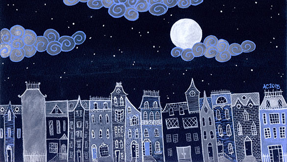
I couldn’t sleep the other night, so I pulled out some paper and my new palette of almost-black paints and painted. It started out with similar spiral clouds as Dirigible, but instead of filling up the whole image, I created a stormy blue-grey sky and then painted the city below in a deep, dark plum color. I wanted to give the whole thing a but of surreal whimsy while keeping the feel of a proper skyline, and keeping the buildings from actually running into the clouds. I kind of like how the lower right ended up shadowed by its incoming cloud bank there, too.
Insomnia City, 8″x4″ watercolor on paper, nfs (sold).

Insomnia City, detail, by Amy Crook
Above I turned up the saturation a little so you could see the subtle purple and blue and the contrast between them. Below, you can see the piece in all its muted glory, tucked into its temporary frame and hanging out with my iPhone in the sunshine.
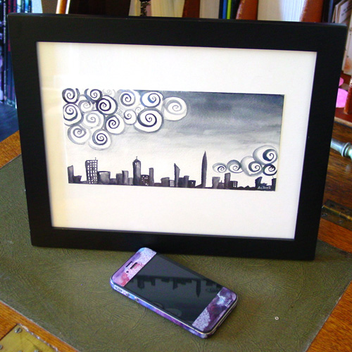
Insomnia City, framed art by Amy Crook
Categories: Daily Art, Flowers, Trees and Landscapes
Tags: blue, city, clouds, nfs, sold, spirals, watercolor
2 Comments »
C is for Counter
Thursday, July 26th, 2012
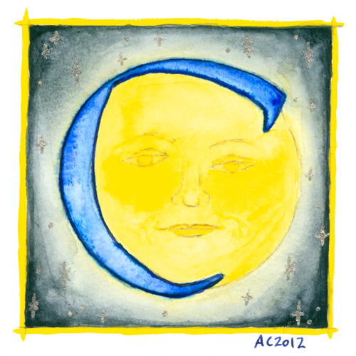
C is for Counter, calligraphic illumination by Amy Crook
Counter space is the space inside of a letter, whether open or closed. No, I didn’t know that before I started this project, either, don’t worry, but once I heard the term I became fascinated with the idea of fitting an old-school moon in the curve of the C for this alphabet.
C is for Counter, 5″x5″ Japanese watercolor, pen & ink and glitter gel pen on paper.
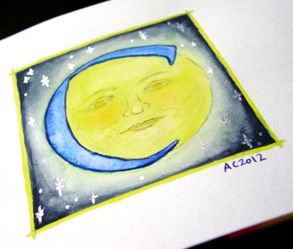
C is for Counter, detail, by Amy Crook
Above, you can see the shining silver stars in the blue sky, and also a better sense of the shading, which my scanner blew out completely in the yellows. Below, the C is hanging out with the Endless (whose names all start with D, ironically) and the G as well. It’s all ready for a Catherine or Carl to take it home, or perhaps a Mr. Cunningham. I think the framed photo actually has the most accurate color, too.

C is for Counter & G is for Gothic, framed art by Amy Crook
Categories: Daily Art, Illuminated Alphabet, Series and Books, Whimsical and Strange
Tags: alphabet, blue, calligraphy, for sale, glitter gel pen, illumination, moon, pen and ink, silver, stars, watercolor, yellow
« Or Head Back That Way
 More Art This Way »

