Archive for the ‘Whimsical and Strange’ Category
Parseltongue
Saturday, August 11th, 2012
Wee Harry’s made a friend! Since he’s a Parselmouth and speaks Parseltongue, the language of snakes, he had no problem convincing this one that he’s not lunch.
Categories: Daily Art, People, Figures and Faces, Series and Books, Things I'm a Fan Of, Whimsical and Strange
Tags: copic marker, Harry Potter, parseltongue, pen and ink
E is for Emboss
Thursday, August 9th, 2012

E is for Emboss, calligraphic illumination by Amy Crook
I did so much measuring and line-drawing for my E I decided to leave in the pencil lines as a sort of underpainting, a decorative structure underlying the letter. Though it’s hard to see in the scan, the whole square is embossed, with gold coloring the embossed edges as well as providing the decoration on an otherwise plain capital. The two greens remind me of marble or malachite, but the gold filigree design really elevates the whole thing to the realm of beauty.
E is for Emboss, 5″x5″ pencil, pen & ink, Japanese watercolor and glitter gel pen on paper.

E is for Emboss, detail, by Amy Crook
Above, you can see the raised edges and shining gold both on the edge itself and in the filigree decoration. Below, I’ve put the piece in a frame with B is for Blackletter. It spells BE! Yes, I’m a dork. You knew that.
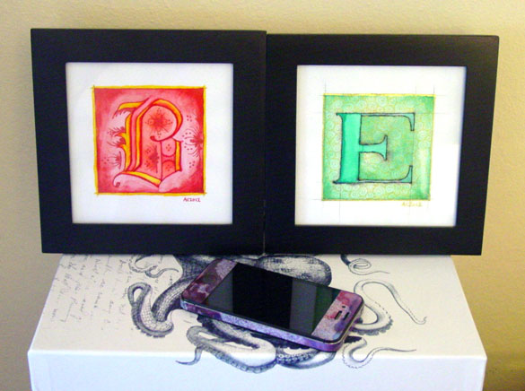
B is for Blackletter & E is for Emboss, framed art by Amy Crook
Categories: Daily Art, Illuminated Alphabet, Series and Books, Whimsical and Strange
Tags: alphabet, calligraphy, for sale, glitter gel pen, gold, green, illumination, pen and ink, pencil, watercolor
1 Comment »
C is for Counter
Thursday, July 26th, 2012
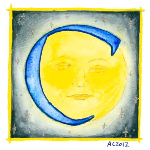
C is for Counter, calligraphic illumination by Amy Crook
Counter space is the space inside of a letter, whether open or closed. No, I didn’t know that before I started this project, either, don’t worry, but once I heard the term I became fascinated with the idea of fitting an old-school moon in the curve of the C for this alphabet.
C is for Counter, 5″x5″ Japanese watercolor, pen & ink and glitter gel pen on paper.
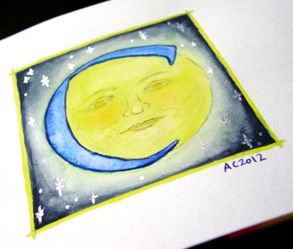
C is for Counter, detail, by Amy Crook
Above, you can see the shining silver stars in the blue sky, and also a better sense of the shading, which my scanner blew out completely in the yellows. Below, the C is hanging out with the Endless (whose names all start with D, ironically) and the G as well. It’s all ready for a Catherine or Carl to take it home, or perhaps a Mr. Cunningham. I think the framed photo actually has the most accurate color, too.

C is for Counter & G is for Gothic, framed art by Amy Crook
Categories: Daily Art, Illuminated Alphabet, Series and Books, Whimsical and Strange
Tags: alphabet, blue, calligraphy, for sale, glitter gel pen, illumination, moon, pen and ink, silver, stars, watercolor, yellow
B is for Blackletter
Thursday, July 19th, 2012
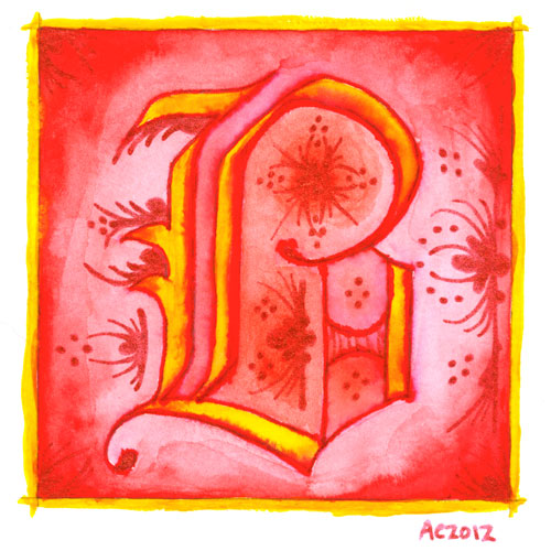
B is for Blackletter, calligraphic illumination by Amy Crook
I went Gryffindor with my second letter, bold red and rich yellow, though I chose the red glitter pen rather than gold for my second illumination. My B uses a classic blackletter face, heavy and Germanic, with a bit of whimsy thrown into the illumination for it.
Just as with the A, I let the ink bleed into the paint so the shapes of the letter have a lovely orange fade, and though I used a very bright, pure red on the background, I used a dark red-orange inside the B itself to better offset the glitter illumination.
B is for Blackletter, 5″x5″ pen & ink, Japanese watercolor, and glitter gel pen on paper.
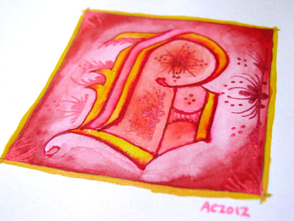
B is for Blackletter, detail, by Amy Crook
The shine on the red glitter is much more subtle and harder to photograph, especially since it goes a bit pink when the light hits it, so the colors in the above detail photo are a bit off in general. Alas. Below, you can see it happily tucked into a frame with my phone to show you the relative size. The central box on these is 3 inches square, but the border and signature rest outside.

B is for Blackletter & E is for Emboss, framed art by Amy Crook
Categories: Daily Art, Illuminated Alphabet, Series and Books, Whimsical and Strange
Tags: alphabet, calligraphy, for sale, glitter gel pen, gold, illumination, pen and ink, red, watercolor
1 Comment »
Make Good Art
Monday, July 16th, 2012
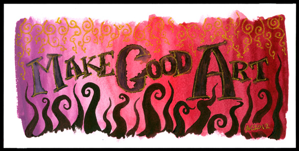
Make Good Art calligraphic painting by Amy Crook
Although I think many people have said this before (including several of my prior art teachers), it’s come most recently from Neil Gaiman. I also find the advice later on about freelancing to be very good and very true — to paraphrase, you must do good work, be on time, and be pleasant, and people will continue to hire you; actually, two out of three will do, most days. And thank goodness for that, because some days all three is more than anyone can manage.
I made this very pink wash when I was mucking about with my red palette of Japanese watercolors, going from the color that is almost exactly the same as the Orchid crayon in my childhood set, through a bright fuchsia pink and on to a lovely deep burgundy. I used my poor abused fountain pen to scribble in the lettering, then took my water brush and blurred it out, which gives an interesting effect, especially in the capitals. Next came the gold glitter paint in the letters, and I left it overnight to figure out what more it needed.
It needed tentacles, of course!
I finally found the fourth palette from the same set, which is six different shades of almost-black, so I took the rich plum-purple one and made a row of tentacles reaching up to tease at the lettering. Then, to balance it, I added the gold filigree at the top, and it finally felt done.
My mental narrative for it is a bit like, “Glimpse of the golden vines of Olympus? Make good art! Chased by tentacles from the Depths? Make good art!”
So, that’s my message for you this Monday – whatever form it takes, whatever inspires you, today, make good art.
Make Good Art, 8″x4″ Japanese watercolor, pen & ink, and glitter gel pen on Fluid watercolor paper on paper.
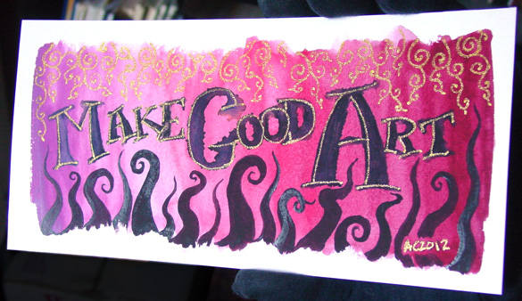
Make Good Art, detail 1, by Amy Crook
This is one of those pieces that’s very different depending on the lighting; the gold almost vanishes when it’s in low light, but it stands out beautifully when the sun hits it, and the thicker paint on the tentacles also has a bit of a gloss here and there. Below, you can see the effect just on the word “Art.”
And for those of you that’ve read this far, have a wallpaper of the above image, with my gloved fingers sneakily Photoshopped out.
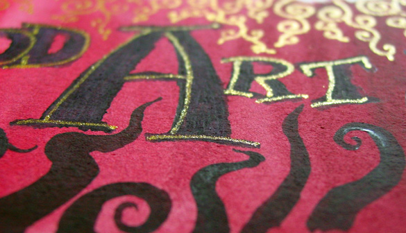
Make Good Art, detail 2, by Amy Crook
I put it in a temporary frame so you can see the scale. Given the odd size, you may want to have it custom framed, or put it on a piece of mat board in a larger frame the way I’ve got it shown below.
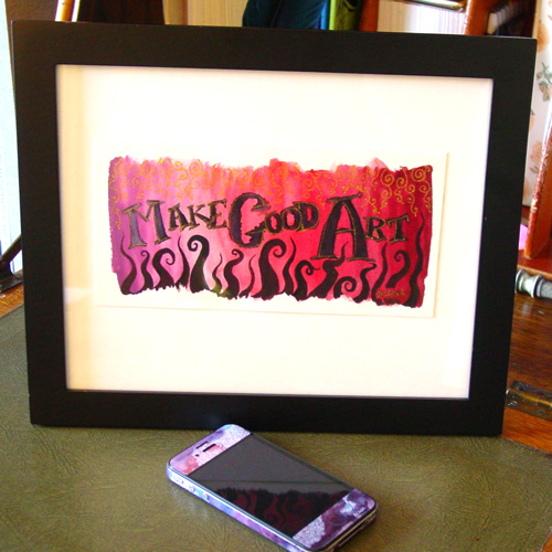
Make Good Art, framed, by Amy Crook
Categories: Daily Art, Free Wallpapers, Things I'm a Fan Of, Whimsical and Strange, Words Words Words
Tags: calligraphy, for sale, glitter gel pen, gold, neil gaiman, pen and ink, pink, red, watercolor
2 Comments »
A is for Arabesque
Thursday, July 12th, 2012
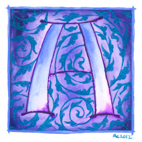
A is for Arabesque, calligraphic illumination by Amy Crook
I’ve begun a new series, though this one I can guarantee has a specifically limited lifespan. I’ve decided to do an illuminated alphabet, using pen and ink for the lines, watercolor for the fills, and glitter gel pen in lieu of gold leaf.
The first in my series is, of course, A, the awesomest letter in the alphabet. A is for Amy who fell down the stairs, after all, at least according to Gorey. A is also for arabesque, in this case referring to the graceful design motif, usually of acanthus leaves, used to decorate all sorts of things from calligraphy to mosques. My blue glittery acanthus are spiraling in the background of this grand periwinkle A. I’ve decided to do each letter with some sort of design or typographical motif represented, so let’s hope I can find something for that other end of the alphabet where things get tricksy.
B and C are already chosen, anyway.
I’m planning to post these once a week, so it will take six months for the series to be done, give or take a few weeks off for bookmarks or Sharpie art.
A is for Arabesque, 5″x5″ watercolor, pen and ink and glitter gel pen on paper.
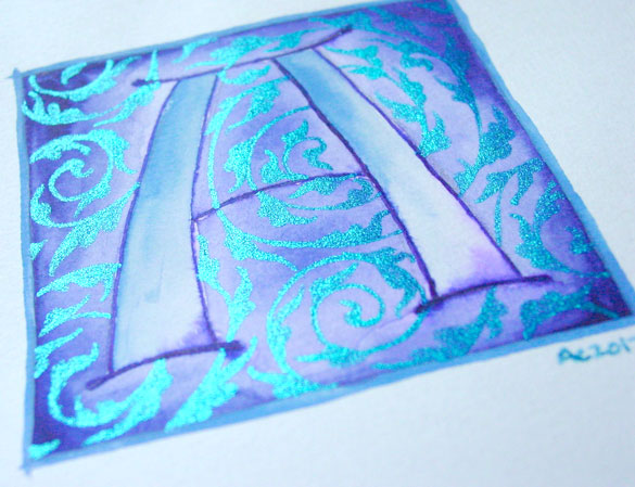
A is for Arabesque, detail, by Amy Crook
Above, you can see the sun catching the glitter and making it shine much brighter than the paper (which really is white, I swear). Below, I’ve got it tucked into a frame and hanging out with the J on the shelf with some of my many, many books.
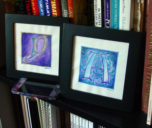
A is for Arabesque & J is for Juxtapose, framed art by Amy Crook
Categories: Daily Art, Illuminated Alphabet, Series and Books, Whimsical and Strange
Tags: alphabet, blue, calligraphy, for sale, glitter gel pen, illumination, pen and ink, periwinkle, purple, watercolor
1 Comment »
« Or Head Back That Way
 More Art This Way »


