Posts Tagged ‘alphabet’
A is for Arabesque
Thursday, July 12th, 2012
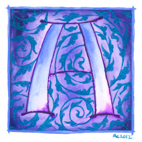
A is for Arabesque, calligraphic illumination by Amy Crook
I’ve begun a new series, though this one I can guarantee has a specifically limited lifespan. I’ve decided to do an illuminated alphabet, using pen and ink for the lines, watercolor for the fills, and glitter gel pen in lieu of gold leaf.
The first in my series is, of course, A, the awesomest letter in the alphabet. A is for Amy who fell down the stairs, after all, at least according to Gorey. A is also for arabesque, in this case referring to the graceful design motif, usually of acanthus leaves, used to decorate all sorts of things from calligraphy to mosques. My blue glittery acanthus are spiraling in the background of this grand periwinkle A. I’ve decided to do each letter with some sort of design or typographical motif represented, so let’s hope I can find something for that other end of the alphabet where things get tricksy.
B and C are already chosen, anyway.
I’m planning to post these once a week, so it will take six months for the series to be done, give or take a few weeks off for bookmarks or Sharpie art.
A is for Arabesque, 5″x5″ watercolor, pen and ink and glitter gel pen on paper.
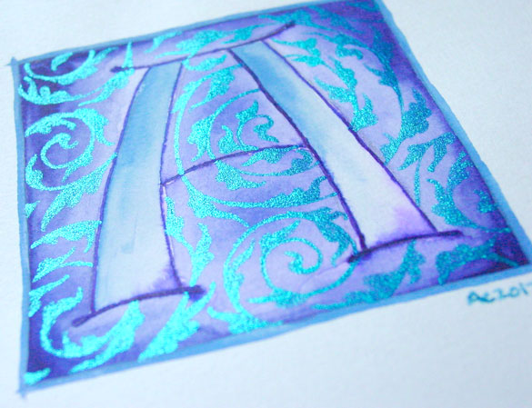
A is for Arabesque, detail, by Amy Crook
Above, you can see the sun catching the glitter and making it shine much brighter than the paper (which really is white, I swear). Below, I’ve got it tucked into a frame and hanging out with the J on the shelf with some of my many, many books.
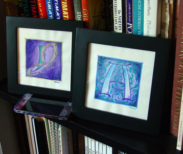
A is for Arabesque & J is for Juxtapose, framed art by Amy Crook
Categories: Daily Art, Illuminated Alphabet, Series and Books, Whimsical and Strange
Tags: alphabet, blue, calligraphy, for sale, glitter gel pen, illumination, pen and ink, periwinkle, purple, watercolor
1 Comment »
B is for Blackletter
Thursday, July 19th, 2012
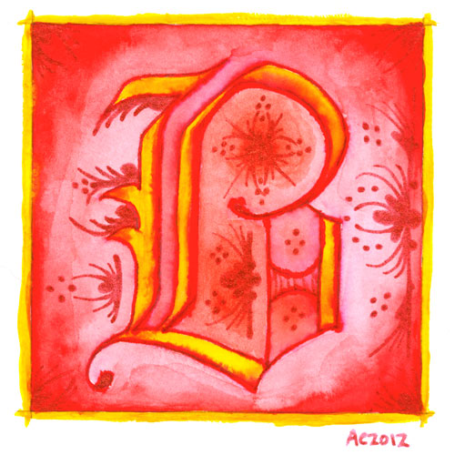
B is for Blackletter, calligraphic illumination by Amy Crook
I went Gryffindor with my second letter, bold red and rich yellow, though I chose the red glitter pen rather than gold for my second illumination. My B uses a classic blackletter face, heavy and Germanic, with a bit of whimsy thrown into the illumination for it.
Just as with the A, I let the ink bleed into the paint so the shapes of the letter have a lovely orange fade, and though I used a very bright, pure red on the background, I used a dark red-orange inside the B itself to better offset the glitter illumination.
B is for Blackletter, 5″x5″ pen & ink, Japanese watercolor, and glitter gel pen on paper.
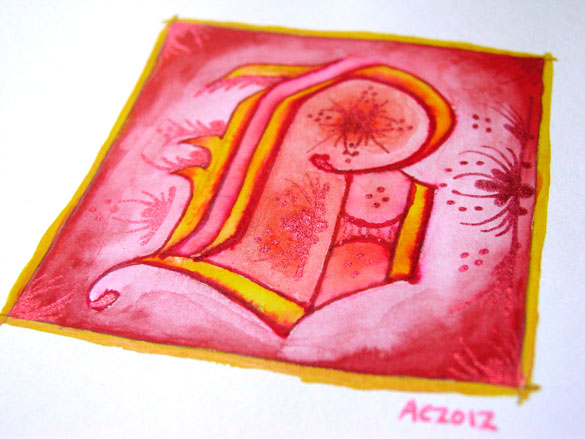
B is for Blackletter, detail, by Amy Crook
The shine on the red glitter is much more subtle and harder to photograph, especially since it goes a bit pink when the light hits it, so the colors in the above detail photo are a bit off in general. Alas. Below, you can see it happily tucked into a frame with my phone to show you the relative size. The central box on these is 3 inches square, but the border and signature rest outside.
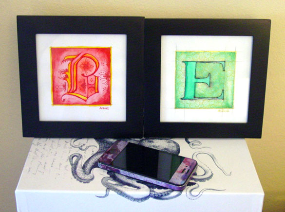
B is for Blackletter & E is for Emboss, framed art by Amy Crook
Categories: Daily Art, Illuminated Alphabet, Series and Books, Whimsical and Strange
Tags: alphabet, calligraphy, for sale, glitter gel pen, gold, illumination, pen and ink, red, watercolor
1 Comment »
C is for Counter
Thursday, July 26th, 2012
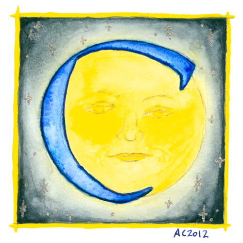
C is for Counter, calligraphic illumination by Amy Crook
Counter space is the space inside of a letter, whether open or closed. No, I didn’t know that before I started this project, either, don’t worry, but once I heard the term I became fascinated with the idea of fitting an old-school moon in the curve of the C for this alphabet.
C is for Counter, 5″x5″ Japanese watercolor, pen & ink and glitter gel pen on paper.
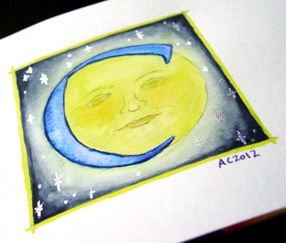
C is for Counter, detail, by Amy Crook
Above, you can see the shining silver stars in the blue sky, and also a better sense of the shading, which my scanner blew out completely in the yellows. Below, the C is hanging out with the Endless (whose names all start with D, ironically) and the G as well. It’s all ready for a Catherine or Carl to take it home, or perhaps a Mr. Cunningham. I think the framed photo actually has the most accurate color, too.

C is for Counter & G is for Gothic, framed art by Amy Crook
Categories: Daily Art, Illuminated Alphabet, Series and Books, Whimsical and Strange
Tags: alphabet, blue, calligraphy, for sale, glitter gel pen, illumination, moon, pen and ink, silver, stars, watercolor, yellow
E is for Emboss
Thursday, August 9th, 2012

E is for Emboss, calligraphic illumination by Amy Crook
I did so much measuring and line-drawing for my E I decided to leave in the pencil lines as a sort of underpainting, a decorative structure underlying the letter. Though it’s hard to see in the scan, the whole square is embossed, with gold coloring the embossed edges as well as providing the decoration on an otherwise plain capital. The two greens remind me of marble or malachite, but the gold filigree design really elevates the whole thing to the realm of beauty.
E is for Emboss, 5″x5″ pencil, pen & ink, Japanese watercolor and glitter gel pen on paper.

E is for Emboss, detail, by Amy Crook
Above, you can see the raised edges and shining gold both on the edge itself and in the filigree decoration. Below, I’ve put the piece in a frame with B is for Blackletter. It spells BE! Yes, I’m a dork. You knew that.

B is for Blackletter & E is for Emboss, framed art by Amy Crook
Categories: Daily Art, Illuminated Alphabet, Series and Books, Whimsical and Strange
Tags: alphabet, calligraphy, for sale, glitter gel pen, gold, green, illumination, pen and ink, pencil, watercolor
1 Comment »
F is for Flourish
Thursday, August 23rd, 2012
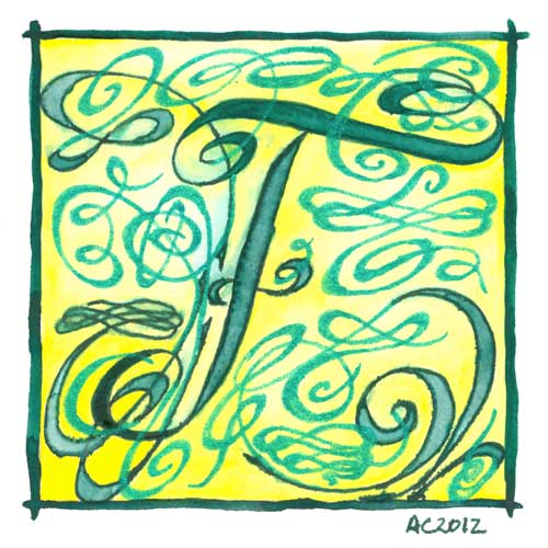
F is for Flourish, calligraphic illumination by Amy Crook
While my embossed E was all warm green and gold, and this week’s F is cool greens and lemon yellow instead. I knew F was going to be flourish from the start, and boy, did I get flourishy! This illuminated letter would look great on the wall of a Fiona, the desk of a Frank or the bookshelf of a Ferdinand.
F is for Flourish, 5″x5″ pen & ink, watercolor, and glitter gel pen on paper.
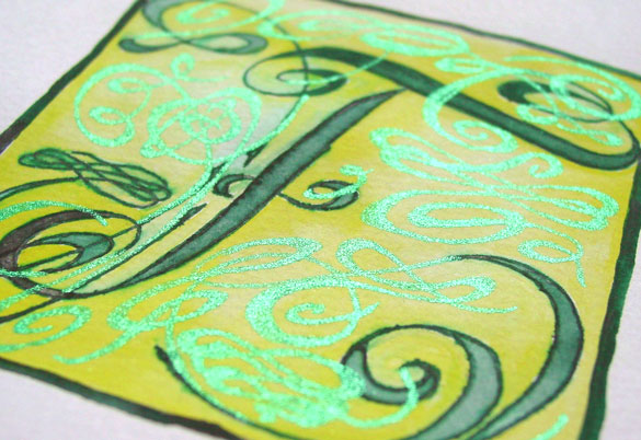
F is for Flourish, detail, by Amy Crook
Above you can see the sun really shining off the green glitter flourishes. Below, F is hanging out with D is for Dada in one of my bookshelves.

F is for Flourish and D is for Dada, framed art by Amy Crook
Categories: Daily Art, Illuminated Alphabet, Series and Books, Whimsical and Strange
Tags: alphabet, calligraphy, for sale, glitter gel pen, green, illumination, pen and ink, watercolor, yellow
G is for Gothic
Thursday, August 30th, 2012
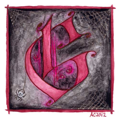
G is for Gothic, calligraphic illumination by Amy Crook
I have to admit, I went for the pun a bit here, combining the Gothic capital with my own Goth sensibilities. The silver spiderwebs are half-seen until they catch the light, and the burgundy G floats in murky gloom, hanging out with the stripey little spider responsible for its extra decoration.
G is for Gothic, 5″x5″ pen & ink, Japanese watercolor, and glitter gel pen on paper.

G is for Gothic, detail, by Amy Crook
Above, you can see the silver details shining in the bright summer sunlight. Goths in hot weather, anyone? Below, it’s hanging out on a little shelf with the C and my collection of Endless pewter figurines.

G is for Gothic & C is for Counter, framed art by Amy Crook
Categories: Daily Art, Illuminated Alphabet, Series and Books, Whimsical and Strange
Tags: alphabet, black, calligraphy, for sale, glitter gel pen, goth, illumination, pen and ink, red, silver, spiderweb, watercolor
4 Comments »
 More Art This Way »

