Posts Tagged ‘alphabet’
H is for Heraldry
Thursday, September 6th, 2012
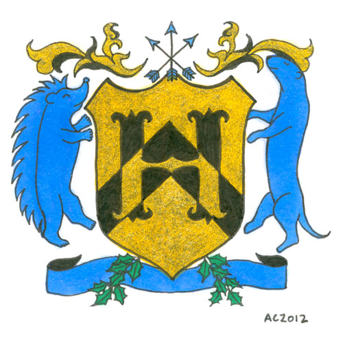
H is for Heraldry, calligraphic illumination by Amy Crook
I have to admit, when deciding on the colors and symbols for this letter with the help of Google, I also enlisted certain fannish friends. That’s how I ended up with Hedgehog Rampant and Otter Rampant as the creatures, making the H secret fan art on top of everything else.
The symbology of the elements of this particular shield are, at least according to Google and artistic intention (which I’m given to understand the latter is more important, anyway):
- Gold/Yellow (Or): generosity
- Blue (Azure): strength, loyalty
- Black (Sable): constancy, grief
- Chevron on the shield: protection, faithful service
- Otter: one who lives life to the fullest
- Hedgehog: provident provider
- Arrows: military readiness
- Holly: truth
H is for Heraldry, 5″x5″ mixed media on paper, nfs (sold). If you’d like an H of your own, you can find out how to commission one here.
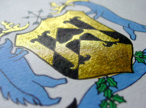
H is for Heraldry, detail, by Amy Crook
Although the glitter looks a bit anemic in the scan, when it catches the light it’s really a lovely bright gold with a nice layer of golden yellow beneath it to add richness. Below, you can see how it looks framed and hanging out on my bookshelf with a little sneak preview of next week’s letter. (HI!)
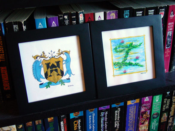
H is for Heraldry & I is for Impressionism, framed art by Amy Crook
Categories: Daily Art, Illuminated Alphabet, Series and Books, Things I'm a Fan Of, Whimsical and Strange
Tags: alphabet, black, blue, calligraphy, copic marker, glitter gel pen, gold, heraldry, illumination, nfs, pen and ink, sherlock, sherlock holmes, sold
2 Comments »
I is for Impressionism
Thursday, September 13th, 2012

I is for Impressionism, calligraphic illumination by Amy Crook
This one was an interesting challenge, because it’s definitely outside of my usual painting style. The first go was determined to stay firmly at the ass point, but this one came together once I gave it a little more love. I think the bright shine of silver on it is what really makes the piece.
I is for Impressionism, 5″x5″ Japanese watercolor and glitter gel pen on paper.
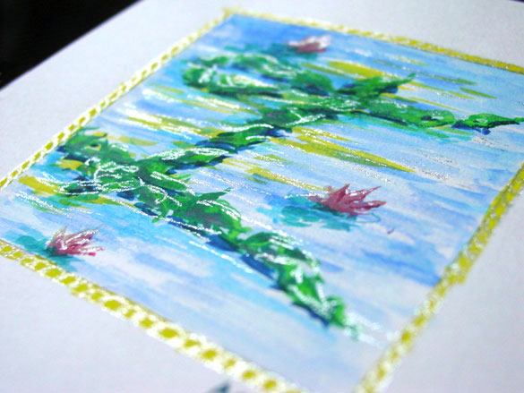
I is for Impressionism, detail, by Amy Crook
Above you can see the silver highlights shining on the page. Below, you can see it in a frame on a bookshelf saying, “HI!” with last week’s H.

H is for Heraldry & I is for Impressionism, framed art by Amy Crook
Categories: Daily Art, Illuminated Alphabet, Series and Books, Whimsical and Strange
Tags: alphabet, blue, calligraphy, for sale, glitter gel pen, green, illumination, pen and ink, silver, watercolor, yellow
1 Comment »
J is for Juxtapose
Thursday, September 20th, 2012

J is for Juxtapose, calligraphic illumination by Amy Crook
I wasn’t sure how well I could manage Juxtaposition, but I’m really happy with the contrasts and superimpositions in this piece, from the colors of subtle buff titanium with bright purple and rich teal, to the way the dark purple ink outline of the neat lower J bled through into the messy top letter. The light purple glitter strips in the upper left blend very differently with the background than the dark inked spirals in the lower right, too.
J is for Juxtapose, 5″x5″ mixed media on paper, nfs (sold). If you’d like a J of your own, you can find out how to commission one here.
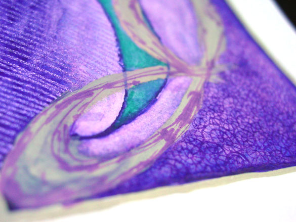
J is for Juxtapose, detail, by Amy Crook
Above, you can see the shine of purple glitter and a close-up of many of the various overlapping styles. Below, the J is hanging out with the A, which shares a similar color scheme but a nicely different feel.
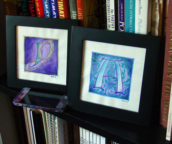
A is for Arabesque & J is for Juxtapose, framed art by Amy Crook
Categories: Daily Art, Illuminated Alphabet, Series and Books, Whimsical and Strange
Tags: alphabet, buff titanium, calligraphy, glitter gel pen, illumination, nfs, pen and ink, purple, sold, spirals, teal, watercolor
1 Comment »
K is for Greek Key
Thursday, October 4th, 2012

K is for Greek Key, calligraphic illumination by Amy Crook
It’s a bit cheating to use the Greek Key pattern for K, but it was the option that appealed to me the most. It’s hard to do kerning with only one letter, after all!
I ended up designing my own Greek Key in Illustrator, printing it, and using my lightbox to copy it in blue glitter gel pen onto the K. All the tools of the modern age are getting put to use as I explore the historic art of calligraphic illumination.
K is for Greek Key, 5″x5″ pen & ink, Japanese watercolor, and glitter gel pen on paper.
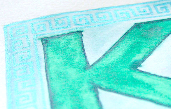
K is for Greek Key, detail, by Amy Crook
Between the color and the glitter, I had a really hard time photographing this piece. The Key pattern blends into the soft blue background to the camera, but of course your eye immediately catches the light. Below, you can see it in a frame, spelling out the word I said when I realized I didn’t have a framed photo for it.
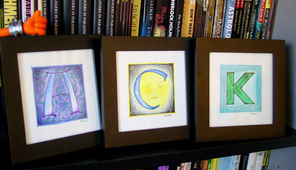
K is for Greek Key, framed art by Amy Crook
(with A is for Arabesque and C is for Counter)
Categories: Daily Art, Illuminated Alphabet, Series and Books, Whimsical and Strange
Tags: alphabet, blue, calligraphy, for sale, glitter gel pen, green, illumination, pen and ink, watercolor
L is for Layers
Thursday, October 11th, 2012
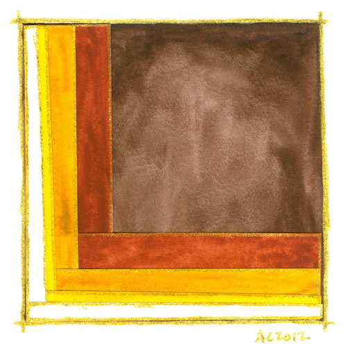
L is for Layers, calligraphic illumination by Amy Crook
One of the things I love about this series is the physicality of it, the way the glitter encourages the viewer to try to catch the light, to pick the piece up and move it around. In this one, I went a step farther and added a physical dimension to it by building up layers of cut and painted paper. The gold at the edges helps each layer stand out, even more than just the cascading autumnal colors.
L is for Layers, 5″x5″ Japanese watercolor and glitter gel pen on collaged paper.
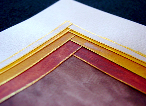
L is for Layers, detail, by Amy Crook
Above you can see a close-up of the overlapping corners, the glued paper growing tall as it builds layer upon layer. Below, the L is hanging out with a preview of the N in my little writing desk.
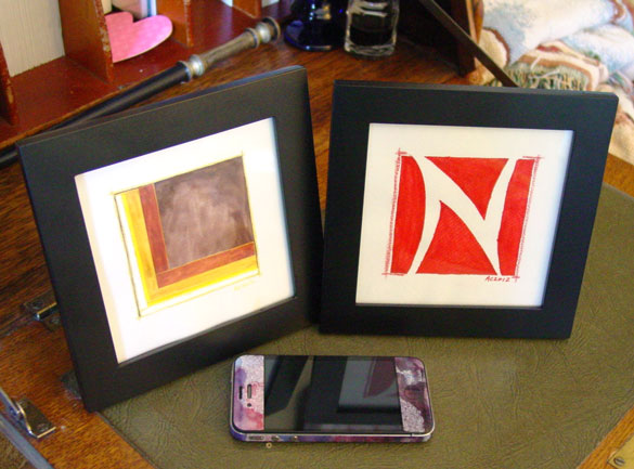
L is for Layers and N is for Negative Space, framed art by Amy Crook
Categories: Daily Art, Illuminated Alphabet, Series and Books, Whimsical and Strange
Tags: alphabet, brown, calligraphy, for sale, glitter gel pen, gold, illumination, watercolor
M is for Majuscule and Miniscule
Thursday, October 18th, 2012

M is for Majuscule & Miniscule, calligraphic illumination by Amy Crook
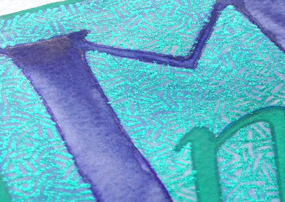
I like to think of the little m as snuggling up to the big M, miniscule trustingly at the feet of the majuscule. The background on this one seems simple, but the crosshatching like that is always quite time-consuming, especially with a glitter gel pen.
M is for Majuscule & Miniscule, 5″x5″ mixed media on paper, nfs (sold). If you’d like an M of your own, you can find out how to commission one here.
M is for Majuscule & Miniscule, detail, by Amy Crook
Above, you can see the green pen shining against the soft periwinkle blue background, with the rich purple and green of the two Ms surrounded by glitter. Below, a shot of the background in progress, to see the way the texture really changed the whole look of the piece.

M is for Majuscule & Miniscule, work in progress by Amy Crook
Categories: Daily Art, Illuminated Alphabet, Series and Books, Whimsical and Strange
Tags: alphabet, blue, calligraphy, glitter gel pen, illumination, nfs, pen and ink, periwinkle, purple, sold, watercolor
1 Comment »
N is for Negative Space
Thursday, November 1st, 2012
N is for Negative Space, calligraphic illumination by Amy Crook
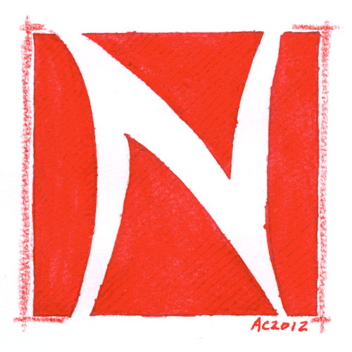
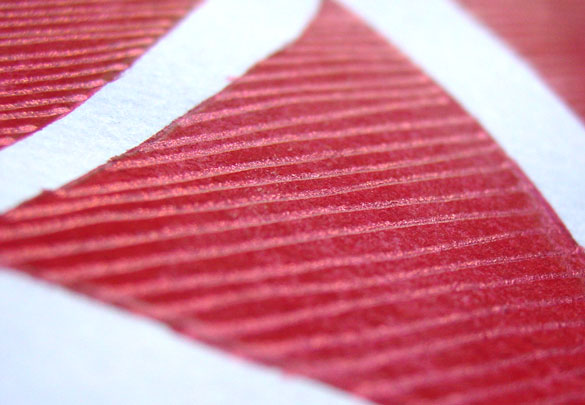
The texture on this one is really subtle; with the red watercolor a very dense and intense tone, the red glitter gel pen nearly vanishes unless it’s at the right angle. I really enjoy the big red shark-fin shape at the bottom, and the deceptive simplicity of this particular letter. Perfect for a Nelson or Natalie or Norbert!
N is for Negative Space, 5″x5″ watercolor stick and glitter gel pen on paper.
N is for Negative Space, detail, by Amy Crook
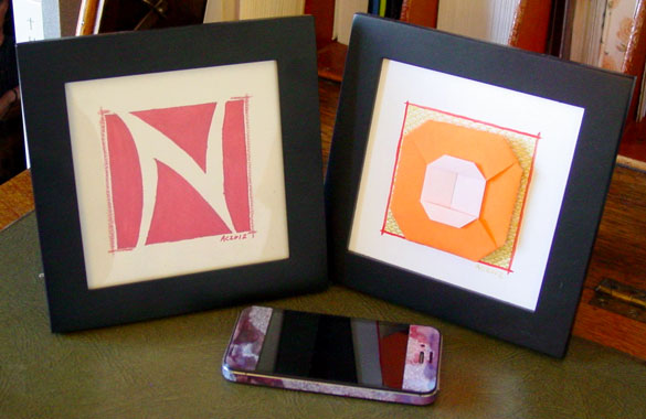
Above, you can see the shining glitter catching the sunlight, giving the whole image a bit of a bluish tint to it. Below, the N is hanging out with next week’s O to spell out every toddler’s favorite word – NO.
N is for Negative Space & O is for Origami, framed art by Amy Crook
Categories: Daily Art, Illuminated Alphabet, Series and Books, Whimsical and Strange
Tags: alphabet, calligraphy, for sale, glitter gel pen, illumination, pen and ink, red, watercolor
« Or Head Back That Way
 More Art This Way »


