Posts Tagged ‘alphabet’
Baker Street Crest
Thursday, March 7th, 2013
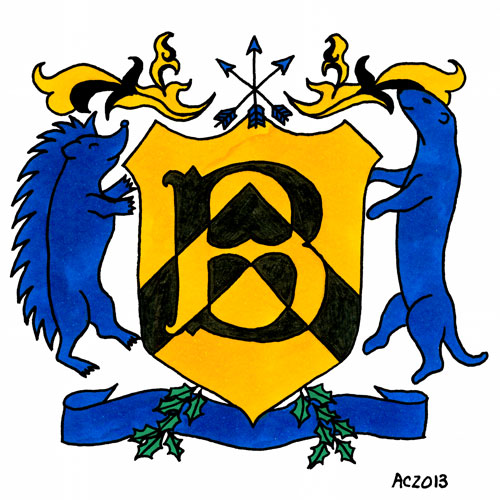
Baker Street Crest by Amy Crook
Just when you thought it was safe to go back to the alphabet, I’ve done another B! I took the design for H is for Heraldry, with all its Sherlock-centric themes, and turned it into a B for 221B Baker Street. There’s actually a lot of John Watson in this crest, almost more so than Sherlock Holmes, with the generosity, loyalty, and martial readiness. Sherlock is in there, too, though, both of them rampant and ready to defend their little kingdom.
I decided not to bling up the gold in this one, sticking to a nice bright, warm yellow to represent the Or field on the shield. This also makes them easier to reproduce, so I’ve got note cards for sale on Etsy with the crest, so you can send your next piece of snail mail in style.
Baker Street Crest, 5″x5″ pen & ink and Copic markers on paper.
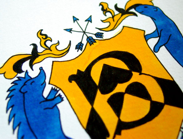
Baker Street Crest, detail, by Amy Crook
Above, you can see the detail on the cheerful hedgehog and rather snooty otter. Below, I’ve put it in a frame and you can see how the original stacks up next to my iPhone.
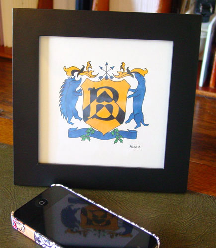
Baker Street Crest, framed art by Amy Crook
Categories: Daily Art, Series and Books, Things I'm a Fan Of, Whimsical and Strange
Tags: alphabet, copic marker, etsy, for sale, heraldry, pen and ink, sherlock, sherlock bbc, sherlock holmes
J is for Journey
Tuesday, September 24th, 2013
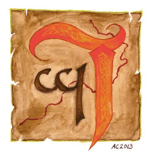
J is for Journey, commissioned illuminated capital by Amy Crook
Predictably, one of the first letters in my Illuminated Alphabet to sell was the J is for Juxtapose. After a lot of wembling and waffling, I’ve finally completed another J for a wonderful patron who commissioned one. He was trying at first to stick to the typographical theme of the finished alphabet, but in the end it just wasn’t working with the elements he wanted.
Instead, I snuck off and finished up the sketch this way, knowing that he’s got a love of maps and using the requested orange for the main capital. The smaller letter is in Tengwar, one of Tolkien’s invented alphabets, and a letter long-beloved by my patron. The squiggly red map-line was added near the end, though usual the glitter gel pen was saved for the very last. The faux Celtic decorations on the J were added in freehand, and you can see them better in the below photo, along with a clearer idea of the orange color behind them, which my scanner tended to oversaturate.
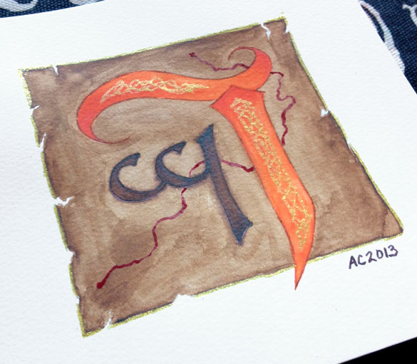
J is for Journey by Amy Crook
Categories: Completed Commissions, Things I'm a Fan Of, Whimsical and Strange
Tags: alphabet, commission, glitter gel pen, nfs, pen and ink, watercolor
2 Comments »
« Or Head Back That Way


