
Posts Tagged ‘blue’
Modern Snow
Friday, September 16th, 2011

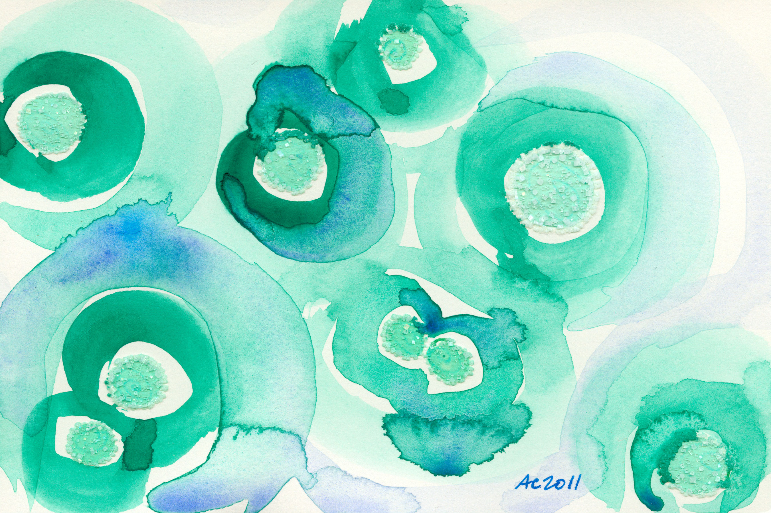
Modern Snow by Amy Crook, $555
It’s always fascinating to me how the different colors of ink react to the salt — some of them don’t actually spread into the halo of crystal formations, but this one took its rich blue color all the way to the tips, leaving the darker, more violet-toned ink behind in the central circle. This piece combines the blue snowflake-like salt formations from Snowflakes with the fascinating brushwork from Aglow 2 to get an entirely new effect that reminds me of a pattern from the ’50s or ’60s.
Modern Snow, 5″x5″ mixed media on paper, $555, framed, with free shipping.
Like all the paintings I made using the lunar black, this one’s got the gorgeous contrast between the velvety dark areas and the sparkling salt crystals.

Modern Snow, detail, by Amy Crook
A simple frame will keep your art safe from damage, even those strange sideways crystals that grow at odd angles out of the paper.

Modern Snow, framed, by Amy Crook, $555
Categories: Abstract and Just Plain Weird, Daily Art
Tags: blue, for sale, pen and ink, salt, snow, snowflake, watercolor
Confetti Rain
Monday, September 5th, 2011

Confetti Rain by Amy Crook
When I started this piece, I was experimenting to see if I could fill a whole paper with the salt-crystal rosettes the way rain on a puddle fills up the whole surface with overlapping shapes. After a while it was hard to get even a tiny rosette to form without the water running and blurring into the already-formed structures. The different shades of blue ink ended up giving it a party-confetti feel, and that with the sparkle from the salt gives the piece its name.
Confetti Rain, 5″x5″ pen and ink and salt on paper
The paper itself is a warm off-white color that’s hard to photograph — for some reason it often shows up quite red when compared to the cool blue ink and sparkling salt.

Confetti Rain, detail 1, by Amy Crook
Still, I love the way the salt catches the light and seems to glow from within, as well as the up-close view of the textures of crystal growth and rough, soft paper.

Confetti Rain, detail 2, by Amy Crook
A simple black frame will keep the salt crystals safe while the piece is in transit, and provide a contrast to the splashes of color on the page.

Confetti Rain, framed art by Amy Crook
Categories: Abstract and Just Plain Weird, Daily Art
Tags: blue, for sale, pen and ink, salt
Iridescence 3
Thursday, August 11th, 2011

Iridescence 3, abstract art by Amy Crook, $333
I admit, I wanted to post both of these in the same week because they feel like different sides of the same coin to me. They use similar color schemes and techniques, but where Iridescence 2 is all soft glowing colors and indistinct shapes, Iridescence 3 is all sharp-edged spirals and visible brush strokes.
Even the haloes of complementary color around each salt pool are sharper and more distinct than in the previous piece, with more areas of pure white paper peeking through as a result. I’m not sure which of the two I prefer, though this is the one I’ve got out on display right now.
Iridescence 3, 7″x5″ mixed media on watercolor paper, $333, framed, with free shipping.
This is a closeup of the green salt pool in the lower left, so you can really see how the paint is layered in distinct circles with watercolor’s characteristic dark, sharp edges.

Iridescence 3, detail, by Amy Crook
The bold black frame works really well with the blue-black and violet-black in the darkest, sharpest of the paint swirls, and protects the fragile salt crystals from damage.

Iridescence 3, framed, by Amy Crook, $333
Categories: Abstract and Just Plain Weird, Daily Art, Series and Books
Tags: blue, for sale, green, hibiscus, iridescence, pen and ink, purple, salt, tea, watercolor
Iridescence 2
Tuesday, August 9th, 2011

Iridescence 2, abstract art by Amy Crook, $333
Going in the opposite direction of yesterday’s art, this one expands the color palette along the entire cool end of the spectrum. I used green, aqua, blue and violet pens for my salt circles. Then I supplemented it with a layer of hibiscus tea in its low-saturation periwinkle shades. After that I used watercolors in matching hues, the dark indigo-black and violet softened by swirls of complementary colors around each salt pool. Finally, I used a little bit of salt to add texture to a few of the darkest places, giving the whole piece a layered complexity.
I decided to continue naming them as a series after one of my favorite of the salt pieces, Iridescence, because they had the same quality of seeming as though they were reflective without anything shiny, other than the sparkling salt crystals.
Iridescence 2, 7″x5″ mixed media on paper, $333, framed, with free shipping.
You can see one of the wonderfully complex salt structures here, a little lopsided ziggurat of crystal formations saturated with ink and ever overdyed with paint. If you click on the image you can see it even bigger and really get a sense of the detail, though of course the actual circle is barely the size of a dime.

Iridescence 2, detail, by Amy Crook
The piece looks beautiful safely tucked into its frame, the soft lines and cool colors offset by the simple black wood.

Iridescence 2, framed, by Amy Crook, $333
Categories: Abstract and Just Plain Weird, Daily Art, Series and Books
Tags: blue, for sale, green, hibiscus, iridescence, pen and ink, purple, salt, tea, watercolor
1 Comment »
Green to Blue
Friday, August 5th, 2011

Green to Blue, abstract art by Amy Crook, $299
This abstract work uses the same soft celadon green Crane & Co. cardstock as Hibiscus Green, but is a much more complex piece. I used a green pen for the salt pools, which ended up with a much less uniform color to them than most of mine, the ink staying more firmly soaked into the paper so that the salt rises pale and shining above the darker green centers. I used watercolor for the surroundings, trying to expand the palette without covering up the gorgeous, subtle hue of the paper completely.
Green to Blue, 6.375″x4.25″ mixed media on paper, $299 with free shipping.
Here you can see a view of one of the formations at the center of the piece, with light shining on the fine line of redistributed salt in the blue paint.

Green to Blue, detail, by Amy Crook, $299
I don’t have a frame for this piece yet, but I’ve made a computer wallpaper and iPhone wallpaper of this piece for you to enjoy.
Categories: Abstract and Just Plain Weird, Daily Art, Free Wallpapers
Tags: blue, crane and co, for sale, green, pen and ink, salt, watercolor
7 Seconds
Thursday, July 28th, 2011

7 Seconds, abstract art by Amy Crook, $399
I can’t really explain the title of this painting, other than to say it suggested itself to me when I was contemplating what to name the file when I was scanning it. There are seven pools of salt, rather more distorted from perfect rounds than usual because the paper was already slightly warped by the wash of hibiscus tea before I made them.
This is one of my first pieces combining watercolor with tea, though I’ve since worked on several more. I really like the way the rich turquoise paint works with the softer green of the salt, and the muted blue-violet of the tea.
7 Seconds, 7″x5″ mixed media on paper, $399, framed, with free shipping.
Here you can see the initial wash drying — the lightest spots turned to blue almost immediately, leaving the original pink lingering in the pools of tea, though as you can see they, too, changed as they dried.

7 Seconds, work in progress, by Amy Crook
This photo gives away one of my cheater secrets — I use the knickknacks off my shelves to flatten out the pages when they get too warped. Though it’s far from perfect, that’s part of the point, the compromise between order and entropy, deliberation and natural randomness.

7 Seconds, work in progress by Amy Crook
It was quite warm the day the salt water was drying, which created unusually delicate salt formations.

7 Seconds, detail 1, by Amy Crook
Some of those formations were washed away by the paint, turning instead into small crystals haloing the original salt pools.

7 Seconds, detail 2, by Amy Crook
This is definitely one of those paintings that looks much better once it’s framed. The black really makes the colors look richer and deeper, and helps showcase the harmony of the piece.

7 Seconds, framed art by Amy Crook, $399
Categories: Abstract and Just Plain Weird, Daily Art
Tags: blue, for sale, green, hibiscus, pen and ink, salt, watercolor
Hibscus Blue 1
Monday, July 11th, 2011

Hibiscus Blue 1 by Amy Crook, $323
I can’t remember who it was that suggested I try out hibiscus tea after I started using regular old black tea on some of these works, but thank you!
It’s fascinating the way the rich, ruby red liquid turns blue when added to certain papers, which is apparently the natural anthocyanins reacting to the pH. I love how multiple layers gave me different shades of blue, and I combined this with the salt circles to create a harmonious whole.
I actually made 21 circles of salt on this page, 7 in each of 3 different shades of blue pen, but the 2 lighter blues turned nearly identical when mixed with the salt and water. I ended up dissolving one of the circles completely to create some visual space in the piece, which I then filled with layer upon layer of the hibiscus tea.
Each layer had to dry before I could work with it more, since it doesn’t stop developing color until it’s fully dry, so this piece took days to get from blank page to finished art.
Hibiscus Blue 1, 5″x7″ mixed media on paper, $323, framed, with free shipping.
Here you can see the sparkle that’s lost in the scanner, and the purple-blue color that the hibiscus tea stained the salt crystals.

Hibiscus Blue 1, detail, by Amy Crook
The piece is safely tucked into its frame and ready to come hang on a wall, find a spot in a bookshelf or perhaps stand up on your desk at work.

Hibiscus Blue 1, framed, by Amy Crook, $323
Categories: Abstract and Just Plain Weird, Daily Art, Series and Books
Tags: blue, for sale, hibiscus, hibiscus blue, pen and ink, salt, tea
« Or Head Back That Way
 More Art This Way »


