Posts Tagged ‘for sale’
F is for Flourish
Thursday, August 23rd, 2012
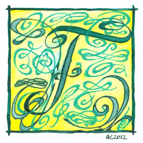
F is for Flourish, calligraphic illumination by Amy Crook
While my embossed E was all warm green and gold, and this week’s F is cool greens and lemon yellow instead. I knew F was going to be flourish from the start, and boy, did I get flourishy! This illuminated letter would look great on the wall of a Fiona, the desk of a Frank or the bookshelf of a Ferdinand.
F is for Flourish, 5″x5″ pen & ink, watercolor, and glitter gel pen on paper.
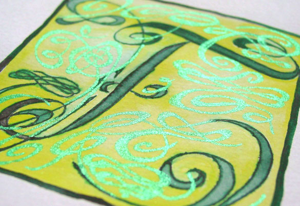
F is for Flourish, detail, by Amy Crook
Above you can see the sun really shining off the green glitter flourishes. Below, F is hanging out with D is for Dada in one of my bookshelves.

F is for Flourish and D is for Dada, framed art by Amy Crook
Categories: Daily Art, Illuminated Alphabet, Series and Books, Whimsical and Strange
Tags: alphabet, calligraphy, for sale, glitter gel pen, green, illumination, pen and ink, watercolor, yellow
Spiral Bookmark 3
Friday, August 17th, 2012

Spiral Bookmark 3
by Amy Crook
This little bookmark uses dark, warm earth tones to in its climbing pattern of lightening spirals. The golden glow at the center of each one has a secret little scattering of subtle salt crystals that give the bookmark an interesting touch of texture. The paper itself is quite soft and thick, almost felt-like, and slightly cream-colored, and invites the fingers to touch.
Spiral Bookmark 3, 1″x5″ watercolor and salt on paper.

Spiral Bookmark 3, detail, by Amy Crook
Above, you can see the textures of paper, paint and salt interacting on this dark, subtle bookmark. Below, it’s hanging out with a book, just waiting to go to its new home.
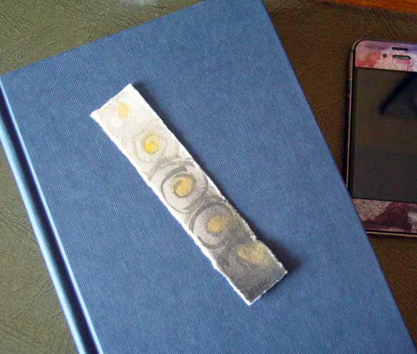
Spiral Bookmark 3, with book, by Amy Crook, $13.13
(book and iPhone not included)
Categories: Abstract and Just Plain Weird, Daily Art
Tags: for sale, salt, spirals, watercolor
Salt Bookmark 5
Wednesday, August 15th, 2012
Salt Bookmark 5
by Amy Crook
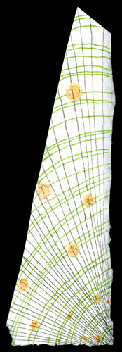
I almost tossed this oddly-shaped little wedge of paper, but instead I blunted its tip and messed about with pens to make this bookmark. It’s a bit like an optical illusion with the wobbly lines and erratic bands of green, not to mention the little floating salt bubbles flowing along some of the spokes. It’s signed on the back to keep from interrupting the pattern, which is too mesmerizing to spoil.
Salt Bookmark 5, 1.5″x5″ pen & ink and salt on paper.
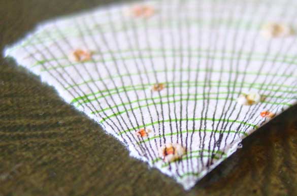
Salt Bookmark 5, detail, by Amy Crook
Above, you can see some of the teeny little salt pools straddling the wobbly radial lines. Below, the book of the week shows off the lovely, thick white watercolor paper nicely.
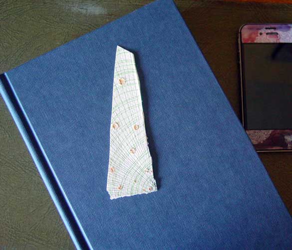
Salt Bookmark 5, with book, by Amy Crook
(book and iPhone not included)
Categories: Abstract and Just Plain Weird, Daily Art, Series and Books
Tags: bookmark, buy a bookmark, for sale, pen and ink, salt
Bubbling Bookmark
Monday, August 13th, 2012

Bubbling Bookmark
by Amy Crook
It’s Bookmark Week all over again! There are only two bookmarks left from the previous offerings, and one of this week’s is already spoken for — the artist is not responsible for dawdlers missing out on the one they liked and having to buy a larger, normally-priced original instead to assuage their disappointment. I’m totally okay with that, come to think of it.
There’s only one of each of these tiny originals, though obviously I sometimes do them in series within the series. Very meta.
Today’s bookmark is not part of a series, but reminds me of water boiling in a dark blue-black cast-iron cauldron. Snape would no doubt approve.
Bubbling Bookmark, 1″x5″ watercolor on paper.
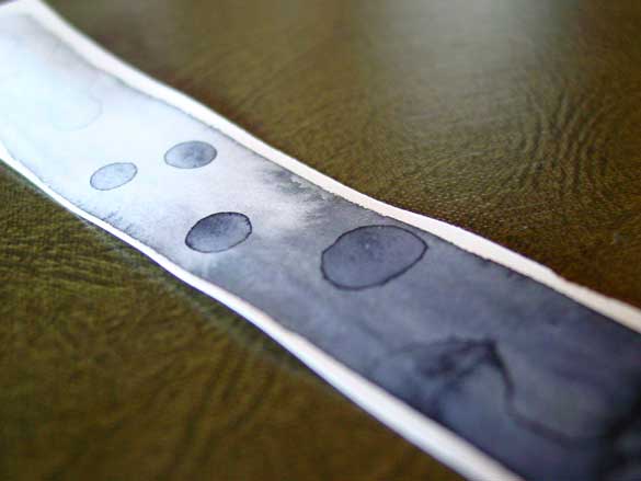
Bubbling Bookmark, detail, by Amy Crook
Above is a close-up of the bubbles in all their glory, while below you can see the bookmark hanging out with a book and my iPhone for extra easy-to-parse size comparisons.
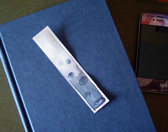
Bubbling Bookmark, with book, by Amy Crook
(book and iPhone not included)
Categories: Abstract and Just Plain Weird, Daily Art, Series and Books
Tags: bookmark, buy a bookmark, for sale, watercolor
E is for Emboss
Thursday, August 9th, 2012

E is for Emboss, calligraphic illumination by Amy Crook
I did so much measuring and line-drawing for my E I decided to leave in the pencil lines as a sort of underpainting, a decorative structure underlying the letter. Though it’s hard to see in the scan, the whole square is embossed, with gold coloring the embossed edges as well as providing the decoration on an otherwise plain capital. The two greens remind me of marble or malachite, but the gold filigree design really elevates the whole thing to the realm of beauty.
E is for Emboss, 5″x5″ pencil, pen & ink, Japanese watercolor and glitter gel pen on paper.

E is for Emboss, detail, by Amy Crook
Above, you can see the raised edges and shining gold both on the edge itself and in the filigree decoration. Below, I’ve put the piece in a frame with B is for Blackletter. It spells BE! Yes, I’m a dork. You knew that.
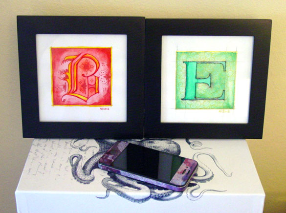
B is for Blackletter & E is for Emboss, framed art by Amy Crook
Categories: Daily Art, Illuminated Alphabet, Series and Books, Whimsical and Strange
Tags: alphabet, calligraphy, for sale, glitter gel pen, gold, green, illumination, pen and ink, pencil, watercolor
1 Comment »
Tentacle Deeps 41
Tuesday, August 7th, 2012
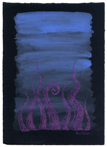
Tentacle Deeps 41 by Amy Crook
These shimmering tentacles are subtle in dim light but glitter brightly in the sun, waving in their periwinkle pond. They’d add the perfect touch of Cthulhu to any girl’s desk or living room.
Tentacle Deeps 41, 5″x7″ Japanese watercolor and glitter gel pen on Arches cover black paper.
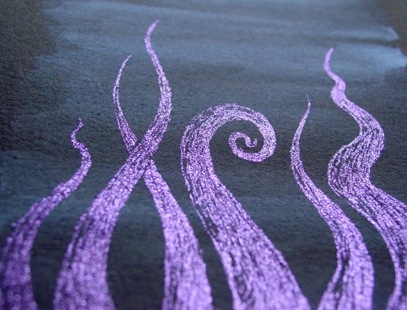
Tentacle Deeps 41, detail, by Amy Crook
Above, you can see the tentacles shining in the sunlight, bright in the the depths of their watery habitat. Below, you can see them in their frame, turned away from the direct light.
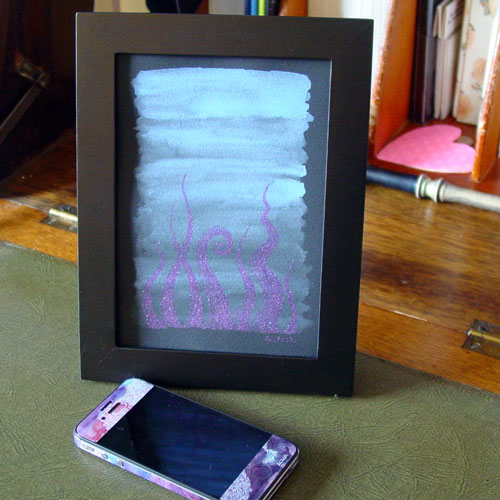
Tentacle Deeps 41, framed art by Amy Crook
Categories: Angels, Cthulhu, and Other Myths, Daily Art, Series and Books, Tentacles
Tags: black paper, for sale, glitter gel pen, japanese watercolor, periwinkle, purple, tentacle deeps, tentacles
Green Cheese Moon
Monday, August 6th, 2012
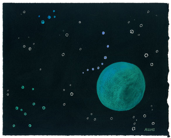
Green Cheese Moon watercolor by Amy Crook
I imagine the three groups of colored stars are constellations of some sort, clustered near the mysterious moon. The color and texture reminds me of the veining in good cheese, and so obviously this moon is made of green cheese.
I’d intended to add in some extra decorative elements, but it was so lovely the way it is I decided to stop there. Knowing when you’re done can be the hard part, some days.
Green Cheese Moon, 10″x8″ salt and watercolor on Arches cover black paper.
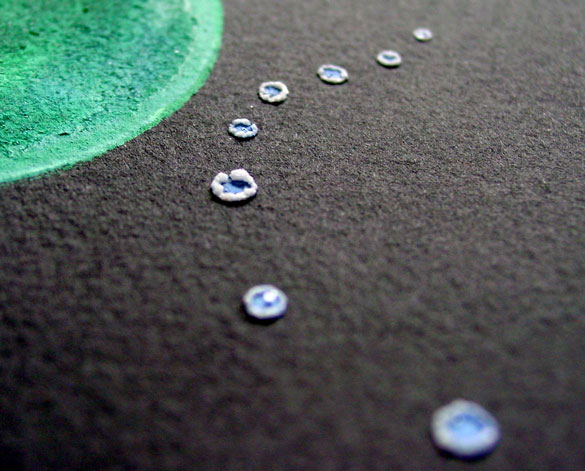
Green Cheese Moon, detail, by Amy Crook
Above you can see one of the constellations curving in a periwinkle line around the edge of the green planet. Below, you can see the whole thing tucked into a glassless frame.
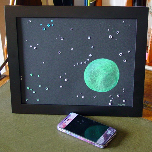
Green Cheese Moon, framed art by Amy Crook
Categories: Daily Art, Flowers, Trees and Landscapes, Series and Books
Tags: black paper, for sale, green, japanese watercolor, moon, salt
« Or Head Back That Way
 More Art This Way »


