Filigree Planet 3
Posted on July 20th, 2012

Filigree Planet 3 by Amy Crook
I used the same rich fuchsia on the stars here as I did on the central part of Monday’s painting, and they make the glittery filigree on the planet look very orange by comparison. The underlying planet is a mix of reds, pinks and oranges, with texture added by salt. Strangely, the crystals on the planet itself grew very flat and dark this time, with almost no shine to them, so I decided to add in the filigree to keep the planet from being outshone by its surrounding field of stars.
Filigree Planet 3, 7″x5″ salt, Japanese watercolor and glitter gel pen on Arches cover black paper.

Filigree Planet 3, detail 1, by Amy Crook
Above, you can see the shine of the red glitter, and some of the underlying texture on the planet as well. Below, you can see a close-up of three of the tiny pink salt pools in all their fucshia glory. Pink (the color, not the rock star) and I have a strange relationship, since I usually loathe it, but I’m finding it’s got its uses in moderation.
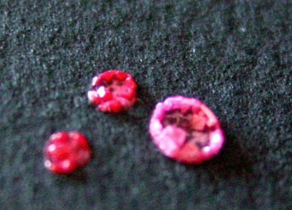
Filigree Planet 3, detail 2, by Amy Crook
Finally, you can see the piece tucked neatly into a frame. There’s no glass here, but it will ship to you fully protected and ready to hang. I just really hate trying to get the glare out of my photos.
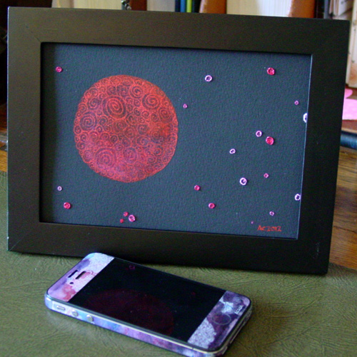
Filigree Planet, framed art by Amy Crook
Categories: Daily Art, Flowers, Trees and Landscapes, Series and Books
Tags: black paper, filigree, for sale, glitter gel pen, pink, planet, red, spirals, watercolor
B is for Blackletter
Posted on July 19th, 2012
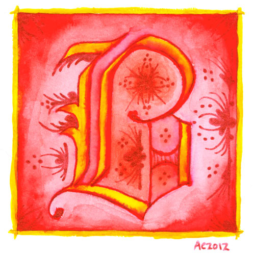
B is for Blackletter, calligraphic illumination by Amy Crook
I went Gryffindor with my second letter, bold red and rich yellow, though I chose the red glitter pen rather than gold for my second illumination. My B uses a classic blackletter face, heavy and Germanic, with a bit of whimsy thrown into the illumination for it.
Just as with the A, I let the ink bleed into the paint so the shapes of the letter have a lovely orange fade, and though I used a very bright, pure red on the background, I used a dark red-orange inside the B itself to better offset the glitter illumination.
B is for Blackletter, 5″x5″ pen & ink, Japanese watercolor, and glitter gel pen on paper.
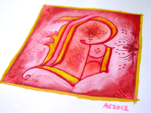
B is for Blackletter, detail, by Amy Crook
The shine on the red glitter is much more subtle and harder to photograph, especially since it goes a bit pink when the light hits it, so the colors in the above detail photo are a bit off in general. Alas. Below, you can see it happily tucked into a frame with my phone to show you the relative size. The central box on these is 3 inches square, but the border and signature rest outside.
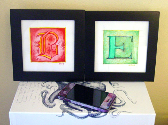
B is for Blackletter & E is for Emboss, framed art by Amy Crook
Categories: Daily Art, Illuminated Alphabet, Series and Books, Whimsical and Strange
Tags: alphabet, calligraphy, for sale, glitter gel pen, gold, illumination, pen and ink, red, watercolor
1 Comment »
On Calligraphy
Posted on July 18th, 2012
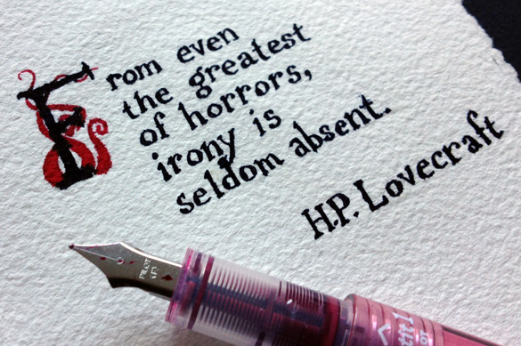
Red Irony, detail, by Amy Crook
Like basically every other artist I’ve ever talked to, I’ve been drawing stuff from a very young age. We all do, really, even the non-artists among us are given crayons, cheap finger paints, sidewalk chalk, and pencils (not to mention in-class boredom to inspire margin-doodling). So, with that in mind, I think the first time I really chose an art form to try to pursue in a meaningful way, on purpose, it was calligraphy.
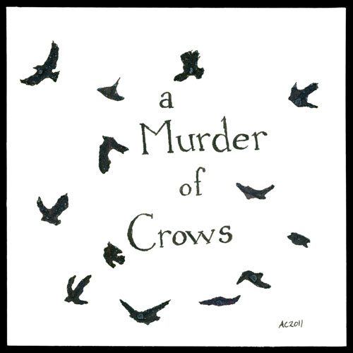
A Murder of Crows by Amy Crook
I started out with one of those Schaeffer calligraphy sets basically just like this one, which I’m pretty sure I still have somewhere, along with a couple dozen of the little ink capsules that fit into those pens. I remember painstakingly learning a few different fonts, writing out song lyrics in a slightly wobbly hand, and doing all those things young girls do when they learn to make their writing pretty.
Once I got older, sometime in college when I was trying Real Serious Art, calligraphy got set aside as a childish plaything, and the pens went into the black hole of art supply hoarding. I’d pull them out once in a while to do something, but in the long run (even now), I tend to prefer simple pointed fountain pens rather than the chisel tips, and drawing the shapes by hand rather than counting on the shape of the pen to create them.
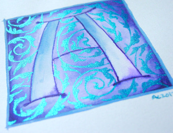
A is for Arabesque, detail, by Amy Crook
Recently I’ve been exposed to a few more examples of grown-up calligraphy, from Melissa Dinwiddie‘s gorgeous professional work to the plethora of Qs I visited online while working on the Quadrivium logo. I’ve seen a lot of people successfully integrating words into their art, as well, often using stamps or collage to add a message to their work.
With all this inspiration and the whole internet full of it as well, I’ve started getting back into calligraphy, not just as a long-forgotten habit but a legitimate art form of its own. Monday’s art may be part of a trend, I’m not sure yet — I don’t always have words to put on a piece. Sometimes Google can find me a quote that fits, like in Pomegranate below, but not always. I’m definitely going to continue my illuminated alphabet, though. I love the intersection between tradition and absurdity, modern glitter gel pen and ancient motifs.
I don’t always have something to say with my art, but when I do, at least I’ve got the skills to make it as beautiful as the pieces deserve, I hope.
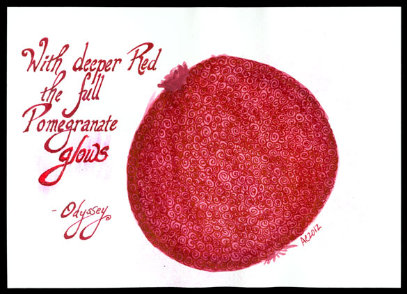
Pomegranate by Amy Crook
Categories: Daily Art, Words Words Words
Tags: calligraphy, info, words
1 Comment »
Lone Tentacle
Posted on July 17th, 2012

Lone Tentacle by Amy Crook
This dark, intense bluish-violet wash was just asking for tentacles, but after I’d scribbled in the first one it seemed like that was really enough. I just really like something about the way the single, lone tentacle reaches upward toward the light, silhouetted against the violet depths.
Lone Tentacle, 6″x6″ pen & ink and Japanese watercolor on Fluid watercolor paper.
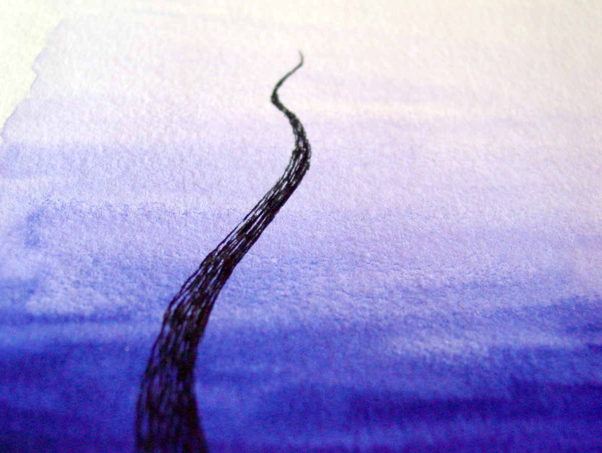
Lone Tentacle, detail, by Amy Crook
Above, you can see the shading detail on the tentacle, the textures of paper and paint that give the piece a murky, atmospheric feel. I liked this shot so much, I’m using it as a wallpaper, in fact. Below, you can see it temporarily tucked into a 8″x10″ frame, hanging out with my iPhone for scale.
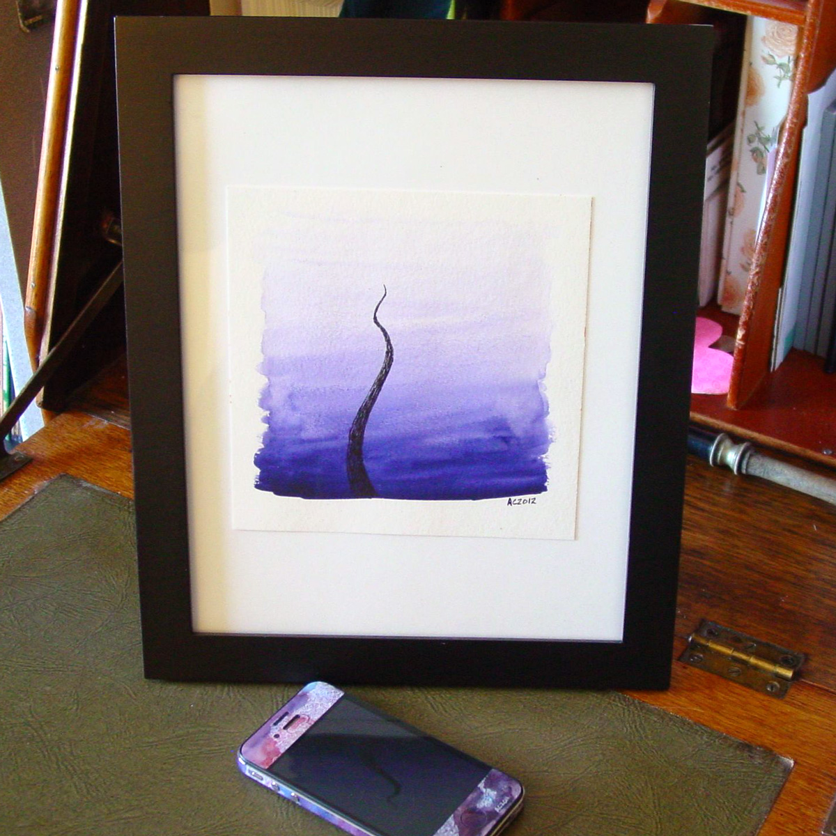
Lone Tentacle, framed, by Amy Crook
Categories: Angels, Cthulhu, and Other Myths, Daily Art, Free Wallpapers, Tentacles
Tags: for sale, pen and ink, tentacles, violet, watercolor
Make Good Art
Posted on July 16th, 2012
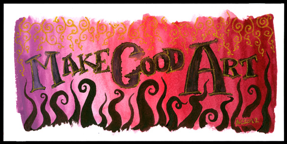
Make Good Art calligraphic painting by Amy Crook
Although I think many people have said this before (including several of my prior art teachers), it’s come most recently from Neil Gaiman. I also find the advice later on about freelancing to be very good and very true — to paraphrase, you must do good work, be on time, and be pleasant, and people will continue to hire you; actually, two out of three will do, most days. And thank goodness for that, because some days all three is more than anyone can manage.
I made this very pink wash when I was mucking about with my red palette of Japanese watercolors, going from the color that is almost exactly the same as the Orchid crayon in my childhood set, through a bright fuchsia pink and on to a lovely deep burgundy. I used my poor abused fountain pen to scribble in the lettering, then took my water brush and blurred it out, which gives an interesting effect, especially in the capitals. Next came the gold glitter paint in the letters, and I left it overnight to figure out what more it needed.
It needed tentacles, of course!
I finally found the fourth palette from the same set, which is six different shades of almost-black, so I took the rich plum-purple one and made a row of tentacles reaching up to tease at the lettering. Then, to balance it, I added the gold filigree at the top, and it finally felt done.
My mental narrative for it is a bit like, “Glimpse of the golden vines of Olympus? Make good art! Chased by tentacles from the Depths? Make good art!”
So, that’s my message for you this Monday – whatever form it takes, whatever inspires you, today, make good art.
Make Good Art, 8″x4″ Japanese watercolor, pen & ink, and glitter gel pen on Fluid watercolor paper on paper.
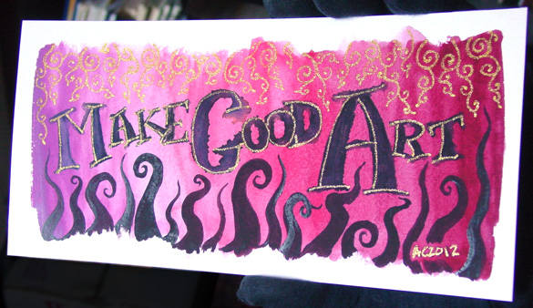
Make Good Art, detail 1, by Amy Crook
This is one of those pieces that’s very different depending on the lighting; the gold almost vanishes when it’s in low light, but it stands out beautifully when the sun hits it, and the thicker paint on the tentacles also has a bit of a gloss here and there. Below, you can see the effect just on the word “Art.”
And for those of you that’ve read this far, have a wallpaper of the above image, with my gloved fingers sneakily Photoshopped out.
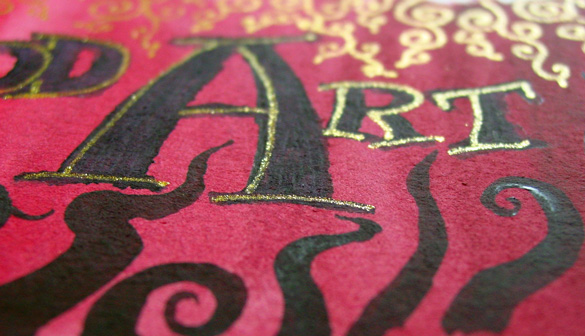
Make Good Art, detail 2, by Amy Crook
I put it in a temporary frame so you can see the scale. Given the odd size, you may want to have it custom framed, or put it on a piece of mat board in a larger frame the way I’ve got it shown below.
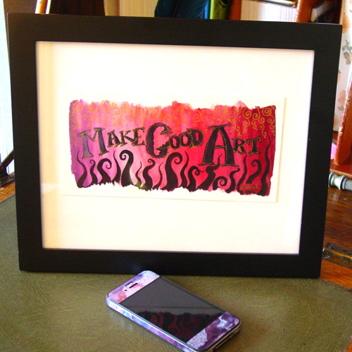
Make Good Art, framed, by Amy Crook
Categories: Daily Art, Free Wallpapers, Things I'm a Fan Of, Whimsical and Strange, Words Words Words
Tags: calligraphy, for sale, glitter gel pen, gold, neil gaiman, pen and ink, pink, red, watercolor
2 Comments »
Onward, Minion!
Posted on July 15th, 2012

Onward, Minion! sketch by Amy Crook
Fans of ICHC might recognize the octopus in this sketch, though I decided he’d be more amusing atop his minion’s head than a mere hand. His human servant is, of course, thrilled by this.
Categories: Daily Art, Sea Creatures and Other Animals, Tentacles
Tags: coloring book, doodle, nfs, pen and ink, pencil, sketch
Giant Rats 16: Don’t You See?
Posted on July 14th, 2012

“Do you see, John?” – a Sherlock comic by Amy Crook
For a few months now I’ve been contemplating the idea of doing a larger work with the Gorey-style shading, taking Sherlock and his Watson on an adventure that I could later put into a short book or something. Apparently, the first step on that path wasn’t deciding on a story or doing thumbnails, but instead drawing a random panel that might or might not fit in the middle, with a cute little one-shot joke.
If I do actually get far enough into the project it seems like it’ll finish (never a guarantee, heh), then I’ll want the originals to be Kickstarter incentives for printing a run of little books, I think, so this one won’t be for sale just yet.
“Don’t you see, John?” Sherlock comic, 7″x5″ pen and ink on paper.

Sherlock comic, framed, by Amy Crook
These are the smaller size from my B is for Baker Street series, the art itself is 5″x3″ on the 7″x5″ paper, whereas the original four character drawings are 7″x5″ including the text, on a larger 8.5″x5.5″ sheet of paper. These are much easier to frame, and easier to finish as well with significantly fewer square inches of white space to be crosshatched in masochistic detail.
So, what do you think? Would you want a little Sherlock book, perhaps The Giant Rats of Sumatra?
Categories: Daily Art, People, Figures and Faces, Series and Books, Things I'm a Fan Of
Tags: black and white, crosshatching, giant rats of sumatra, gorey, john watson, pen and ink, sherlock, sherlock bbc, sherlock holmes
6 Comments »
« Or Head Back That Way
 More Art This Way »