Archive for the ‘Whimsical and Strange’ Category
Fairytale Sky
Monday, August 20th, 2012
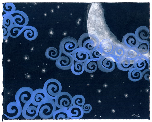
Fairytale Sky watercolor by Amy Crook
This piece exists in the intersection of realism and whimsy. It started with a white crescent moon that fades mysteriously to its dark side with a pitted, rocky texture. Then the cheerful periwinkle clouds spiral through the field of silver stars that shine out in the dark black of the paper. It’s an image that brings to mind the magic of bedtime stories and fairy tales, even the ones with happy endings.
Fairytale Sky, 10″x8″ Japanese watercolor on Arches cover black paper, nfs (sold).
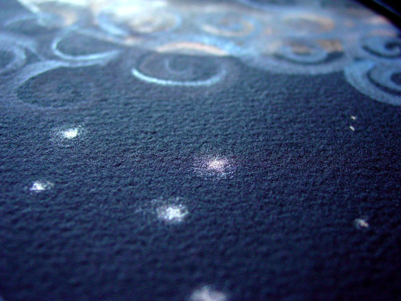
Fairytale Sky, detail, by Amy Crook
Above, you can see the silver stars catching the light against the paper – Arches makes this soft black paper for printmaking, but I like it because the black is chemical rather than dyed, so it never fades from its original velvety charcoal color. Below, you can see how this painting might look on your desk, well, if you’ve got the kind of desk I do, anyway. It’s bigger than a lot of my skies, so it would also work well on a bedroom wall or above someone’s bed to help assure sweet dreams.
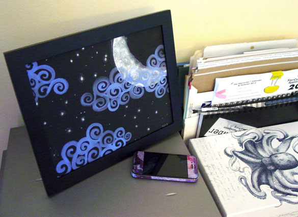
Fairytale Sky, framed art by Amy Crook
Categories: Daily Art, Flowers, Trees and Landscapes, Whimsical and Strange
Tags: black paper, fairytale sky, iridescent, japanese watercolor, moon, nfs, periwinkle, silver
1 Comment »
Parseltongue
Saturday, August 11th, 2012
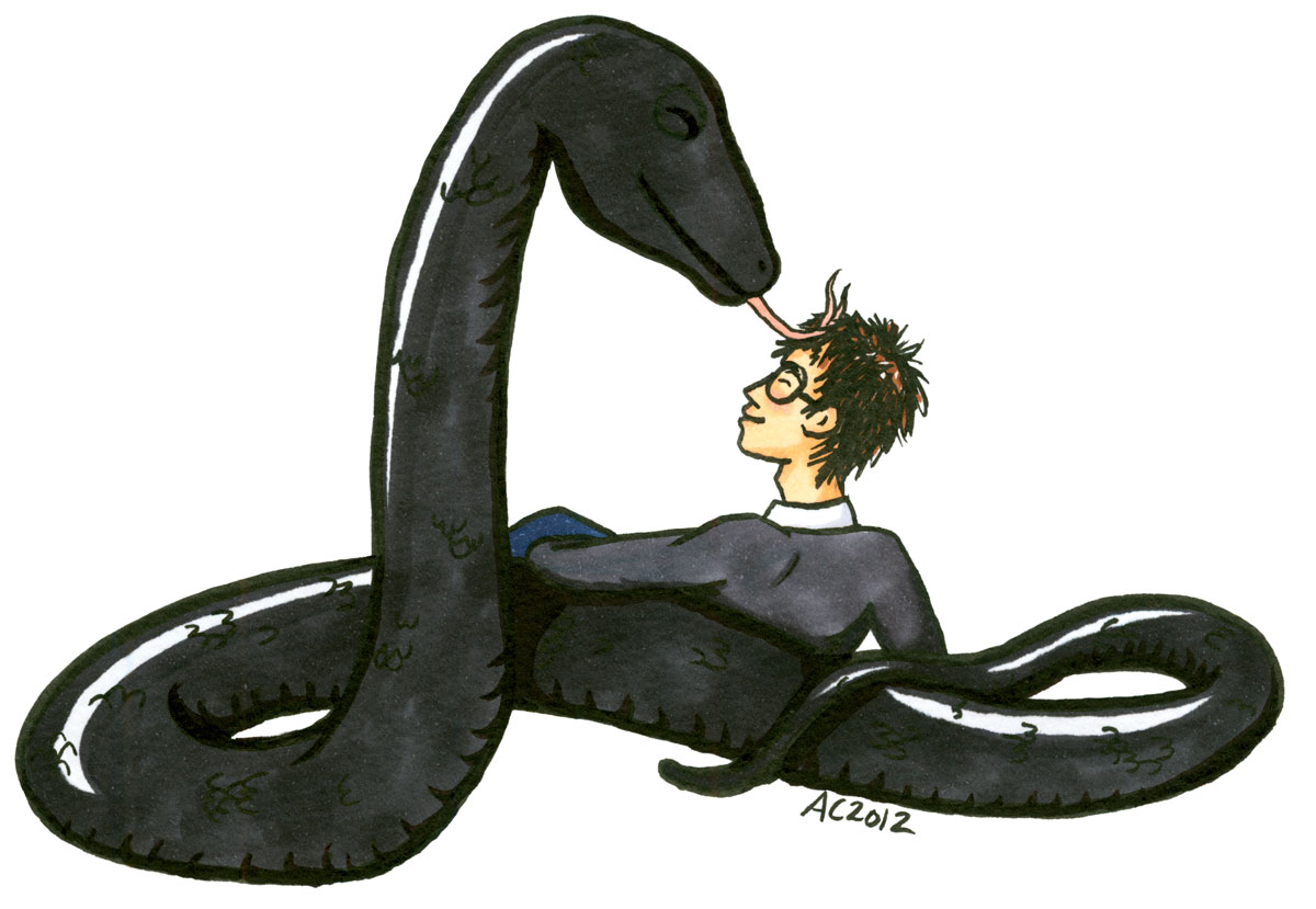
Parseltongue, Harry Potter fan art by Amy Crook
Wee Harry’s made a friend! Since he’s a Parselmouth and speaks Parseltongue, the language of snakes, he had no problem convincing this one that he’s not lunch.
Categories: Daily Art, People, Figures and Faces, Series and Books, Things I'm a Fan Of, Whimsical and Strange
Tags: copic marker, Harry Potter, parseltongue, pen and ink
E is for Emboss
Thursday, August 9th, 2012

E is for Emboss, calligraphic illumination by Amy Crook
I did so much measuring and line-drawing for my E I decided to leave in the pencil lines as a sort of underpainting, a decorative structure underlying the letter. Though it’s hard to see in the scan, the whole square is embossed, with gold coloring the embossed edges as well as providing the decoration on an otherwise plain capital. The two greens remind me of marble or malachite, but the gold filigree design really elevates the whole thing to the realm of beauty.
E is for Emboss, 5″x5″ pencil, pen & ink, Japanese watercolor and glitter gel pen on paper.

E is for Emboss, detail, by Amy Crook
Above, you can see the raised edges and shining gold both on the edge itself and in the filigree decoration. Below, I’ve put the piece in a frame with B is for Blackletter. It spells BE! Yes, I’m a dork. You knew that.
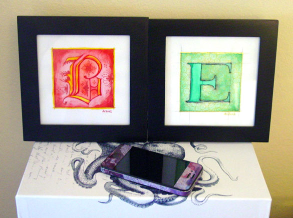
B is for Blackletter & E is for Emboss, framed art by Amy Crook
Categories: Daily Art, Illuminated Alphabet, Series and Books, Whimsical and Strange
Tags: alphabet, calligraphy, for sale, glitter gel pen, gold, green, illumination, pen and ink, pencil, watercolor
1 Comment »
D is for Dada
Thursday, August 2nd, 2012
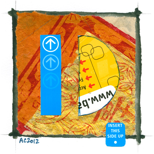
D is for Dada, calligraphic illumination by Amy Crook
I was thinking of cheating and using Art Deco for my D but some googling around reminded me of the Dada art movement and all its wacky semi-political cut-and-paste collage. I got some 5-cent BART tickets from my roommate, who is a great source for all sorts of useful things, and dug through my own art supply hoard for a sheet of Chinese New Year paper. The letter itself echoes my original intent, using an Art Deco-esque font, but in a very Dada manner.
I’m thinking of trimming all of these down to 5″x5″, doing an ampersand, and then displaying them in a 3×9 grid of square black frames. What do you guys think?
Just remember, insert this side up.
D is for Dada, 5″x5″ collage, Sharpie marker and Japanese watercolor on paper.
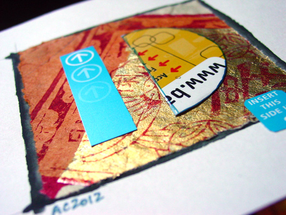
D is for Dada, detail, by Amy Crook
Above, you can really see the soft torn edges of the Chinese paper contrasted with the sharp, thick, plastic-like material of the BART ticket, which really stands out against the backdrop of mismatched stamping and gilding. Below, you can see this piece tucked into a frame and hanging out with the F, just waiting for a new home. Derek, Dave, Danielle, who will take it home and keep it for their very own?

D is for Dada & F is for Flourish, framed art by Amy Crook
Categories: Daily Art, Illuminated Alphabet, Series and Books, Whimsical and Strange
Tags: alphabet, bart ticket, blue, calligraphy, collage, for sale, gold, illumination, red, sharpie marker, watercolor, yellow
3 Comments »
C is for Counter
Thursday, July 26th, 2012
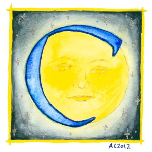
C is for Counter, calligraphic illumination by Amy Crook
Counter space is the space inside of a letter, whether open or closed. No, I didn’t know that before I started this project, either, don’t worry, but once I heard the term I became fascinated with the idea of fitting an old-school moon in the curve of the C for this alphabet.
C is for Counter, 5″x5″ Japanese watercolor, pen & ink and glitter gel pen on paper.
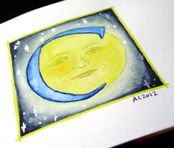
C is for Counter, detail, by Amy Crook
Above, you can see the shining silver stars in the blue sky, and also a better sense of the shading, which my scanner blew out completely in the yellows. Below, the C is hanging out with the Endless (whose names all start with D, ironically) and the G as well. It’s all ready for a Catherine or Carl to take it home, or perhaps a Mr. Cunningham. I think the framed photo actually has the most accurate color, too.

C is for Counter & G is for Gothic, framed art by Amy Crook
Categories: Daily Art, Illuminated Alphabet, Series and Books, Whimsical and Strange
Tags: alphabet, blue, calligraphy, for sale, glitter gel pen, illumination, moon, pen and ink, silver, stars, watercolor, yellow
B is for Blackletter
Thursday, July 19th, 2012
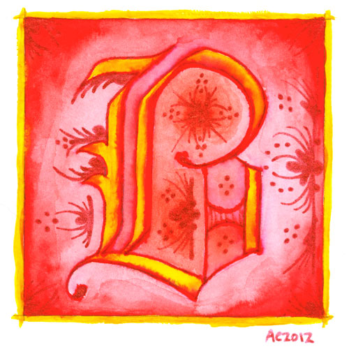
B is for Blackletter, calligraphic illumination by Amy Crook
I went Gryffindor with my second letter, bold red and rich yellow, though I chose the red glitter pen rather than gold for my second illumination. My B uses a classic blackletter face, heavy and Germanic, with a bit of whimsy thrown into the illumination for it.
Just as with the A, I let the ink bleed into the paint so the shapes of the letter have a lovely orange fade, and though I used a very bright, pure red on the background, I used a dark red-orange inside the B itself to better offset the glitter illumination.
B is for Blackletter, 5″x5″ pen & ink, Japanese watercolor, and glitter gel pen on paper.
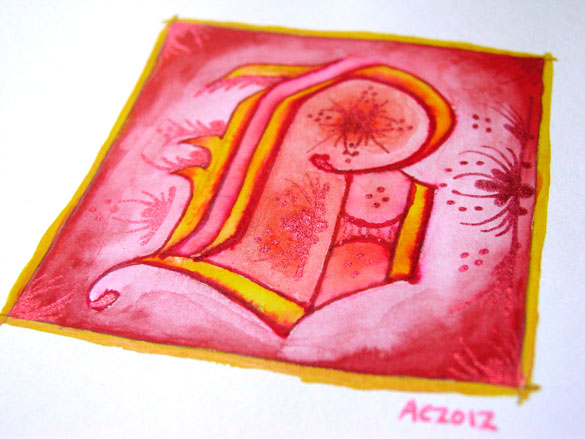
B is for Blackletter, detail, by Amy Crook
The shine on the red glitter is much more subtle and harder to photograph, especially since it goes a bit pink when the light hits it, so the colors in the above detail photo are a bit off in general. Alas. Below, you can see it happily tucked into a frame with my phone to show you the relative size. The central box on these is 3 inches square, but the border and signature rest outside.
B is for Blackletter & E is for Emboss, framed art by Amy Crook
Categories: Daily Art, Illuminated Alphabet, Series and Books, Whimsical and Strange
Tags: alphabet, calligraphy, for sale, glitter gel pen, gold, illumination, pen and ink, red, watercolor
1 Comment »
Make Good Art
Monday, July 16th, 2012
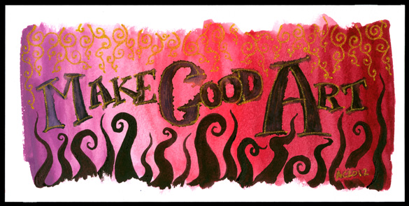
Make Good Art calligraphic painting by Amy Crook
Although I think many people have said this before (including several of my prior art teachers), it’s come most recently from Neil Gaiman. I also find the advice later on about freelancing to be very good and very true — to paraphrase, you must do good work, be on time, and be pleasant, and people will continue to hire you; actually, two out of three will do, most days. And thank goodness for that, because some days all three is more than anyone can manage.
I made this very pink wash when I was mucking about with my red palette of Japanese watercolors, going from the color that is almost exactly the same as the Orchid crayon in my childhood set, through a bright fuchsia pink and on to a lovely deep burgundy. I used my poor abused fountain pen to scribble in the lettering, then took my water brush and blurred it out, which gives an interesting effect, especially in the capitals. Next came the gold glitter paint in the letters, and I left it overnight to figure out what more it needed.
It needed tentacles, of course!
I finally found the fourth palette from the same set, which is six different shades of almost-black, so I took the rich plum-purple one and made a row of tentacles reaching up to tease at the lettering. Then, to balance it, I added the gold filigree at the top, and it finally felt done.
My mental narrative for it is a bit like, “Glimpse of the golden vines of Olympus? Make good art! Chased by tentacles from the Depths? Make good art!”
So, that’s my message for you this Monday – whatever form it takes, whatever inspires you, today, make good art.
Make Good Art, 8″x4″ Japanese watercolor, pen & ink, and glitter gel pen on Fluid watercolor paper on paper.
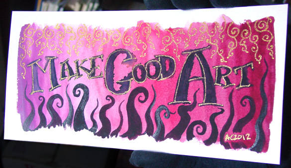
Make Good Art, detail 1, by Amy Crook
This is one of those pieces that’s very different depending on the lighting; the gold almost vanishes when it’s in low light, but it stands out beautifully when the sun hits it, and the thicker paint on the tentacles also has a bit of a gloss here and there. Below, you can see the effect just on the word “Art.”
And for those of you that’ve read this far, have a wallpaper of the above image, with my gloved fingers sneakily Photoshopped out.
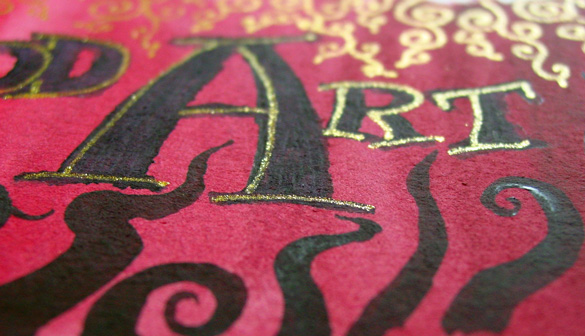
Make Good Art, detail 2, by Amy Crook
I put it in a temporary frame so you can see the scale. Given the odd size, you may want to have it custom framed, or put it on a piece of mat board in a larger frame the way I’ve got it shown below.
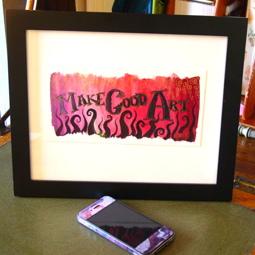
Make Good Art, framed, by Amy Crook
Categories: Daily Art, Free Wallpapers, Things I'm a Fan Of, Whimsical and Strange, Words Words Words
Tags: calligraphy, for sale, glitter gel pen, gold, neil gaiman, pen and ink, pink, red, watercolor
2 Comments »
« Or Head Back That Way
 More Art This Way »