Posts Tagged ‘calligraphy’
Cassiopeia
Monday, August 27th, 2012
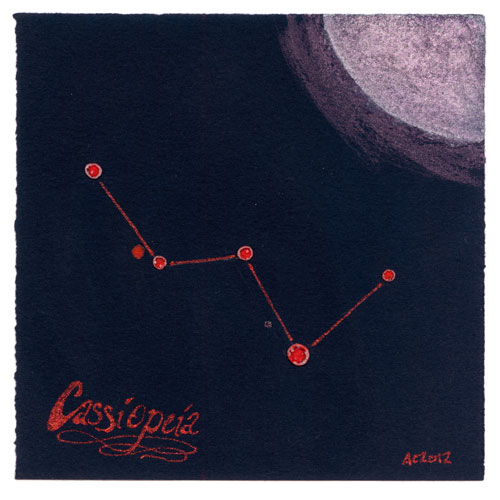
Cassiopeia by Amy Crook
I have been thinking I might want to do some more ordered skies, rather than just the random dots I usually paint, but to be honest when I look up at the stars I mostly see… random dots. Thanks to the power of Google, however, I’ve brought you Cassiopeia done up like a prog rock album cover from the ’70s complete with groovy, glittery calligraphy. Fortunately, I know someone who loves the colors, the constellation and prog rock, so they know what they’re getting for Christmas.
The perks of hanging out with an artist, right?
Cassiopeia, 5″x5″ mixed media on paper, nfs.
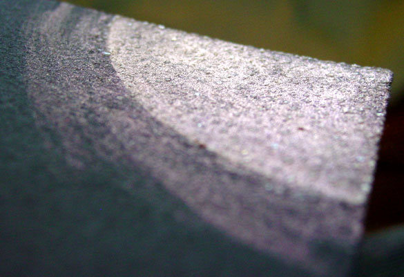
Cassiopeia, detail, by Amy Crook
There’s actually a fine layer of sparkly salt crystals mixed in with the iridescent red paint and the whiter glow of the moon on this, which you can only see in the sun from certain angles. This whole piece blends minimalism with bling in a way that amuses me greatly, so I’m glad it’s going to someone that’s already making grabbyhands at it.
Categories: Daily Art, Flowers, Trees and Landscapes
Tags: black paper, calligraphy, constellation, glitter gel pen, iridescent, japanese watercolor, moon, nfs, salt
F is for Flourish
Thursday, August 23rd, 2012
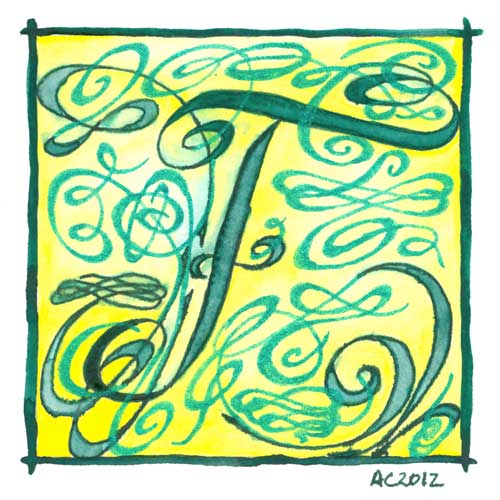
F is for Flourish, calligraphic illumination by Amy Crook
While my embossed E was all warm green and gold, and this week’s F is cool greens and lemon yellow instead. I knew F was going to be flourish from the start, and boy, did I get flourishy! This illuminated letter would look great on the wall of a Fiona, the desk of a Frank or the bookshelf of a Ferdinand.
F is for Flourish, 5″x5″ pen & ink, watercolor, and glitter gel pen on paper.
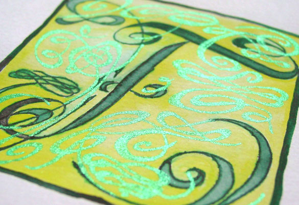
F is for Flourish, detail, by Amy Crook
Above you can see the sun really shining off the green glitter flourishes. Below, F is hanging out with D is for Dada in one of my bookshelves.

F is for Flourish and D is for Dada, framed art by Amy Crook
Categories: Daily Art, Illuminated Alphabet, Series and Books, Whimsical and Strange
Tags: alphabet, calligraphy, for sale, glitter gel pen, green, illumination, pen and ink, watercolor, yellow
E is for Emboss
Thursday, August 9th, 2012

E is for Emboss, calligraphic illumination by Amy Crook
I did so much measuring and line-drawing for my E I decided to leave in the pencil lines as a sort of underpainting, a decorative structure underlying the letter. Though it’s hard to see in the scan, the whole square is embossed, with gold coloring the embossed edges as well as providing the decoration on an otherwise plain capital. The two greens remind me of marble or malachite, but the gold filigree design really elevates the whole thing to the realm of beauty.
E is for Emboss, 5″x5″ pencil, pen & ink, Japanese watercolor and glitter gel pen on paper.

E is for Emboss, detail, by Amy Crook
Above, you can see the raised edges and shining gold both on the edge itself and in the filigree decoration. Below, I’ve put the piece in a frame with B is for Blackletter. It spells BE! Yes, I’m a dork. You knew that.
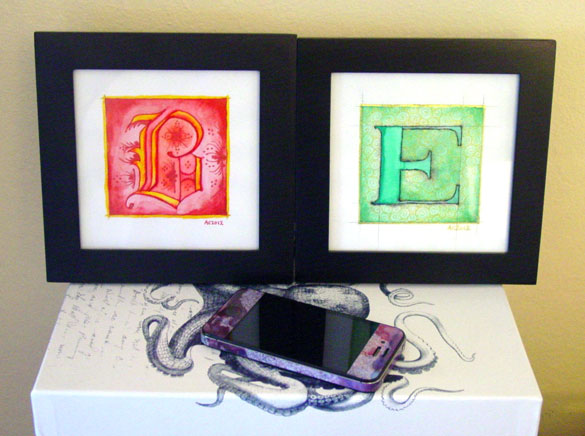
B is for Blackletter & E is for Emboss, framed art by Amy Crook
Categories: Daily Art, Illuminated Alphabet, Series and Books, Whimsical and Strange
Tags: alphabet, calligraphy, for sale, glitter gel pen, gold, green, illumination, pen and ink, pencil, watercolor
1 Comment »
C is for Counter
Thursday, July 26th, 2012
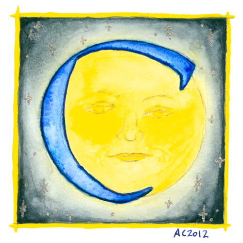
C is for Counter, calligraphic illumination by Amy Crook
Counter space is the space inside of a letter, whether open or closed. No, I didn’t know that before I started this project, either, don’t worry, but once I heard the term I became fascinated with the idea of fitting an old-school moon in the curve of the C for this alphabet.
C is for Counter, 5″x5″ Japanese watercolor, pen & ink and glitter gel pen on paper.
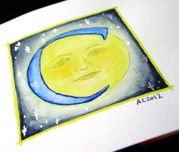
C is for Counter, detail, by Amy Crook
Above, you can see the shining silver stars in the blue sky, and also a better sense of the shading, which my scanner blew out completely in the yellows. Below, the C is hanging out with the Endless (whose names all start with D, ironically) and the G as well. It’s all ready for a Catherine or Carl to take it home, or perhaps a Mr. Cunningham. I think the framed photo actually has the most accurate color, too.

C is for Counter & G is for Gothic, framed art by Amy Crook
Categories: Daily Art, Illuminated Alphabet, Series and Books, Whimsical and Strange
Tags: alphabet, blue, calligraphy, for sale, glitter gel pen, illumination, moon, pen and ink, silver, stars, watercolor, yellow
B is for Blackletter
Thursday, July 19th, 2012
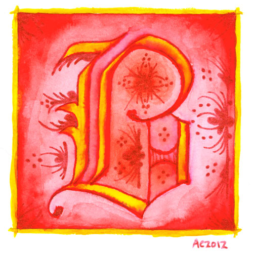
B is for Blackletter, calligraphic illumination by Amy Crook
I went Gryffindor with my second letter, bold red and rich yellow, though I chose the red glitter pen rather than gold for my second illumination. My B uses a classic blackletter face, heavy and Germanic, with a bit of whimsy thrown into the illumination for it.
Just as with the A, I let the ink bleed into the paint so the shapes of the letter have a lovely orange fade, and though I used a very bright, pure red on the background, I used a dark red-orange inside the B itself to better offset the glitter illumination.
B is for Blackletter, 5″x5″ pen & ink, Japanese watercolor, and glitter gel pen on paper.
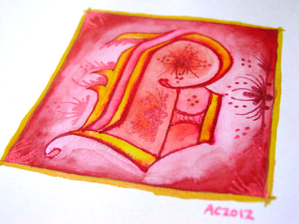
B is for Blackletter, detail, by Amy Crook
The shine on the red glitter is much more subtle and harder to photograph, especially since it goes a bit pink when the light hits it, so the colors in the above detail photo are a bit off in general. Alas. Below, you can see it happily tucked into a frame with my phone to show you the relative size. The central box on these is 3 inches square, but the border and signature rest outside.

B is for Blackletter & E is for Emboss, framed art by Amy Crook
Categories: Daily Art, Illuminated Alphabet, Series and Books, Whimsical and Strange
Tags: alphabet, calligraphy, for sale, glitter gel pen, gold, illumination, pen and ink, red, watercolor
1 Comment »
On Calligraphy
Wednesday, July 18th, 2012
Like basically every other artist I’ve ever talked to, I’ve been drawing stuff from a very young age. We all do, really, even the non-artists among us are given crayons, cheap finger paints, sidewalk chalk, and pencils (not to mention in-class boredom to inspire margin-doodling). So, with that in mind, I think the first time I really chose an art form to try to pursue in a meaningful way, on purpose, it was calligraphy.
I started out with one of those Schaeffer calligraphy sets basically just like this one, which I’m pretty sure I still have somewhere, along with a couple dozen of the little ink capsules that fit into those pens. I remember painstakingly learning a few different fonts, writing out song lyrics in a slightly wobbly hand, and doing all those things young girls do when they learn to make their writing pretty.
Once I got older, sometime in college when I was trying Real Serious Art, calligraphy got set aside as a childish plaything, and the pens went into the black hole of art supply hoarding. I’d pull them out once in a while to do something, but in the long run (even now), I tend to prefer simple pointed fountain pens rather than the chisel tips, and drawing the shapes by hand rather than counting on the shape of the pen to create them.
Recently I’ve been exposed to a few more examples of grown-up calligraphy, from Melissa Dinwiddie‘s gorgeous professional work to the plethora of Qs I visited online while working on the Quadrivium logo. I’ve seen a lot of people successfully integrating words into their art, as well, often using stamps or collage to add a message to their work.
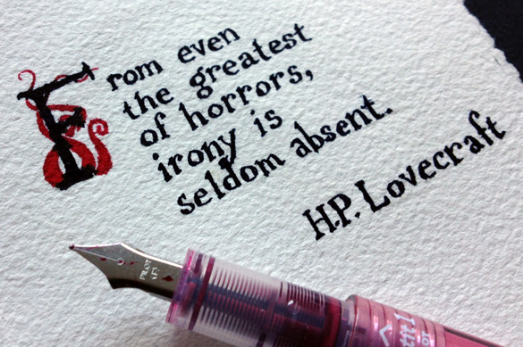
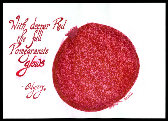
With all this inspiration and the whole internet full of it as well, I’ve started getting back into calligraphy, not just as a long-forgotten habit but a legitimate art form of its own. Monday’s art may be part of a trend, I’m not sure yet — I don’t always have words to put on a piece. Sometimes Google can find me a quote that fits, like in Pomegranate below, but not always. I’m definitely going to continue my illuminated alphabet, though. I love the intersection between tradition and absurdity, modern glitter gel pen and ancient motifs.
I don’t always have something to say with my art, but when I do, at least I’ve got the skills to make it as beautiful as the pieces deserve, I hope.
Categories: Daily Art, Words Words Words
Tags: calligraphy, info, words
1 Comment »
« Or Head Back That Way
 More Art This Way »

