
On the Horizon
Posted on August 15th, 2011

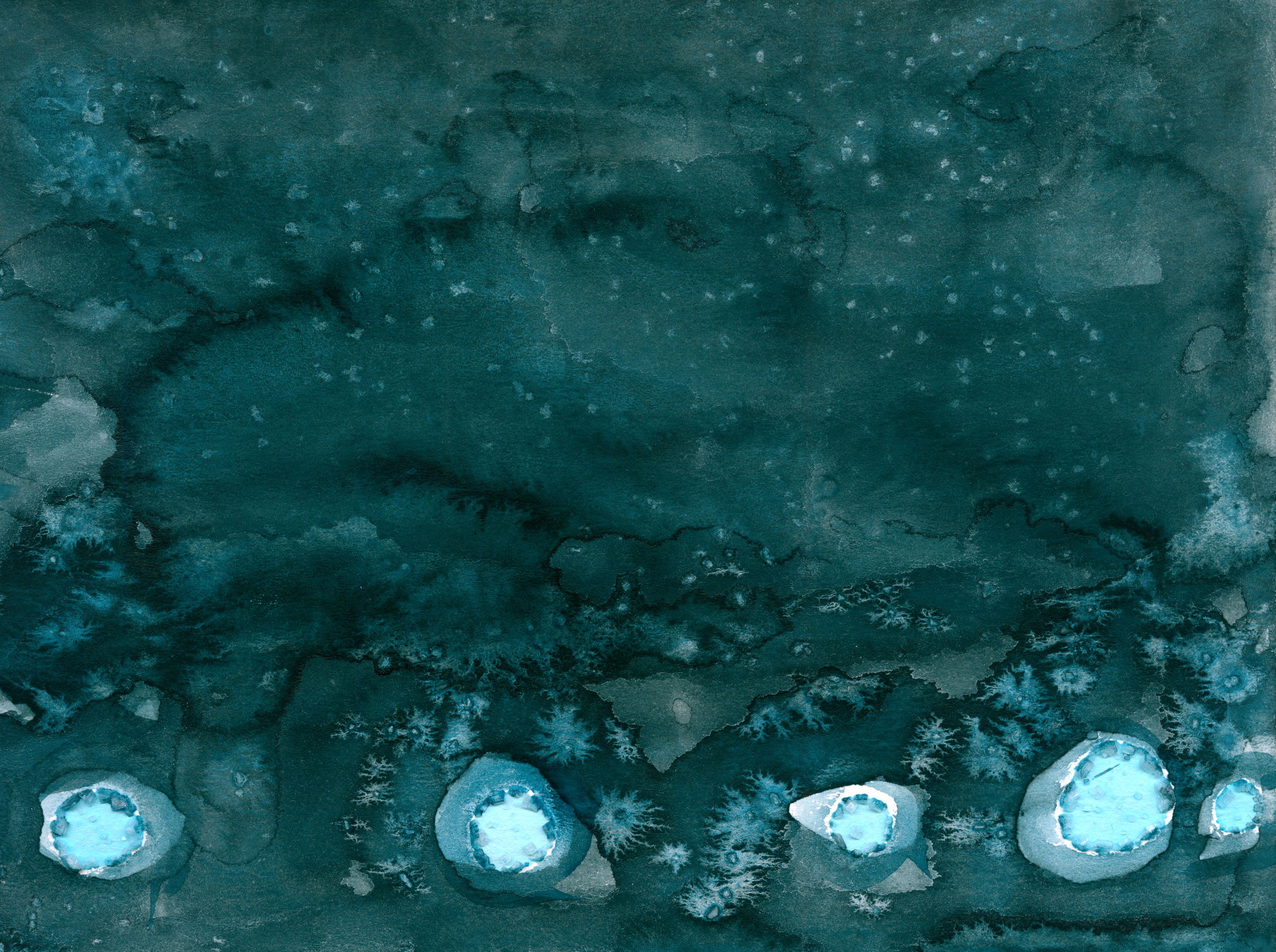
On the Horizon by Amy Crook
I used two different salt techniques on this piece, first making the row of big ‘lights’ and then creating the dark watercolor wash. Then I used small flakes of salt to create the bigger lights along the horizon and the stars in the tall, endless sky. This particular paint leaves gorgeous cloud-like formations, adding a level of texture and detail that’s really hard to see all tiny. If you click on the image, you can see a larger version, I also made a computer wallpaper and two different iPhone wallpapers.
I originally started this with something else in mind, which is why there’s a very straight row of salt across the bottom, but I find I’m far happier with this than the first idea.
On the Horizon, 7″x8″ salt and watercolor on watercolor paper.
You can see some of the detail here, with just a touch of sunlight caught on the peaks of the salt crystals.

On the Horizion, detail 1, by Amy Crook
This image shows the subtle sparkle of salt along a few of the deeper pools, where some of the fine flakes dissolved and left tiny crystals just at the edges.

On the Horizion, detail 2, by Amy Crook
Categories: Abstract and Just Plain Weird, Daily Art, Flowers, Trees and Landscapes
Tags: salt, stars, watercolor
1 Comment »
Evil Fishie sketch
Posted on August 13th, 2011

Evil Fishie sketch by Amy Crook
I managed a sketch for Saturday, whee! I realized that a lot of what I sketch is the preliminary drawings for things I’d rather post finished, so that’s why I never seem to have any sketches for my Saturday posts. This guy seems rather Lovecraftian to me, perhaps I can do a properly inked version of him of I do another coloring book sometime.
Categories: Daily Art, Sea Creatures and Other Animals, Things I'm a Fan Of, Zombies, Skulls, and Other Morbid Things
Tags: fish, lovecraft, nfs, pencil
Hibiscus Violet
Posted on August 12th, 2011

Hibiscus Violet, abstract art by Amy Crook, $99
Something about having painted the iridescent oils onto this watercolor postcard before gracing it with the hibiscus tea caused the tea to stop at a lovely violet mid-stage between the vibrant pink and soft blue of my other hibiscus pieces. I used salt to add some extra texture to the tea wash, but most of the texture comes from the peaks of dried oil paint.
This piece rides the edge of being busy, the harmonious color palette keeping it from being too random. I really like the way the paint shimmers in the light, but the areas of tea are a soft matte, which makes the paint seem to float above the background just a tiny bit.
Hibiscus Violet, 4″x6″ mixed media on watercolor postcard, $99, framed, with free shipping.
Here you can really see how the paint rises up from the page, and get a sense of the iridescent effect.

Hibiscus Violet, detail, by Amy Crook
I’ve put it in a simple black frame, you can see how the colors change depending on the light.

Hibiscus Violet, framed art by Amy Crook, $99
Categories: Abstract and Just Plain Weird, Daily Art
Tags: for sale, hibiscus, iridescent, oil paint, postcard, tea, violet
Iridescence 3
Posted on August 11th, 2011

Iridescence 3, abstract art by Amy Crook, $333
I admit, I wanted to post both of these in the same week because they feel like different sides of the same coin to me. They use similar color schemes and techniques, but where Iridescence 2 is all soft glowing colors and indistinct shapes, Iridescence 3 is all sharp-edged spirals and visible brush strokes.
Even the haloes of complementary color around each salt pool are sharper and more distinct than in the previous piece, with more areas of pure white paper peeking through as a result. I’m not sure which of the two I prefer, though this is the one I’ve got out on display right now.
Iridescence 3, 7″x5″ mixed media on watercolor paper, $333, framed, with free shipping.
This is a closeup of the green salt pool in the lower left, so you can really see how the paint is layered in distinct circles with watercolor’s characteristic dark, sharp edges.

Iridescence 3, detail, by Amy Crook
The bold black frame works really well with the blue-black and violet-black in the darkest, sharpest of the paint swirls, and protects the fragile salt crystals from damage.

Iridescence 3, framed, by Amy Crook, $333
Categories: Abstract and Just Plain Weird, Daily Art, Series and Books
Tags: blue, for sale, green, hibiscus, iridescence, pen and ink, purple, salt, tea, watercolor
Cousin Godiva
Posted on August 10th, 2011

Cousin Godiva by Amy Crook
This idea came to me when I was walking to meet a friend, my (ridiculously) long hair blowing in the breeze. I’ve always been a bit fascinated by the idea of Lady Godiva, and of course Cousin It is a theme anyone with long brown hair will find in their life. The combination of Addams Family and legendary lady was irresistible to my cartooning fingers.
With all the cartoons I do, I’m getting to be an old hand at drawing and coloring hair, so Cousin It was pretty easy overall. It’s the first time I’ve tried to weeble-ify a horse, though!
Categories: Daily Art, People, Figures and Faces, Series and Books, Whimsical and Strange
Tags: addams family, copic marker, hair, lady godiva, nfs, pen and ink, weeble
2 Comments »
Iridescence 2
Posted on August 9th, 2011

Iridescence 2, abstract art by Amy Crook, $333
Going in the opposite direction of yesterday’s art, this one expands the color palette along the entire cool end of the spectrum. I used green, aqua, blue and violet pens for my salt circles. Then I supplemented it with a layer of hibiscus tea in its low-saturation periwinkle shades. After that I used watercolors in matching hues, the dark indigo-black and violet softened by swirls of complementary colors around each salt pool. Finally, I used a little bit of salt to add texture to a few of the darkest places, giving the whole piece a layered complexity.
I decided to continue naming them as a series after one of my favorite of the salt pieces, Iridescence, because they had the same quality of seeming as though they were reflective without anything shiny, other than the sparkling salt crystals.
Iridescence 2, 7″x5″ mixed media on paper, $333, framed, with free shipping.
You can see one of the wonderfully complex salt structures here, a little lopsided ziggurat of crystal formations saturated with ink and ever overdyed with paint. If you click on the image you can see it even bigger and really get a sense of the detail, though of course the actual circle is barely the size of a dime.

Iridescence 2, detail, by Amy Crook
The piece looks beautiful safely tucked into its frame, the soft lines and cool colors offset by the simple black wood.

Iridescence 2, framed, by Amy Crook, $333
Categories: Abstract and Just Plain Weird, Daily Art, Series and Books
Tags: blue, for sale, green, hibiscus, iridescence, pen and ink, purple, salt, tea, watercolor
1 Comment »
Hibiscus Blue 5
Posted on August 8th, 2011

Hibiscus Blue 5, abstract art by Amy Crook, $323
In this installment of my Hibiscus Blue series, I decided to go fully monochromatic by using the hibiscus tea rather than water to create my salt pools. Other than the signature, there’s no ink or watercolor in this it all, only the various shades of indigo created by the tea and its chemical reaction to the paper.
When I added the tea to the salt, it was fascinating to watch the droplets of liquid turn from a clear pinkish ruby, to a dark red, then almost an opaque black before drying the deep indigo you see here. It took a long time for both the chemical reaction and for the tea to fully evaporate, but the product is completely unique.
One random thing I discovered when I was working on these pieces — mosquitoes apparently find hibiscus tea quite tasty. I had one that kept circling and landing on the art, drinking from the shallow pool of tea (rather than me, thankfully). Since I didn’t want a bug-print in the middle of my painting, I had to let it go, though I think it fell prey to one of my cats shortly after.
Hibiscus Blue 5, 5″x7″ salt and hibiscus tea on paper, $323, framed, with free shipping.
Something about the way the salt and tea reacted caused the salt pools to form as circles of low, flat crystals with no large central formation, which then tended to dissolve easily when further tea was added to the page, creating irregular shapes of iridescent sparkle on the page.

Hibiscus Blue 5, detail, by Amy Crook
I think the simple black frame really sets off the organic, monochromatic shapes, giving structure to the abstract swirls of color. The color seems a bit more accurate here, too; my scanner tends to pick up the least bit of remaining pink in the tea that isn’t as visible to the naked eye — or at least not to my eyes.

Hibiscus Blue 5, framed, by Amy Crook, $323
Categories: Abstract and Just Plain Weird, Daily Art, Series and Books
Tags: for sale, hibiscus, hibiscus blue, salt, tea
« Or Head Back That Way
 More Art This Way »


