
7 Seconds
Posted on July 28th, 2011

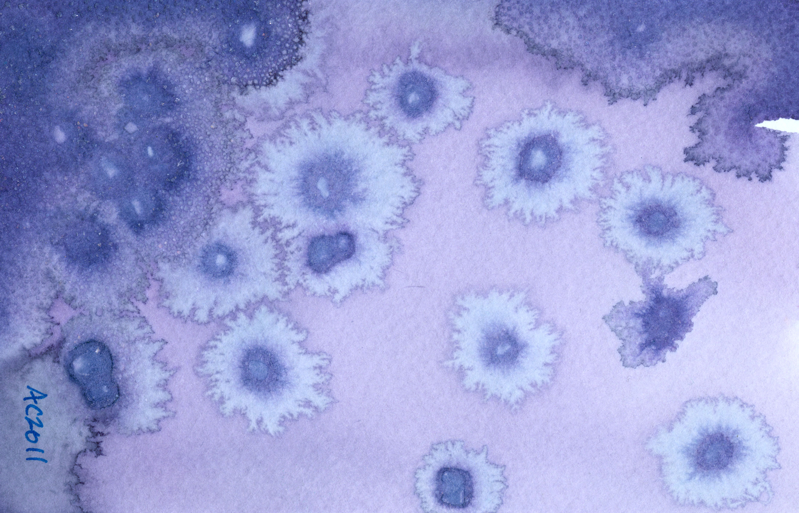
7 Seconds, abstract art by Amy Crook, $399
I can’t really explain the title of this painting, other than to say it suggested itself to me when I was contemplating what to name the file when I was scanning it. There are seven pools of salt, rather more distorted from perfect rounds than usual because the paper was already slightly warped by the wash of hibiscus tea before I made them.
This is one of my first pieces combining watercolor with tea, though I’ve since worked on several more. I really like the way the rich turquoise paint works with the softer green of the salt, and the muted blue-violet of the tea.
7 Seconds, 7″x5″ mixed media on paper, $399, framed, with free shipping.
Here you can see the initial wash drying — the lightest spots turned to blue almost immediately, leaving the original pink lingering in the pools of tea, though as you can see they, too, changed as they dried.

7 Seconds, work in progress, by Amy Crook
This photo gives away one of my cheater secrets — I use the knickknacks off my shelves to flatten out the pages when they get too warped. Though it’s far from perfect, that’s part of the point, the compromise between order and entropy, deliberation and natural randomness.

7 Seconds, work in progress by Amy Crook
It was quite warm the day the salt water was drying, which created unusually delicate salt formations.

7 Seconds, detail 1, by Amy Crook
Some of those formations were washed away by the paint, turning instead into small crystals haloing the original salt pools.

7 Seconds, detail 2, by Amy Crook
This is definitely one of those paintings that looks much better once it’s framed. The black really makes the colors look richer and deeper, and helps showcase the harmony of the piece.

7 Seconds, framed art by Amy Crook, $399
Categories: Abstract and Just Plain Weird, Daily Art
Tags: blue, for sale, green, hibiscus, pen and ink, salt, watercolor
Mapping Your Thing
Posted on July 27th, 2011

Fairytale Path by Amy Crook, for Tara Swiger’s Map-Making Guide
I have to admit I was utterly thrilled when Tara Swiger.* asked me to paint a path for her latest awesome product, the Map-Making Guide*. After some back-and-forth discussion, she ended up commissioning the path itself, and a page of fairytale-related dingbats to go with it. The purple fuzzy monster is even a bit weeble-y, so when he wanted to be posted on a Wednesday, I went with it.
I sketched up the path itself, and then after her enthusiastic approval, painted in the wandering curve, leaving plenty of white space around it for writing, and playing. Then I had fun drawing all the things I could think of to decorate it, most of which you can see here. The extra curve of path is for those whose ambitions sometimes require a detour, for instance, and there’s a dragon and fuzzy monster to represent the scary obstacles along the way. A pot of gold awaits those for whom that’s part of the goal, as well as a castle.
I had a lot of fun printing off a sample page and cutting out all the bits to play with, though I have to admit that I haven’t made it all the way through making my own Map yet. I’m thinking of making myself a page of pennants and banners to act as mile-markers, though I’m also tempted to get some of those Post-It flags for the same purpose. I’ve always wanted an excuse to buy some!
If you’ve got a goal and you’re a bit fuzzy on how to get from Point A to Point B, think about giving Tara’s Map-Making Guide* a try! Just doing Step 1 (spoiler: it’s “define Point A & Point B”) has been a great help in focusing my efforts.
“Working on the map with Amy was fantastic. I came to her while the idea was still just an unformed thought. Not only did she totally NAIL what I only vaguely described, she also helped me think it through. She turned my ideas into actual, visual products and delighted me beyond belief.”
-Tara Swiger
If you’re interested in working with me on an illustration, just drop me a line and I’ll be happy to give you a price quote and timeline estimate.
*Disclosure: I’m using affiliate links! If you buy it, I will get a few dollars. This will make us all happy.
Categories: Completed Commissions, Daily Art, Flowers, Trees and Landscapes
Tags: commission, dragon, monster, tara swiger, watercolor
1 Comment »
Tentacles at Endgame
Posted on July 26th, 2011

Tentacle Deeps watercolor series by Amy Crook, on display at Endgame in Oakland, CA
If you’ve been curious to see some of these pieces in person, now’s your chance! The wonderful guys at Endgame in Oakland, CA have graciously allowed me to take over one the walls up in their open gaming area for a mini-show of my Tentacle Deeps series. I’m really enjoying the way the whole series looks all together like this, though there are two pieces that didn’t make it up onto the wall — these only go to 11.
I’m usually there on Wednesday nights to game if you’d like to come see me as well as my work, but if you go by when I’m not there, be sure to tell the guys at the counter I said hi!
Categories: Daily Art, Tentacles, Words Words Words
Tags: endgame, show, tentacle deeps
Hibiscus Blue 3
Posted on July 25th, 2011

Hibiscus Blue 3, abstract art by Amy Crook, $323
I wasn’t sure if this piece would be part of my Hibiscus Blue series or not until I started it, because I used an entirely different sort of paper. This is a thick watercolor postcard, which turned the rich pink of the tea into a gorgeous periwinkle blue that grew even darker where it pooled around the salt. The two unusual art materials reacted together to create gorgeous cornflower-like rosettes in the lighter places, while sparkling patterns of blue-dyed salt crystals add texture to the darker sections.
Hibiscus Blue 3, 4″x6″ hibiscus tea and salt on watercolor postcard.
Rather than my usual method of putting the liquid over the salt, this time I created a very wet wash of tea and then scattered the salt crystals onto the drying tea. You can see below how the tea stayed pink the longest where it was drawn into the salt, but at the same time it also turned bluest in those places where there was more salt.

HIbiscus Blue 3, work in progress by Amy Crook
This shot really captures the sparkle of the piece, not just in the places where the salt is thickest but also around the center of each flower.

Hibiscus Blue 3, detail, by Amy Crook
It fits nicely in a simple black frame, ready to ship and hang in your home or office. It’s the perfect size to decorate your desk or a small bit of wall to which you’ve been wanting to add a surprising touch of beauty.

Hibiscus Blue 3, framed art by Amy Crook
As a bonus, I made a free computer wallpaper and iPhone wallpaper of this piece just for the people who read all the way to the bottom. Enjoy!
Categories: Abstract and Just Plain Weird, Daily Art, Free Wallpapers, Series and Books
Tags: hibiscus, hibiscus blue, nfs, salt, sold
Crow Sketch
Posted on July 23rd, 2011

Crow sketch by Amy Crook
Finally had some time to sketch for Saturday, and I decided to draw a black bird of some sort. I say that because of course, despite the fact that Pod spends hours every day staring hungrily out the window, pretending in his head that our local flock of crows wouldn’t make carrion out of him were the barriers between them removed, I couldn’t be bothered to get up and go look at one when I was doodling this. So, I’m calling it a crow, but if crows have special beak things or different wings, I’m… really okay with that, actually.
Hope you all have just as relaxed a weekend as I was with my sketchbook!
Categories: Daily Art
Tags: nfs, pencil, sketch
1 Comment »
Hibiscus Pink
Posted on July 22nd, 2011

Hibiscus Pink by Amy Crook, $323
If a paper doesn’t have the right pH to change the hibiscus tea to blue, it dries a rich, saturated pink with just a hint of violet undertones. The color layers on much more solidly than the blue, soaking into the paper to make it look almost dyed.
This is also the paper that makes gorgeous little flower-like shapes with the salt, which turned out very pale with the assortment of ink colors I chose for the piece. There’s 21 of them, in 3 very similar shades.
It’s a bit of a difficult piece for me to judge because I’m not a fan of pink, but I do think it’s a successful one. The rich color of the tea really permeates the paper, while the inks colored the salt very delicately, giving a good contrast between them.
Hibiscus Pink, 5″x7″mixed media on watercolor paper, $323, framed, with free shipping.
This detail shot shows the subtle raised texture of the salt crystals on the paper, and the sparkle at the center of each salt “flower”.”

Hibiscus Pink, detail, by Amy Crook
When I was making the piece, I tried to make a sort of gradient, distributing the orange, red and pink circles. I always love the way the water droplets pick up the color and shine on the paper, a temporary moment of beauty in the process.

Hibiscus Pink, work in progress, by Amy Crook
The paper on this piece is a little big for a standard 5″x7″ frame, so I might change it out for a matted one if it sells, but here you can get an idea of how it looks framed.

Hibiscus Pink, framed, by Amy Crook, $323
Categories: Abstract and Just Plain Weird, Daily Art, Series and Books
Tags: for sale, hibiscus, pen and ink, salt, tea
2 Comments »
Midnight Blue
Posted on July 21st, 2011

Midnight Blue, art by Amy Crook
This piece is a deliberate echo of last week’s intricate Cross the Sky, but both simpler and using the iconic blue and yellow color scheme from Van Gogh’s Starry Night.
The stars are monochromatic, first using spirals of orange-gold ink, and then a softer gold mixed to match. The moon is salt-free this time, inked in and then gently blurred with the gold watercolor to give it, too, a bright glow. The pure blue watercolor is bright and joyful, and it dried with a lovely texture in the denser areas. I thought about going in with some black to darken it up, but I like the cheery glow of the piece as is.
Midnight Blue, 7″x5″ pen & ink, salt and watercolor on paper.
The pure blue watercolor is bright and joyful, and it dried with a lovely texture in the denser areas. I thought about going in with some black to darken it up, but I like the cheery glow of the piece as is.

Midnight Blue, detail 1, by Amy Crook
You can see the gentle blurring of the moon below, and the line where a pool of pale gold paint dried.

Midnight Blue, detail 2, by Amy Crook
It looks quite nice in its frame, with the bright colors offset by the black wood.

Midnight Blue, framed art by Amy Crook
Categories: Daily Art, Flowers, Trees and Landscapes
Tags: for sale, moon, pen and ink, salt, stars, watercolor
1 Comment »
« Or Head Back That Way
 More Art This Way »


