Posts Tagged ‘black paper’
Spiral Splash
Friday, April 6th, 2012
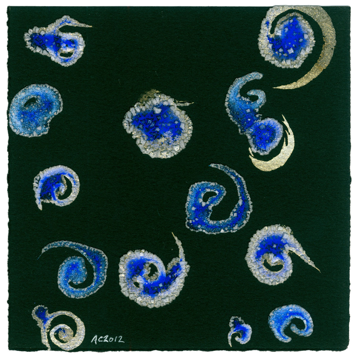
Spiral Splash, abstract art by Amy Crook, $299
This is another of those pieces that looks different from every angle. From the three dimensional salt to to the iridescent paint, it catches the light and the eye differently depending on how you look at it.
In this case I painted in the swishy, splashy gold spirals, and then added the blue-infused salt water in a bit of controlled chaos. Then I repeated the experiment with blue spirals, so some of the shapes are rimed in cold blue while others are edged in gilt.
Spiral Splash, watercolor and salt on paper, $299 framed, with free shipping.

Spiral Splash, detail 1, by Amy Crook
You can really see the difference in the blue and gold paints in the shot above, with the cold, grainy blue making the left side look like it’s frosted over, while the shining gold on the left adds a rich warmth to the shape on the right. Below, I took a photo of the whole thing from the top down. I especially like the progression of color in the shape in the lower right, the way you can really see that the blue paint settled into the center of each shape while the gold floated to the edges.

Spiral Splash, detail 2, by Amy Crook
Categories: Abstract and Just Plain Weird, Daily Art
Tags: black paper, blue, for sale, gold, iridescent, salt, watercolor
Event Horizons: Black, Blacker, Blackest
Monday, March 19th, 2012

Event Horizons: Black, Blacker, Blackest watercolor triptych by Amy Crook
I entered this triptych in the juried art auction for IMSA25, the 25th anniversary for my old high school. They wanted art with a theme of energy and innovation, and the connection of these mini black holes was enough to get in, thankfully.
I actually only had the first piece done, the white one, when I decided to enter them into the show. The idea to make them into a triptych came later, and I really think the framing on their grey backing paper was the final piece that the work needed to come together. The salt pools in all three pieces are infused with fountain pen ink, and then I used the pen to draw a circle around each pool, a little event horizon between the pool and the black halo around it.
Interestingly, the black paper absorbed the Lunar Black paint too well for it to really granulate like it does on the other two pieces, and the paint is just slightly blacker than the paper itself, which provides an interesting contrast to the other two parts of the series. The whole thing makes me think of atoms or micro black holes, something tiny and mysterious that can’t normally be seen with the naked eye.
Event Horizons: Black, Blacker, Blackest, 3-5″x7″ mixed media on paper, nfs (available at the auction only).
I’ve got one detail shot from each piece for you, anyway, just because I think they’re beautiful.

Event Horizons 1: Black, detail, by Amy Crook

Event Horizons 2: Blacker, detail, by Amy Crook

Event Horizons 3: Blackest, detail, by Amy Crook
This is my first juried show in nearly 20 years, so I was extremely nervous about entering, and very excited to get in! I just thought you should know that. Heh.
Categories: Abstract and Just Plain Weird, Daily Art
Tags: art auction, black paper, pen and ink, salt, triptych, watercolor
Tentacle Deeps 29
Tuesday, March 13th, 2012

Tentacle Deeps 29, watercolor by Amy Crook
Unlike last week’s tentacles, these, you can have if you want to. Yes, Tuesday is upon us once again and this time I used the opaque Japanese watercolors on black paper to create a wonderful bright green background with an intriguing squamous texture. I used black paint to put in the tentacles, letting it re-wet the green and mix in, giving the whole thing a monochromatic, layered feeling. I’ve been trying to get back to doing the fading layers of tentacles, dark at first with lighter and more transparent ones fading off into the distance, though I do love some of the ones I’ve done with a single layer, as well. Basically, I just like tentacles. I know, you’re shocked.
I’ve been flipping through some of the last year or so’s worth of art, and it’s interesting to see how the tentacles started out in one specific style and then evolved into something else. Revisiting those older pieces, I’ve been revisiting some of the original ideas, like having the wash only take up a portion of the page instead of running edge to edge.
Tentacle Deeps 29, 5″x7″ watercolor on paper.

Tentacle Deeps 29, detail, by Amy Crook
Above is your usual close-up of the reaching tentacles. Maybe one of these days I’ll take a photo of them reaching toward the camera, instead, just for variety. Below is the usual picture in the usual frame. Who ever thought there’d be “the usual tentacles” in your life?

Tentacle Deeps 29, framed art by Amy Crook
Categories: Angels, Cthulhu, and Other Myths, Daily Art, Series and Books, Tentacles
Tags: black paper, for sale, green, tentacle deeps, tentacles, watercolor
Violet Way
Monday, March 12th, 2012
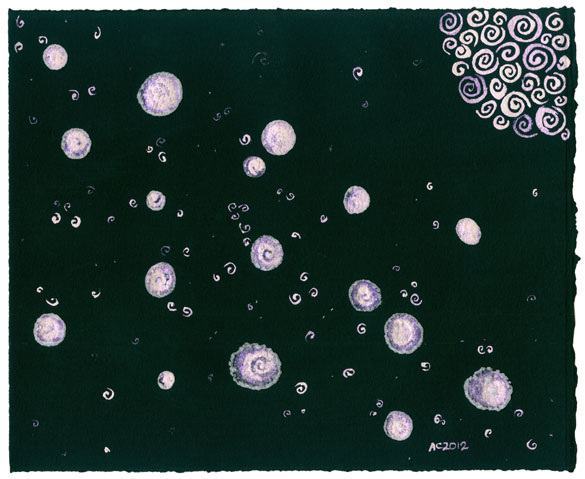
Violet Way, abstract art by Amy Crook
This is a larger piece like Golden Moon, done with the same black paper. This time I used a pearlescent violet paint and created a swath of larger stars, then filled in with smaller, salt-free spirals to give a feeling of clustered stars, like looking up at the Milky Way. This paint looks white from some angles and a lovely pale violet from others; the scanner picks up the violets pretty well, so for once I think the colors are pretty accurate.
Violet Way, 10″x8″ iridescent Japanese watercolor and salt on Arches cover black paper.
Like most of my salt paintings, this one started in the spirit of experimentation. I just bought some new watercolors from Japantown (along with ALL the pens), and I wanted to see how they’d work with the salt. techniques. I made a special effort to mix extra paint into the water droplets after they were on the paper, and you can see how it looked while I was working on it below.
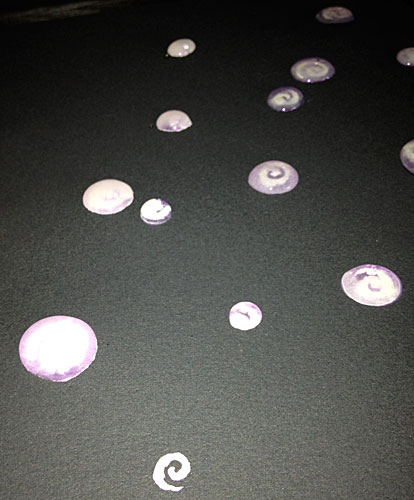
Violet Way, work in progress, detail 1, by Amy Crook
You can see one freshly-painted spiral at the bottom, and then the water droplet just above that and to the left is opaque with swirled paint. It settled out after a while, as you can see in the droplets further away, but the salt pools have a definite coating of iridescent paint you can see in the next photo.

Violet Way, work in progress, detail 2, by Amy Crook
Below you can see a more oblique shot of one tiny detail in the finished piece, one single pool of salt surrounded by the little echoing spirals. I really love the way you can see each individual salt crystal, especially if you click through to the larger version of the image.
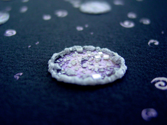
Violet Way, detail, by Amy Crook
I’ve also made a computer wallpaper, should you like to splash my artificial stars across your computer screen. Finally, you can see it in its frame below, attempting to turn itself into a mirror. Glass reflects, who knew?
Violet Way, framed art by Amy Crook
Categories: Daily Art, Flowers, Trees and Landscapes, Free Wallpapers
Tags: black paper, iridescent, moon, nfs, salt, spirals, violet
Positive Space
Friday, March 9th, 2012
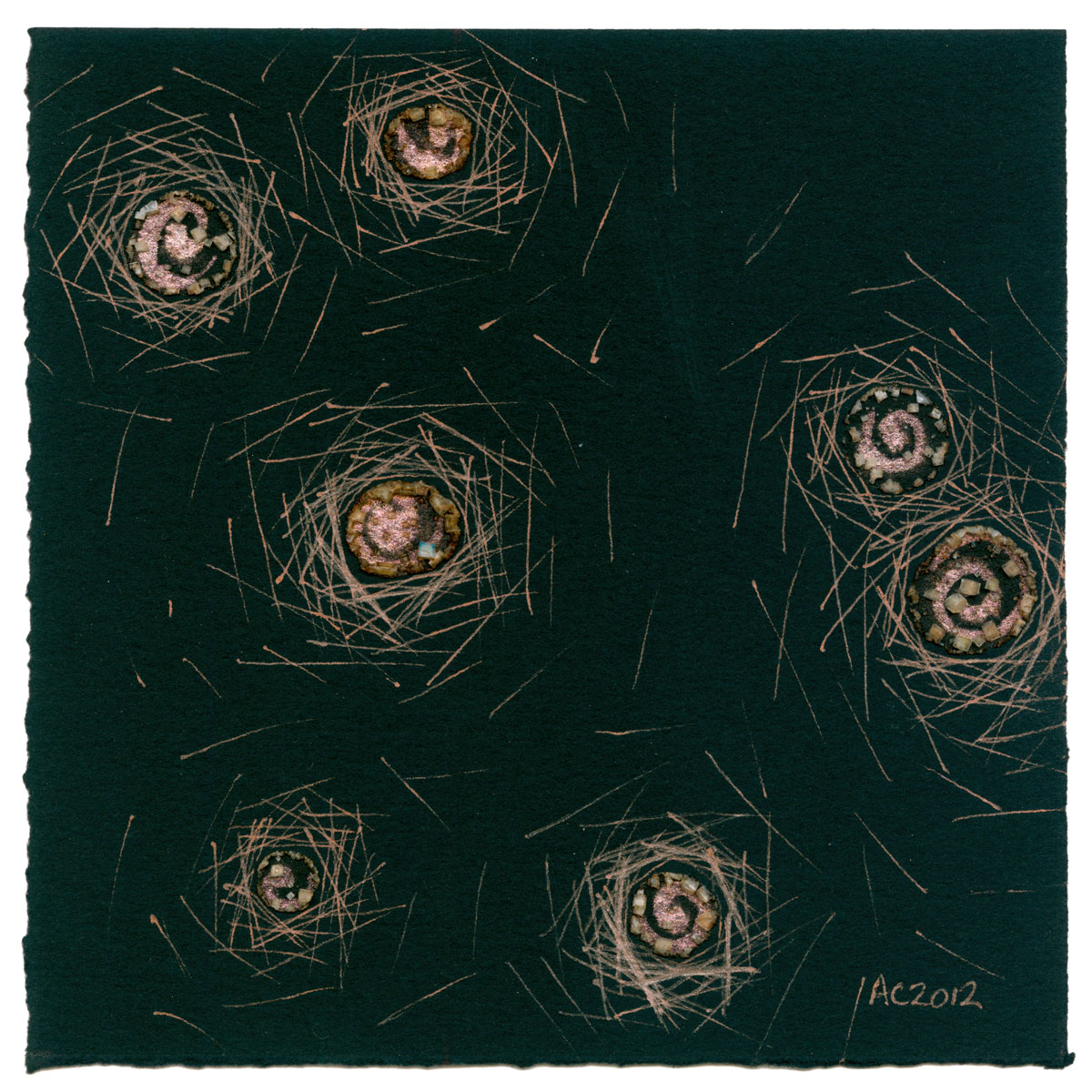
Positive Space, abstract art by Amy Crook, $333
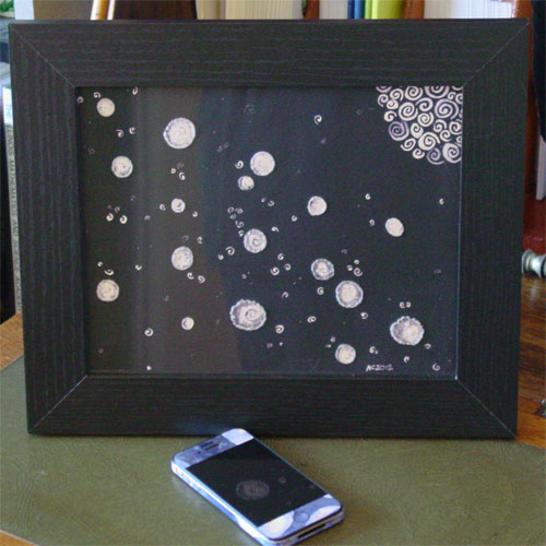
The inverse (and slightly smaller) companion to yesterday’s piece, Positive Space uses coppery paint and copper-colored glitter gel pen on black paper to create a halo of light around the spiral “stars.” I had actually created the salt pools on this one at the same time I did Monday’s Moonglow. I have two little pots of iridescent paint I got as samples, and I tend to use them on pieces at the same time, though rarely the same piece.
I liked the effect of Negative Space so much, however, that I took this work in progress and used the same technique to make a not-quite-mirror image. I like that they’re not exactly the same — the halos on this one tend to be bigger and scatter wider, and of course they’re different sizes. A bit like last week’s Spirals Trio, thematically linked but not matchy-matchy.
Positive Space, 5″x5″ mixed media on paper, $333 framed, with free shipping.
Randomly, if you ever get frustrated with the term “mixed media,” just check out the tags at the bottom of the post. I try to list all the media I’ve mixed down there.

Positive Space, detail, by Amy Crook
The sunlight reflects beautifully off the copper-toned salt, ink and paint in the detail photo, above. Below, you can see the painting with my iPhone for scale. To see it beside its friend, check out yesterday’s post.

Positive Space, framed art by Amy Crook
Categories: Abstract and Just Plain Weird, Daily Art, Series and Books
Tags: black paper, copper, for sale, glitter gel pen, iridescent, salt, that space pair, watercolor
Moonglow
Monday, March 5th, 2012
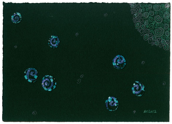
Moonglow by Amy Crook
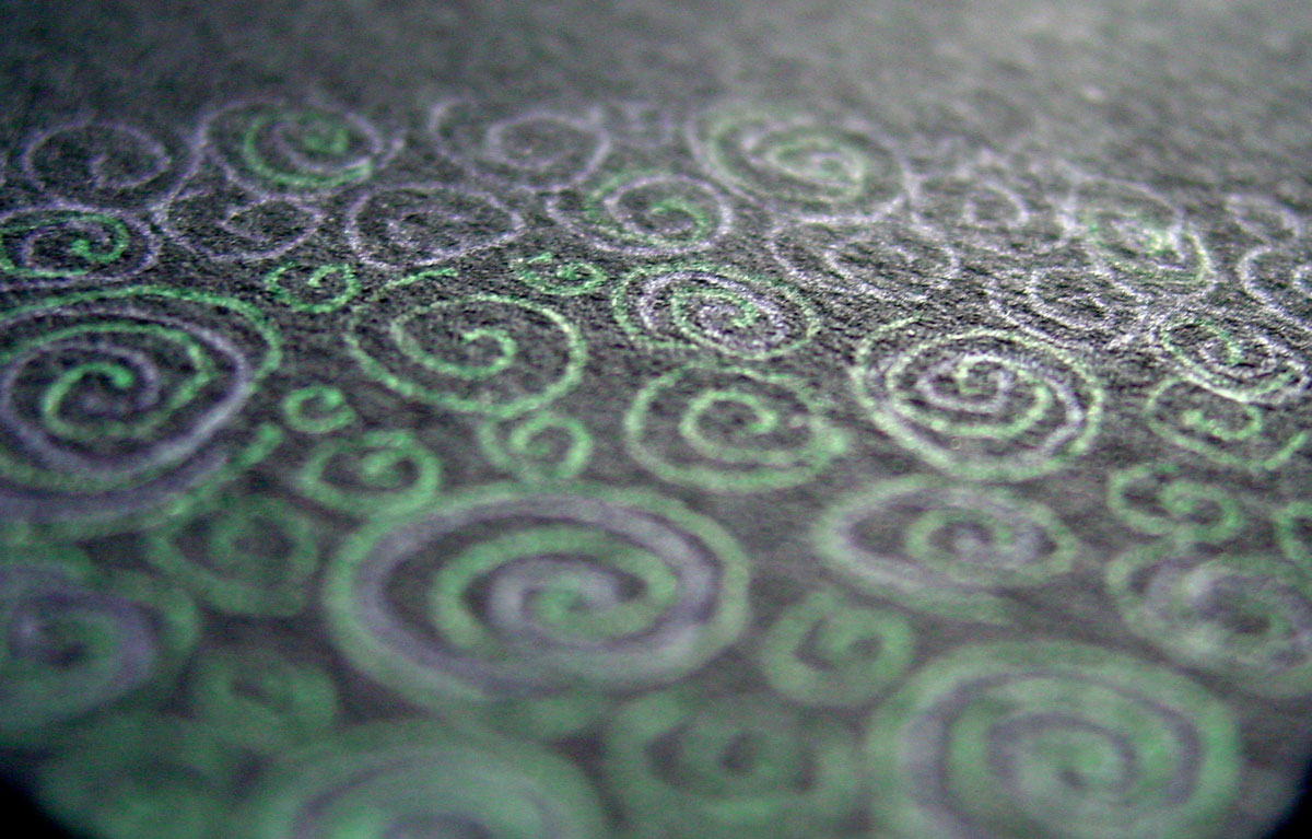
Sparkly green and purples sit suspended in deep, rich black. For some reason it reminded me of one of my favorite oil paint colors, even though it’s not at all the same shade of purple, but I still named the piece Moonglow after the paint.
The watercolor paint I used in the salt pools separated, with the green pigment all going into the salt and leaving the sparkly violet swirls attached to the paper for a very nifty effect. I carried it through with purple and green glitter gel pen, adding smaller spiral stars and drawing in the eerie, barely-there moon.
I’ve totally embraced my sparkly side, too, and bought more glittery pens in Japantown as well as some pearlescent paints. Expect to see more shiny!
Moonglow, 7″x5″ iridescent watercolor, salt and glitter gel pen on Arches cover black paper.
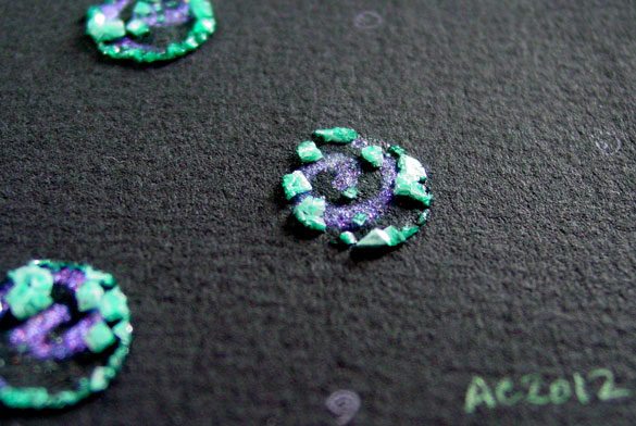
Moonglow, detail 1, by Amy Crook
The first detail photo, above, totally exaggerates the separation of the paint, the sunlight making the salt practically glow while the purple spirals catch the light. The second one, below, shows the play of green and purple gel pen in the moon. Spirals!
Moonglow, detail 2, by Amy Crook
Categories: Daily Art, Flowers, Trees and Landscapes, Series and Books
Tags: black paper, for sale, glitter gel pen, green, iridescent, moon, salt, violet, watercolor
1 Comment »
Golden Moon
Monday, February 27th, 2012
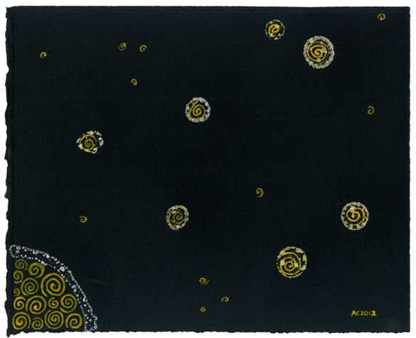
Golden Moon, watercolor and salt painting by Amy Crook
Two of my favorite pieces at the Endgame show have been bought, so I took this one and Violet Midnight 2 over there to replace the sold pieces on the wall. Then I realized I’m so far behind in posting that I hadn’t even shown it to you guys here on the site, oops.
I used a gorgeous golden yellow paint to make these spirals, and then added the salt while they were still wet. You can really see how the salt around the “stars” is yellower than the white aura I added to the moon later, sans paint. I like this one because it makes me think of moonrise, of looking up into the sky with the low, yellow moon hanging just off to one side of your vision, rather than taking over the whole show.
It’s bigger than my usual, too, 10″x8″ instead of the smaller size, which gives room for the smaller, saltless star-spirals that I put into the background. The piece is really simple but it’s got a lot of depth for me because it took several sessions to paint all the details, and spent at least two days just growing salt crystals. Each of these salt pieces is part art and part experiment for me, so when I’m working on them I tend to think a lot about the technical aspects and let the aesthetics work themselves out almost meditatively in the spacing, size and color choices.
Golden Moon, 10″x8″ salt and watercolor on Arches cover black paper.

Golden Moon, detail 1, by Amy Crook
Above you can really see how much whiter the salt is without the paint adulterating it. I love the way this shot came out enough I even made you guys a wallpaper of it. And by you I mean me, of course. Below, I’ve zoomed in on just one pair of stars, so you can see how sparkly and three-dimensional they really are. I actually find it pretty funny that I’ve started making a lot of art that shimmers, glitters and sparkles, since in my real life I’m the least-sparkly person you’ll meet with my unchanging jewelry and boring black t-shirts.
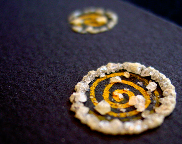
Golden Moon, detail 2, by Amy Crook
And finally, you can see it in a frame! The shot’s a little dark, but that’s because black paper behind glass is basically a mirror, also known as a huge pain in my butt to photograph.

Golden Moon, framed art by Amy Crook
Categories: Daily Art, Flowers, Trees and Landscapes, Free Wallpapers, Series and Books
Tags: black paper, for sale, moon, salt, spirals, stars, watercolor, yellow
1 Comment »
« Or Head Back That Way
 More Art This Way »