Posts Tagged ‘orange’
Halloween Trees
Friday, October 10th, 2014
I suppose I should think of something to call this series of paintings so I can make a tag for it, with the spooky winter trees against the various skies. These trees are so finely detailed it’s almost like lace against the brilliant orange sunset sky. I have to deliberately work against my desire to make things very regular and symmetrical, to put in broken branches and bare spots just like real trees.
Five black crows fly off into the sunset, riding the cool autumn winds. Everything about this piece feels like October, from the orange and black color scheme to the bare trees and exiting birds.
Next time, I’ll have to sneak in some extra bats, though.
Halloween Trees, 8″x4″ pen & ink and watercolor on Fluid watercolor paper.

Halloween Trees, detail, by Amy Crook
Above, I’ve zoomed in on the fine lacework of branches, and a few crows flying into the intensely orange sunset. Below, you can see the piece in a temporary frame, waiting to go to its new home.
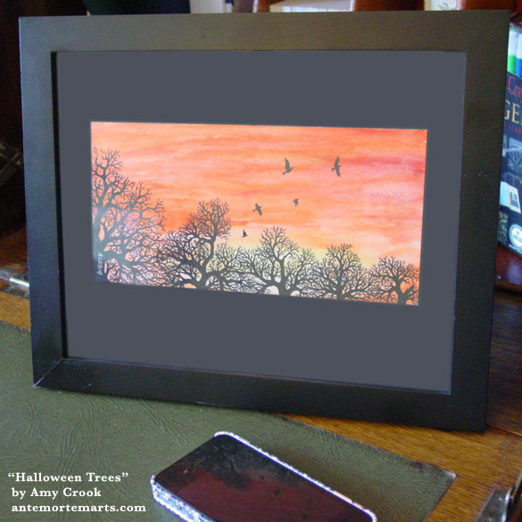
Halloween Trees, framed art by Amy Crook
Categories: Floating Gallery, Flowers, Trees and Landscapes, Sea Creatures and Other Animals, Series and Books, Things I'm a Fan Of, Whimsical and Strange
Tags: crow, halloween trees, horizons, nfs, orange, pen and ink, sold, tree, watercolor
Fairytale Sky 8
Monday, January 13th, 2014
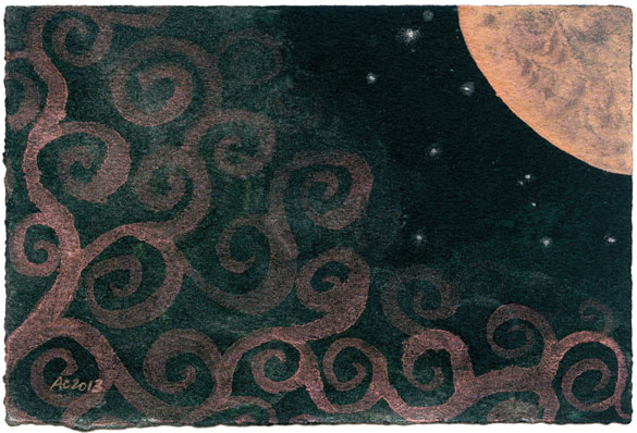
Fairytale Sky 8 by Amy Crook
It’s the last day of the Floating Gallery, and I’m rounding up a week of art with another Fairytale Sky.
I used a different palette this time, a rich orange harvest moon that lights up the mist below in swirls of the same color. There’s a soft silvery green shimmer in and around those orange spirals, and a few little silver stars manage to peek out above the thick fog.
Everything about this painting is better in person, of course, from the shimmer of paint that changes color when the light hits to the soft texture of the black paper.
Fairytale Sky 8, 6″x4″ duochrome watercolor and Japanese watercolor on Arches cover black paper.
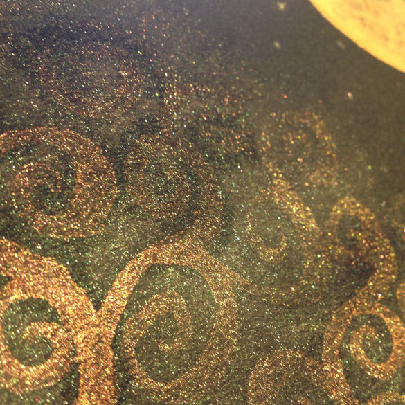
Fairytale Sky 8, detail, by Amy Crook
Above, you can see the mist lit up with golden sparkles by the last rays of a sunset. Below, you can see the painting in a frame, with the phone that took the picture above. It’s quite a small piece, and could go on a desk, cubicle wall, or tucked into an odd corner of architecture to bring a smile whenever you glance into that little hidden place.
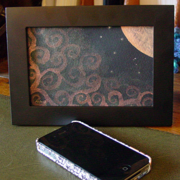
Fairytale Sky 8, framed art by Amy Crook
Categories: Floating Gallery, Flowers, Trees and Landscapes, Series and Books, Whimsical and Strange
Tags: black paper, duochrome, fairytale sky, for sale, iridescent, japanese watercolor, moon, orange, spirals, watercolor
Exit Strategy
Friday, December 6th, 2013
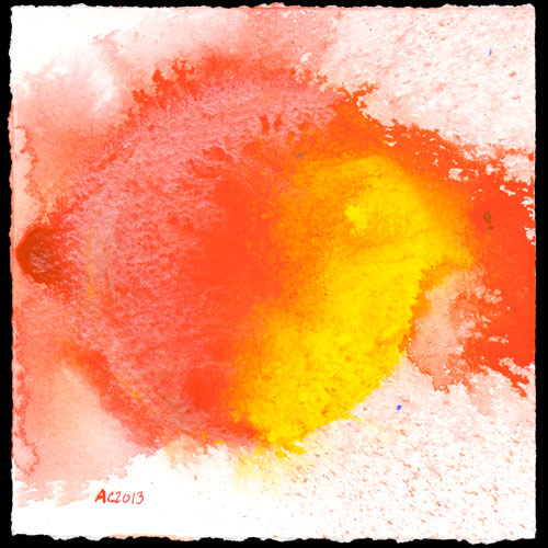
Exit Strategy, abstract watercolor by Amy Crook
Go out of the week with a bang! This image is like a brilliant sun with vibrant, rich colours and shimmering Duochrome Autumn Mystery forming licks of fire and spattering explosions. Like a bullet through an apple, there’s and entry and a bigger, messier exit.
This explosive piece of art could brighten up a corner of your home with its mix of rich matte Japanese paints and the shimmering red-orange-gold of the duochrome paint, but only until Sunday when the Floating Gallery closes up shop once again.
Exit Strategy, 5″x5″ Japanese and duochrome watercolor on watercolor paper.
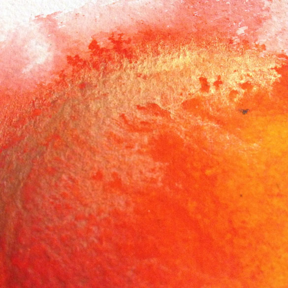
Exit Strategy, detail, by Amy Crook
Above you can see the shiny paint catching the light and turning from red to gold. Below, you can see it in a frame, small enough to tuck into a little corner or fit on a desk, adding a bit of vibrant interest.
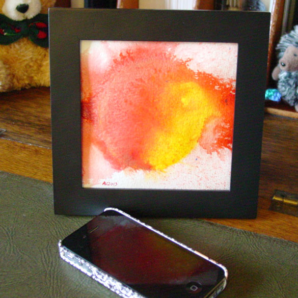
Exit Strategy, framed art by Amy Crook
Categories: Abstract and Just Plain Weird, Floating Gallery
Tags: duochrome, for sale, orange, watercolor, yellow
1 Comment »
Goldfish
Tuesday, May 28th, 2013
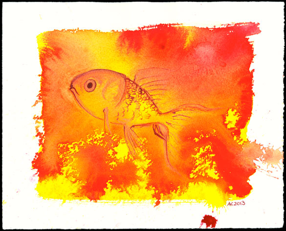
Goldfish, watercolor by Amy Crook
Last Thursday I finally got around to tearing some big sheets of paper I had into smaller, more Amy-sized sheets. Then I just had to play with the results, so I asked a friend to pick a color, and she said gold.
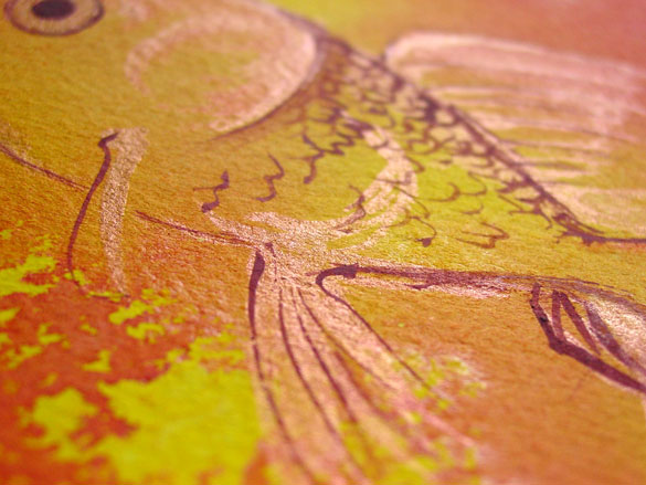
After a bit of playing and a bit of waiting, I ended up with this very bright red-orange-yellow background. Then I flipped it over, and found a fish in the shapes. I used a dark red and my lovely duochrome orange-gold paint to bring out the shape of this little guy, just a few strokes of paint to make a fishy.
Goldfish, 10″x8″ Japanese watercolor and duochrome watercolor on Arches cover white paper.
Goldfish, detail, by Amy Crook
Above, you can see the shine of the paint I used to put some of the gold in the goldfish. Below, the piece is sitting in a frame, and you can see how vibrant the colors really are.

Goldfish, framed art by Amy Crook
Categories: Daily Art, Sea Creatures and Other Animals, Series and Books
Tags: duochrome, fish, for sale, orange, portfolio, watercolor
2 Comments »
Hellfire
Friday, November 9th, 2012
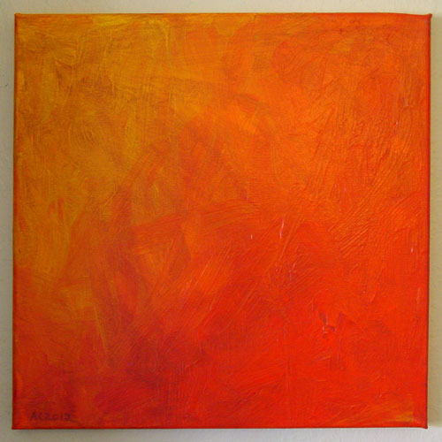
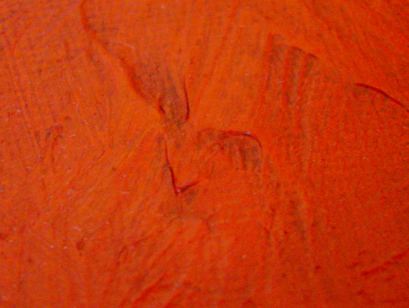
Oranges and reds are some of the hardest colors to reproduce really well in Photoshop, alas. This piece has a great, intense bright orange that lightens up to golden-yellow in one corner, and holds a secret little demon-face in the other that scowls at you from out of the flame, or perhaps is made from it. The texture is enhanced with a bit of brown in the low spots, and the little face got a tiny bit of extra love to pull it out of the background using Copic markers.
Hellfire, 12″x12″ acrylic paint and Copic marker on canvas.
Hellfire, detail, by Amy Crook
Above, you can see the scowly little demon-face glaring up at you from the canvas. Below, I stepped back and got a photo of it with some of the stuff on my desk, including pens, pencils, and a Jack in the Box Christmas antenna ball, because I am a very special sort of artist.

Hellfire by Amy Crook
Categories: Angels, Cthulhu, and Other Myths, Daily Art
Tags: acrylic paint, canvas, copic marker, for sale, orange
O is for Origami
Thursday, November 8th, 2012

O is for Origami, calligraphic illumination by Amy Crook
I believe this pattern is actually for an origami fried egg, when done with yellow paper and the colors reversed, but I wanted a big, bold shape for my O. The four corners created little points when folded back, so I actually drew the gold pattern on the entire 3″x3″ square background and then glued just the points on the back of the O down. The O floats above the background serenely, and it has to be framed with no glass in order to make room.
This was the first non-flat letter I made, though there’s a few more coming, including the ampersand (&). I’m nearly done with the series, half a dozen letters to go, so if you are curious about one we haven’t seen yet (perhaps for a holiday gift!), just drop me a line and I’ll give you a sneak preview.
O is for Origami, 5″x5″ Origami paper, watercolor and glitter gel pen on paper.

O is for Origami, detail, by Amy Crook
Above, you can see the way the origami floats on its background, letting the gold glow beneath it as it sits serenely above, the whole thing surrounded by a simple red border. Below, M is for Majuscule and Miniscule is hanging out with my O to make OM!

O is for Origami and M is for Majuscule & Miniscule, framed art by Amy Crook
Categories: Daily Art, Illuminated Alphabet, Series and Books, Whimsical and Strange
Tags: alphabet, calligraphy, for sale, glitter gel pen, gold, illumination, orange, origami, watercolor
Tentacle Reach
Tuesday, June 26th, 2012
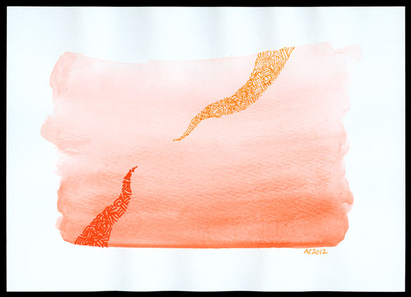
One of the colors I have in my flower-shaped Japanese watercolor palette is a vivid, almost fluorescent orange that makes a surprisingly subtle wash. I started doing another Tentacle Deeps with the red pen on the orange wash, but i liked the reaching-out gesture of the first crosshatched tentacle so much I decided to do something a little different.
I grabbed my Apricot fountain pen and brought another tentacle down from above, the two of them not quite touching as they try to cross the distance. The result echoes a lot of iconic images without actually copying any of them.
Also, there’s spirals.
Tentacle Reach, 7″x5″ pen & ink and watercolor on paper.
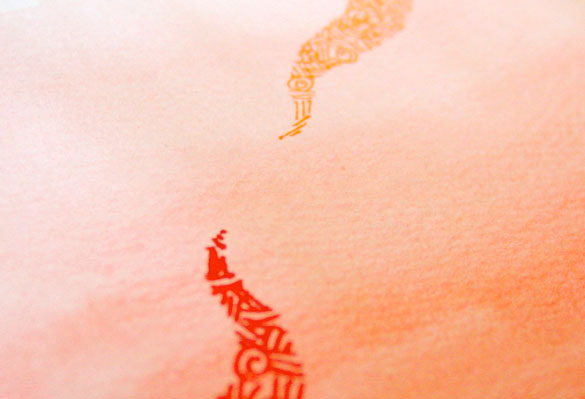
Above, you can see a close-up of the crosshatched tentacles and the aching space between them. The red pen has a fatter nib, and its ink tended to bleed more where the paint wash was denser, which gives the orange tentacle a more ethereal feel by comparison. Below, you can see them tucked in a frame, hanging out with my jellyfish phone for scale.
Categories: Angels, Cthulhu, and Other Myths, Daily Art, Tentacles
Tags: crosshatching, for sale, orange, pen and ink, tentacles, watercolor
« Or Head Back That Way
 More Art This Way »

