Posts Tagged ‘red’
R is for Retro
Thursday, December 6th, 2012
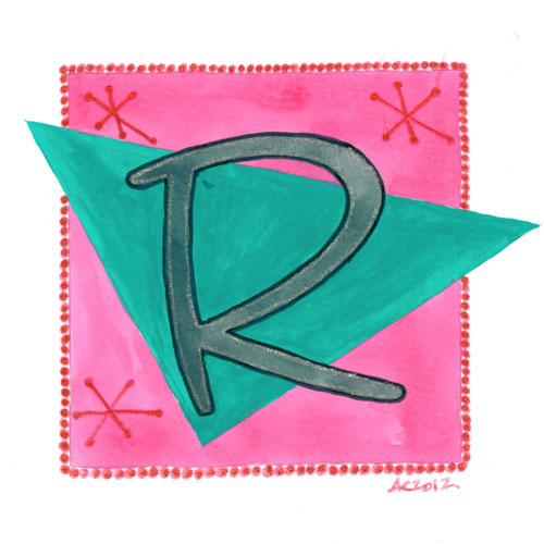
R is for Retro, calligraphic illumination by Amy Crook
Do you know a Renee or Robert who loves retro design? This R has a bit of sparkle, a bit of old-school charm, and a lot of pink and teal. The grey R is outlined in black and silver, and the red border and designs are also done in shiny glitter. I’m almost done with my alphabet, too, so if you’ve been waiting on T or V, they’ll be up soon!
R is for Retro, 5″x5″ Japanese watercolor and glitter gel pen on paper.
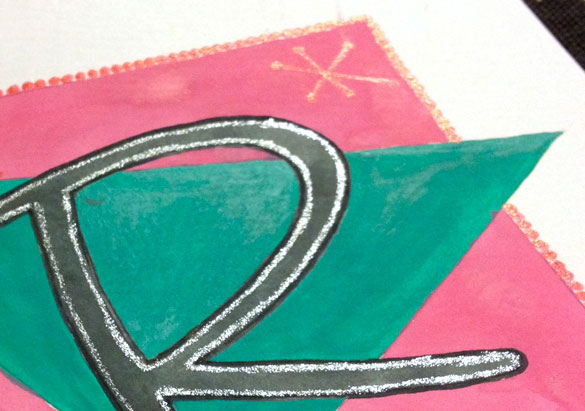
R is for Retro, detail, by Amy Crook
Above, you can see the shine of glitter on both borders, highlighting the rich, opaque pink and teal. Below, the R is hanging out with a few sneak peeks to spell STAR.

S, T, A & R, calligraphic illuminations by Amy Crook
Categories: Daily Art, Illuminated Alphabet, Series and Books, Whimsical and Strange
Tags: alphabet, calligraphy, for sale, glitter gel pen, illumination, pen and ink, pink, purple, red, silver, teal
P is for Pattern and Primary
Thursday, November 15th, 2012
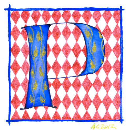
P is for Pattern & Primary, calligraphic illumination by Amy Crook
And now for something completely different! Comic to resume tomorrow, never fear. And remember, you can always see the whole series so far (in order from A) at the alphabet tag.
This came out a bit patriotic as well, though mostly I wanted the red-and-white harlequin background to contrast well with the bright, primary blue of the letter. Gold glitter gel pen adds the yellow for all three primary colors, and since the red is glitter pen as well, the whole thing has a lovely sparkle. Perfect for a Patricia or Peter.
P is for Pattern & Primary, 5″x5″ Japanese watercolor, pen & pink and glitter gel pen on paper.
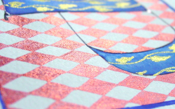
P is for Pattern & Primary, detail, by Amy Crook
Above, you can see the sun shining off the red diamond and gold vine patterns. Below, the P is hanging out all by itself in its frame.

P is for Pattern & Primary, framed art by Amy Crook
Categories: Daily Art, Illuminated Alphabet, Series and Books, Whimsical and Strange
Tags: alphabet, blue, calligraphy, for sale, glitter gel pen, gold, illumination, pen and ink, red, watercolor
N is for Negative Space
Thursday, November 1st, 2012
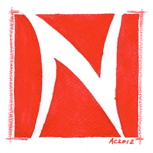
N is for Negative Space, calligraphic illumination by Amy Crook
The texture on this one is really subtle; with the red watercolor a very dense and intense tone, the red glitter gel pen nearly vanishes unless it’s at the right angle. I really enjoy the big red shark-fin shape at the bottom, and the deceptive simplicity of this particular letter. Perfect for a Nelson or Natalie or Norbert!
N is for Negative Space, 5″x5″ watercolor stick and glitter gel pen on paper.
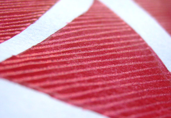
N is for Negative Space, detail, by Amy Crook
Above, you can see the shining glitter catching the sunlight, giving the whole image a bit of a bluish tint to it. Below, the N is hanging out with next week’s O to spell out every toddler’s favorite word – NO.
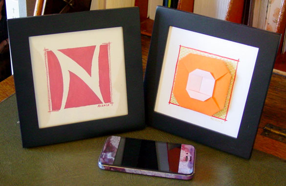
N is for Negative Space & O is for Origami, framed art by Amy Crook
Categories: Daily Art, Illuminated Alphabet, Series and Books, Whimsical and Strange
Tags: alphabet, calligraphy, for sale, glitter gel pen, illumination, pen and ink, red, watercolor
Bordello Red Bookmark
Sunday, October 28th, 2012
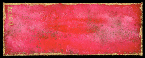
Bordello Red Bookmark by Amy Crook
Despite being red and gold, this bookmark reminds me more of some aging, velvet-and-cheap-gilt bordello than Gryffindor House. There’s a plethora of subtle texture on this one, from the wash of red-on-red to the fine layer of crystallized salt, the copper metallic paint powder mixed into the salt and the brighter gold border.
Bordello Red Bookmark, 1.875″ x 4.875″ salt and watercolor on paper.
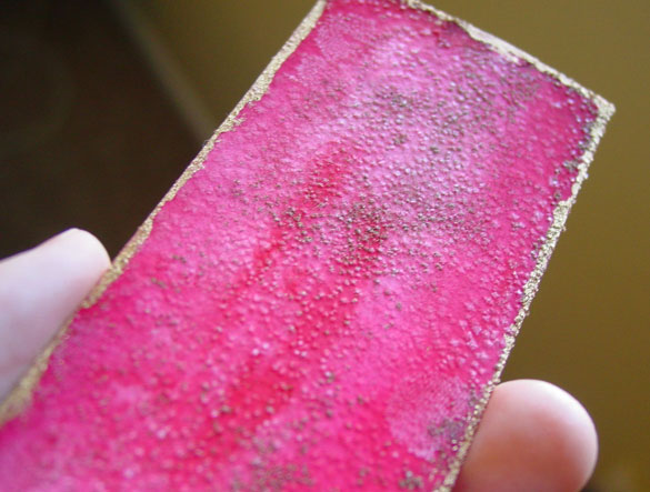
Bordello Red Bookmark, detail, by Amy Crook
Above, you can see the sparkle in the rain, and the odd spot where I made a little fingerprint in the paint that then grew its own salt-crystal relief. Below, the bookmark is resting against my blue-violet book, waiting for a chance at a new life.
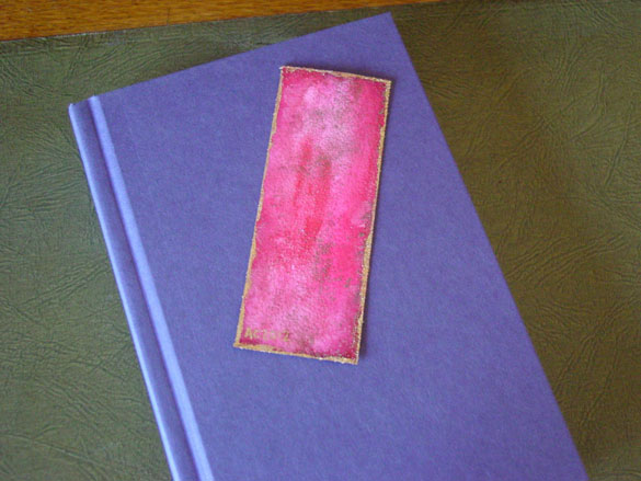
Bordello Red Bookmark, with book, by Amy Crook
(book for size reference only)
Categories: Abstract and Just Plain Weird, Daily Art, Series and Books
Tags: bookmark, buy a bookmark, for sale, gold, iridescent, red, salt, watercolor
G is for Gothic
Thursday, August 30th, 2012
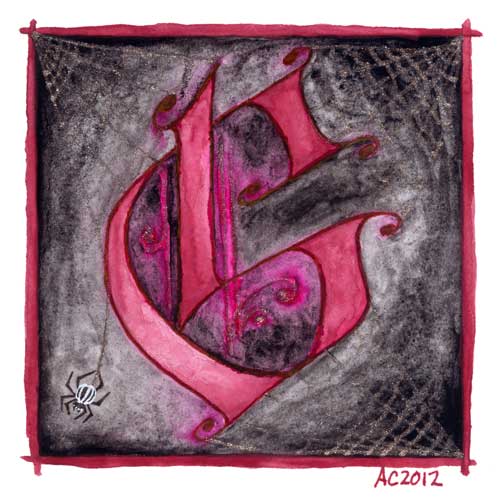
G is for Gothic, calligraphic illumination by Amy Crook
I have to admit, I went for the pun a bit here, combining the Gothic capital with my own Goth sensibilities. The silver spiderwebs are half-seen until they catch the light, and the burgundy G floats in murky gloom, hanging out with the stripey little spider responsible for its extra decoration.
G is for Gothic, 5″x5″ pen & ink, Japanese watercolor, and glitter gel pen on paper.

G is for Gothic, detail, by Amy Crook
Above, you can see the silver details shining in the bright summer sunlight. Goths in hot weather, anyone? Below, it’s hanging out on a little shelf with the C and my collection of Endless pewter figurines.

G is for Gothic & C is for Counter, framed art by Amy Crook
Categories: Daily Art, Illuminated Alphabet, Series and Books, Whimsical and Strange
Tags: alphabet, black, calligraphy, for sale, glitter gel pen, goth, illumination, pen and ink, red, silver, spiderweb, watercolor
4 Comments »
Filigree Planet 3
Friday, July 20th, 2012

Filigree Planet 3 by Amy Crook
I used the same rich fuchsia on the stars here as I did on the central part of Monday’s painting, and they make the glittery filigree on the planet look very orange by comparison. The underlying planet is a mix of reds, pinks and oranges, with texture added by salt. Strangely, the crystals on the planet itself grew very flat and dark this time, with almost no shine to them, so I decided to add in the filigree to keep the planet from being outshone by its surrounding field of stars.
Filigree Planet 3, 7″x5″ salt, Japanese watercolor and glitter gel pen on Arches cover black paper.

Filigree Planet 3, detail 1, by Amy Crook
Above, you can see the shine of the red glitter, and some of the underlying texture on the planet as well. Below, you can see a close-up of three of the tiny pink salt pools in all their fucshia glory. Pink (the color, not the rock star) and I have a strange relationship, since I usually loathe it, but I’m finding it’s got its uses in moderation.
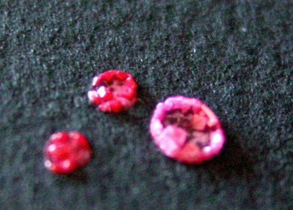
Filigree Planet 3, detail 2, by Amy Crook
Finally, you can see the piece tucked neatly into a frame. There’s no glass here, but it will ship to you fully protected and ready to hang. I just really hate trying to get the glare out of my photos.
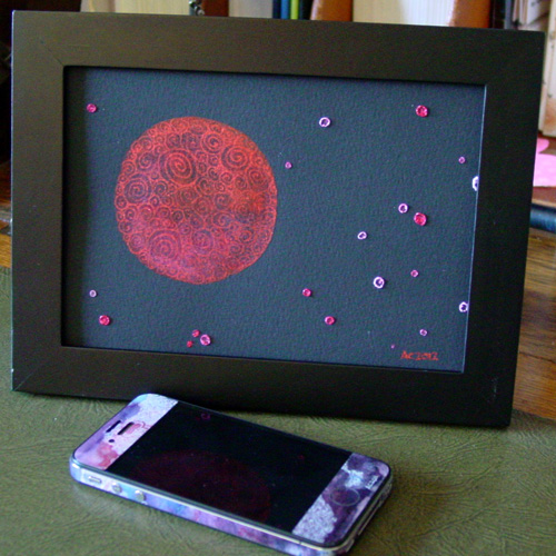
Filigree Planet, framed art by Amy Crook
Categories: Daily Art, Flowers, Trees and Landscapes, Series and Books
Tags: black paper, filigree, for sale, glitter gel pen, pink, planet, red, spirals, watercolor
« Or Head Back That Way
 More Art This Way »

