Posts Tagged ‘gold’
P is for Pattern and Primary
Thursday, November 15th, 2012
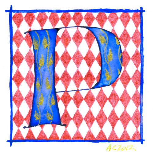
P is for Pattern & Primary, calligraphic illumination by Amy Crook
And now for something completely different! Comic to resume tomorrow, never fear. And remember, you can always see the whole series so far (in order from A) at the alphabet tag.
This came out a bit patriotic as well, though mostly I wanted the red-and-white harlequin background to contrast well with the bright, primary blue of the letter. Gold glitter gel pen adds the yellow for all three primary colors, and since the red is glitter pen as well, the whole thing has a lovely sparkle. Perfect for a Patricia or Peter.
P is for Pattern & Primary, 5″x5″ Japanese watercolor, pen & pink and glitter gel pen on paper.
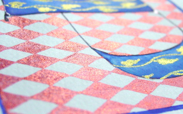
P is for Pattern & Primary, detail, by Amy Crook
Above, you can see the sun shining off the red diamond and gold vine patterns. Below, the P is hanging out all by itself in its frame.

P is for Pattern & Primary, framed art by Amy Crook
Categories: Daily Art, Illuminated Alphabet, Series and Books, Whimsical and Strange
Tags: alphabet, blue, calligraphy, for sale, glitter gel pen, gold, illumination, pen and ink, red, watercolor
O is for Origami
Thursday, November 8th, 2012

O is for Origami, calligraphic illumination by Amy Crook
I believe this pattern is actually for an origami fried egg, when done with yellow paper and the colors reversed, but I wanted a big, bold shape for my O. The four corners created little points when folded back, so I actually drew the gold pattern on the entire 3″x3″ square background and then glued just the points on the back of the O down. The O floats above the background serenely, and it has to be framed with no glass in order to make room.
This was the first non-flat letter I made, though there’s a few more coming, including the ampersand (&). I’m nearly done with the series, half a dozen letters to go, so if you are curious about one we haven’t seen yet (perhaps for a holiday gift!), just drop me a line and I’ll give you a sneak preview.
O is for Origami, 5″x5″ Origami paper, watercolor and glitter gel pen on paper.

O is for Origami, detail, by Amy Crook
Above, you can see the way the origami floats on its background, letting the gold glow beneath it as it sits serenely above, the whole thing surrounded by a simple red border. Below, M is for Majuscule and Miniscule is hanging out with my O to make OM!

O is for Origami and M is for Majuscule & Miniscule, framed art by Amy Crook
Categories: Daily Art, Illuminated Alphabet, Series and Books, Whimsical and Strange
Tags: alphabet, calligraphy, for sale, glitter gel pen, gold, illumination, orange, origami, watercolor
Bordello Red Bookmark
Sunday, October 28th, 2012
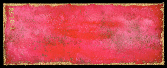
Bordello Red Bookmark by Amy Crook
Despite being red and gold, this bookmark reminds me more of some aging, velvet-and-cheap-gilt bordello than Gryffindor House. There’s a plethora of subtle texture on this one, from the wash of red-on-red to the fine layer of crystallized salt, the copper metallic paint powder mixed into the salt and the brighter gold border.
Bordello Red Bookmark, 1.875″ x 4.875″ salt and watercolor on paper.
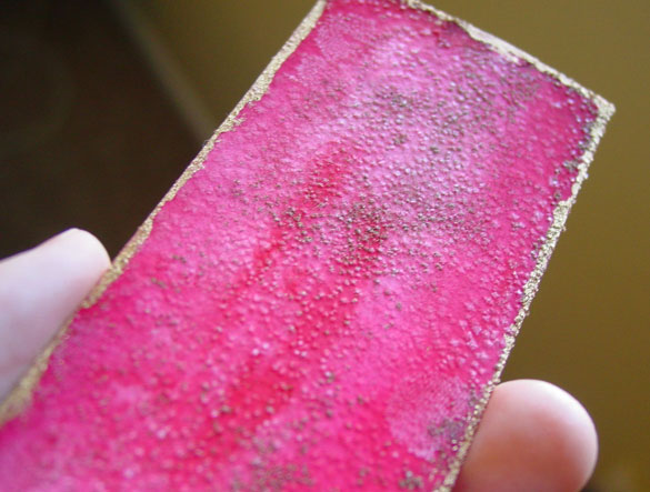
Bordello Red Bookmark, detail, by Amy Crook
Above, you can see the sparkle in the rain, and the odd spot where I made a little fingerprint in the paint that then grew its own salt-crystal relief. Below, the bookmark is resting against my blue-violet book, waiting for a chance at a new life.
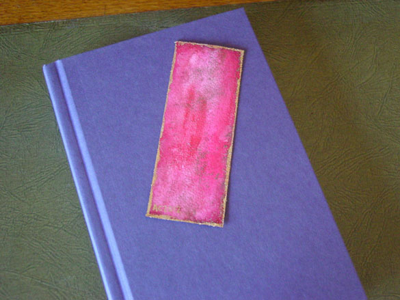
Bordello Red Bookmark, with book, by Amy Crook
(book for size reference only)
Categories: Abstract and Just Plain Weird, Daily Art, Series and Books
Tags: bookmark, buy a bookmark, for sale, gold, iridescent, red, salt, watercolor
L is for Layers
Thursday, October 11th, 2012
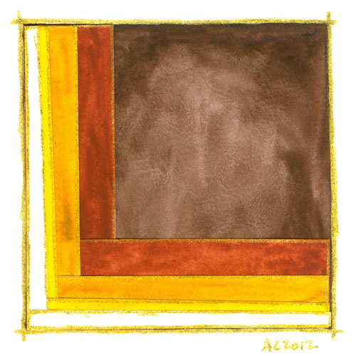
L is for Layers, calligraphic illumination by Amy Crook
One of the things I love about this series is the physicality of it, the way the glitter encourages the viewer to try to catch the light, to pick the piece up and move it around. In this one, I went a step farther and added a physical dimension to it by building up layers of cut and painted paper. The gold at the edges helps each layer stand out, even more than just the cascading autumnal colors.
L is for Layers, 5″x5″ Japanese watercolor and glitter gel pen on collaged paper.
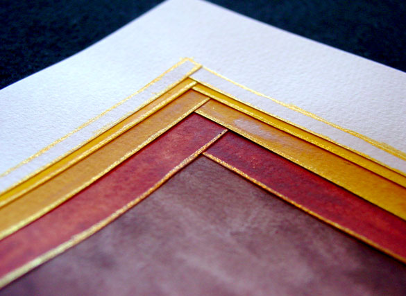
L is for Layers, detail, by Amy Crook
Above you can see a close-up of the overlapping corners, the glued paper growing tall as it builds layer upon layer. Below, the L is hanging out with a preview of the N in my little writing desk.
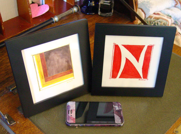
L is for Layers and N is for Negative Space, framed art by Amy Crook
Categories: Daily Art, Illuminated Alphabet, Series and Books, Whimsical and Strange
Tags: alphabet, brown, calligraphy, for sale, glitter gel pen, gold, illumination, watercolor
The Stars Are Right 4
Friday, September 21st, 2012
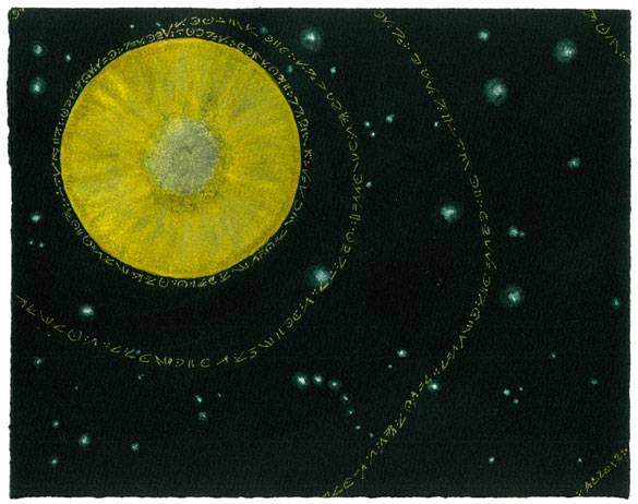
The Stars Are Right 4 by Amy Crook
A baleful yellow planted like a great eye stares out from the cold depths of space, sending golden chanting out into the void in a mysterious ancient language. The surrounding stars are a shimmery green, adding to the surreal feeling of the piece. This piece would a nice touch of eerie Lovecraftian horror to any office or home. Well, for certain values of nice, anyway.
The Stars Are Right 4, 10″x8″ Japanese watercolor and glitter gel pen on Arches cover black paper.
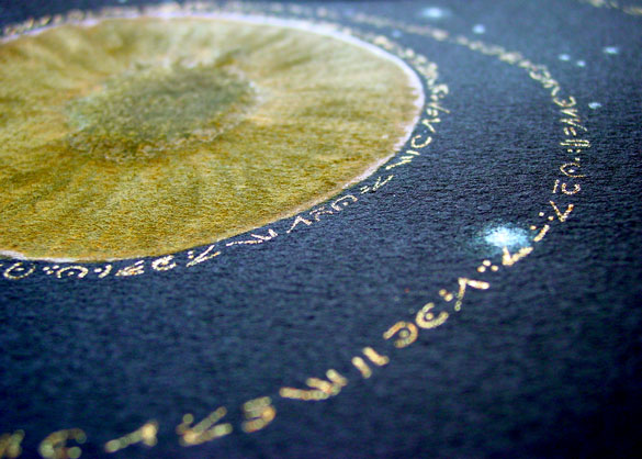
The Stars Are Right 4, detail, by Amy Crook
Above you can see the shiny gold glitter “lettering” and iridescent green starnext to the eye-like yellow planet. Below, I’ve put it in a frame and let it loom over my comparatively wee iPhone for your visual reference.
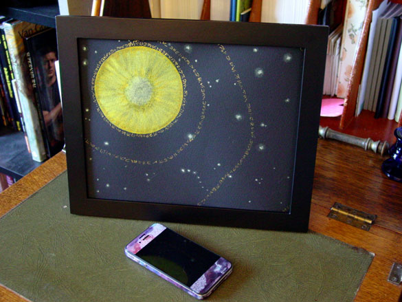
The Stars Are Right 4, framed art by Amy Crook
Categories: Angels, Cthulhu, and Other Myths, Daily Art, Flowers, Trees and Landscapes, Series and Books, Things I'm a Fan Of
Tags: black paper, cthulhu, for sale, glitter gel pen, gold, japanese watercolor, planet, stars, stars are right
H is for Heraldry
Thursday, September 6th, 2012
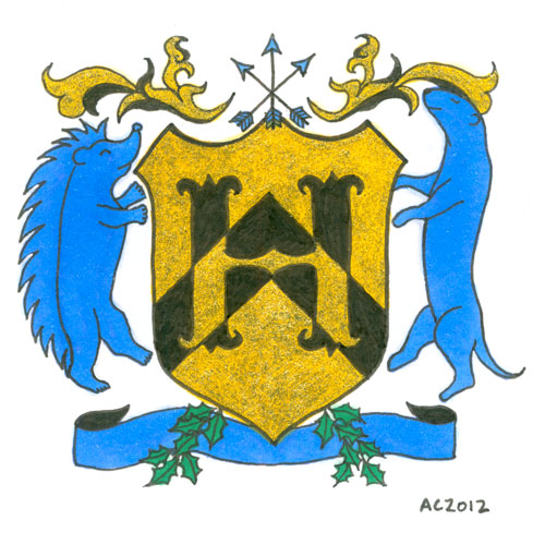
H is for Heraldry, calligraphic illumination by Amy Crook
I have to admit, when deciding on the colors and symbols for this letter with the help of Google, I also enlisted certain fannish friends. That’s how I ended up with Hedgehog Rampant and Otter Rampant as the creatures, making the H secret fan art on top of everything else.
The symbology of the elements of this particular shield are, at least according to Google and artistic intention (which I’m given to understand the latter is more important, anyway):
- Gold/Yellow (Or): generosity
- Blue (Azure): strength, loyalty
- Black (Sable): constancy, grief
- Chevron on the shield: protection, faithful service
- Otter: one who lives life to the fullest
- Hedgehog: provident provider
- Arrows: military readiness
- Holly: truth
H is for Heraldry, 5″x5″ mixed media on paper, nfs (sold). If you’d like an H of your own, you can find out how to commission one here.
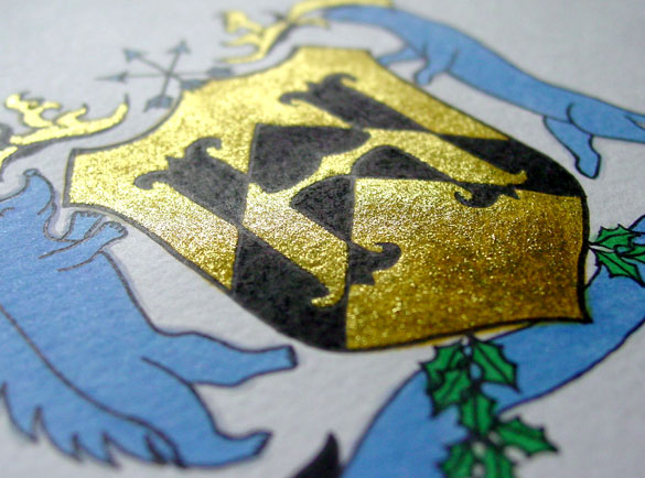
H is for Heraldry, detail, by Amy Crook
Although the glitter looks a bit anemic in the scan, when it catches the light it’s really a lovely bright gold with a nice layer of golden yellow beneath it to add richness. Below, you can see how it looks framed and hanging out on my bookshelf with a little sneak preview of next week’s letter. (HI!)
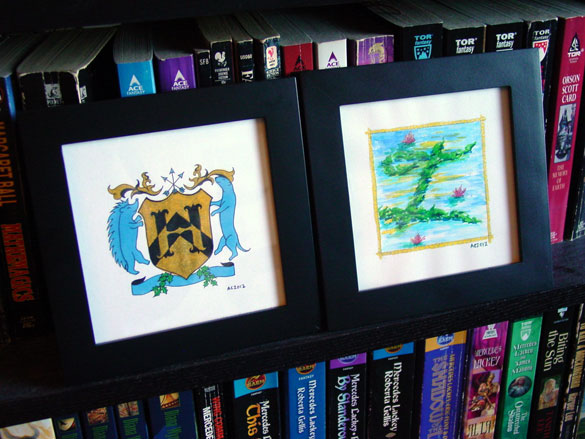
H is for Heraldry & I is for Impressionism, framed art by Amy Crook
Categories: Daily Art, Illuminated Alphabet, Series and Books, Things I'm a Fan Of, Whimsical and Strange
Tags: alphabet, black, blue, calligraphy, copic marker, glitter gel pen, gold, heraldry, illumination, nfs, pen and ink, sherlock, sherlock holmes, sold
2 Comments »
E is for Emboss
Thursday, August 9th, 2012

E is for Emboss, calligraphic illumination by Amy Crook
I did so much measuring and line-drawing for my E I decided to leave in the pencil lines as a sort of underpainting, a decorative structure underlying the letter. Though it’s hard to see in the scan, the whole square is embossed, with gold coloring the embossed edges as well as providing the decoration on an otherwise plain capital. The two greens remind me of marble or malachite, but the gold filigree design really elevates the whole thing to the realm of beauty.
E is for Emboss, 5″x5″ pencil, pen & ink, Japanese watercolor and glitter gel pen on paper.

E is for Emboss, detail, by Amy Crook
Above, you can see the raised edges and shining gold both on the edge itself and in the filigree decoration. Below, I’ve put the piece in a frame with B is for Blackletter. It spells BE! Yes, I’m a dork. You knew that.
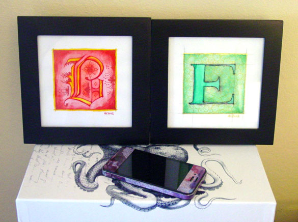
B is for Blackletter & E is for Emboss, framed art by Amy Crook
Categories: Daily Art, Illuminated Alphabet, Series and Books, Whimsical and Strange
Tags: alphabet, calligraphy, for sale, glitter gel pen, gold, green, illumination, pen and ink, pencil, watercolor
1 Comment »
« Or Head Back That Way
 More Art This Way »


