Archive for the ‘Series and Books’ Category
Tentacle Deeps 39
Tuesday, July 24th, 2012

Tentacle Deeps 39 by Amy Crook
Golden sunlight filters into the murky deeps, while iridescent, ghostly green tentacles slither upward, reaching for the surface. The tentacles nearly vanish from some angles, but they’re bright as gilt when they catch the light, in a cool, shining green.
Tentacle Deeps 39, 6″x6″ Japanese watercolor and iridescent watercolor on Fluid watercolor paper with pen & ink signature.

Tentacle Deeps 39, detail, by Amy Crook
Above, you can see the light shining off the tentacles against the velvety green-black of the background. Below, you can see it temporarily tucked into an 8″x10″ frame, waiting its final destination.
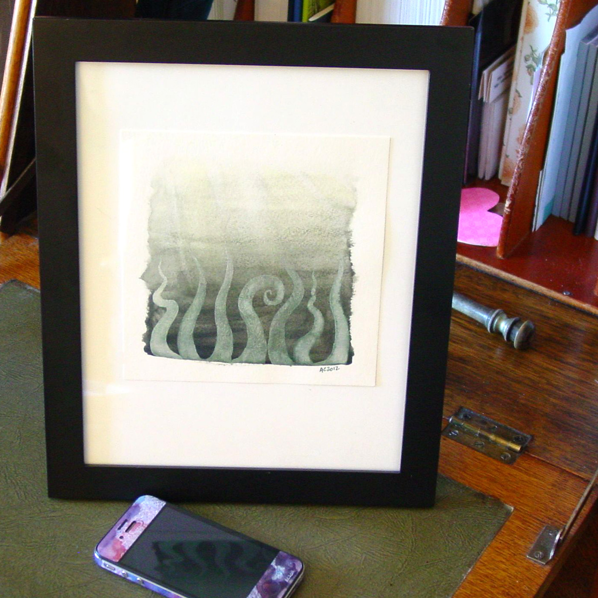
Tentacle Deeps 39, framed art by Amy Crook
Categories: Angels, Cthulhu, and Other Myths, Daily Art, Series and Books, Tentacles
Tags: for sale, green, iridescent, tentacle deeps, tentacles, watercolor
Sherlock Quote Cards
Saturday, July 21st, 2012
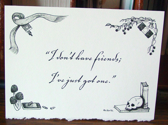
Sherlock BBC quote cards with art by Amy Crook
I’ve decided to do a new little line of Sherlock cards at my Etsy shop, which I hope you’re thrilled about, heh. I drew four painstakingly crosshatched corner designs, and then put together a card with one of my favorite quotes from the series. I’ve chosen one quote from each episode, making a total of six cards, which you can to buy in threes (by series, of course) or as a set of six.
Starting clockwise from the upper left, I’ve drawn Sherlock’s much-beloved scarf, curled around a pack of cigarettes which bear a skull and crossbones to indicate poison, or maybe pirates. Then there’s his ubiquitous magnifier, the design fudged a bit to make it more resemble an eye in its own right. It’s surrounded by deadly nightshade, a nod to Sherlock’s profession (and my cat, Belladonna). Down in the lower left, there’s also amanita mushrooms, which are quite poisonous indeed. A mysterious iPhone that might be pink were it not in black and white rests with two large, speckled pills and one shiny bullet. The last set, in the lower right, is Sherlock’s beloved skull (well, I say friend…), along with three books of mysterious origin, though I imagine the biggest one is the volume of fairy tales Sherlock found at a certain crime scene.
The quote above is from my favorite episode of Series 2, not perhaps the best objectively but the most fun by far, The Hounds of Baskerville. I love how Gatiss shifted the plurality from the original title (The Hound of the Baskervilles) and gave it a whole new, equally sinister meaning. I’m using the Sherlock page on Wikiquotes to get the phrasing right, so all mistakes in canon are totally theirs, wot.
Sherlock Quote Cards, 7″x5″ pen and ink on paper, original nfs. But feel free to buy the cards at my Etsy shop!
Categories: Daily Art, Series and Books, Things I'm a Fan Of, Zombies, Skulls, and Other Morbid Things
Tags: cards, crosshatching, etsy, greeting card, nfs, pen and ink, sherlock
Filigree Planet 3
Friday, July 20th, 2012

Filigree Planet 3 by Amy Crook
I used the same rich fuchsia on the stars here as I did on the central part of Monday’s painting, and they make the glittery filigree on the planet look very orange by comparison. The underlying planet is a mix of reds, pinks and oranges, with texture added by salt. Strangely, the crystals on the planet itself grew very flat and dark this time, with almost no shine to them, so I decided to add in the filigree to keep the planet from being outshone by its surrounding field of stars.
Filigree Planet 3, 7″x5″ salt, Japanese watercolor and glitter gel pen on Arches cover black paper.

Filigree Planet 3, detail 1, by Amy Crook
Above, you can see the shine of the red glitter, and some of the underlying texture on the planet as well. Below, you can see a close-up of three of the tiny pink salt pools in all their fucshia glory. Pink (the color, not the rock star) and I have a strange relationship, since I usually loathe it, but I’m finding it’s got its uses in moderation.
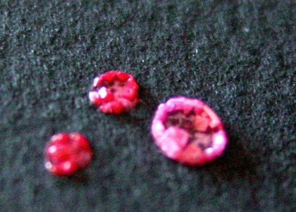
Filigree Planet 3, detail 2, by Amy Crook
Finally, you can see the piece tucked neatly into a frame. There’s no glass here, but it will ship to you fully protected and ready to hang. I just really hate trying to get the glare out of my photos.
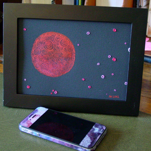
Filigree Planet, framed art by Amy Crook
Categories: Daily Art, Flowers, Trees and Landscapes, Series and Books
Tags: black paper, filigree, for sale, glitter gel pen, pink, planet, red, spirals, watercolor
B is for Blackletter
Thursday, July 19th, 2012
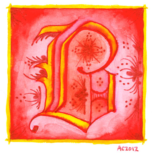
B is for Blackletter, calligraphic illumination by Amy Crook
I went Gryffindor with my second letter, bold red and rich yellow, though I chose the red glitter pen rather than gold for my second illumination. My B uses a classic blackletter face, heavy and Germanic, with a bit of whimsy thrown into the illumination for it.
Just as with the A, I let the ink bleed into the paint so the shapes of the letter have a lovely orange fade, and though I used a very bright, pure red on the background, I used a dark red-orange inside the B itself to better offset the glitter illumination.
B is for Blackletter, 5″x5″ pen & ink, Japanese watercolor, and glitter gel pen on paper.
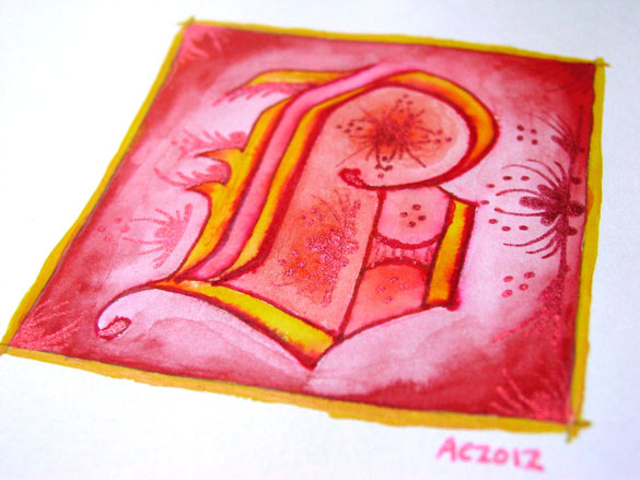
B is for Blackletter, detail, by Amy Crook
The shine on the red glitter is much more subtle and harder to photograph, especially since it goes a bit pink when the light hits it, so the colors in the above detail photo are a bit off in general. Alas. Below, you can see it happily tucked into a frame with my phone to show you the relative size. The central box on these is 3 inches square, but the border and signature rest outside.
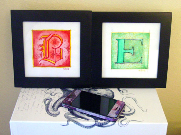
B is for Blackletter & E is for Emboss, framed art by Amy Crook
Categories: Daily Art, Illuminated Alphabet, Series and Books, Whimsical and Strange
Tags: alphabet, calligraphy, for sale, glitter gel pen, gold, illumination, pen and ink, red, watercolor
1 Comment »
Giant Rats 16: Don’t You See?
Saturday, July 14th, 2012

“Do you see, John?” – a Sherlock comic by Amy Crook
For a few months now I’ve been contemplating the idea of doing a larger work with the Gorey-style shading, taking Sherlock and his Watson on an adventure that I could later put into a short book or something. Apparently, the first step on that path wasn’t deciding on a story or doing thumbnails, but instead drawing a random panel that might or might not fit in the middle, with a cute little one-shot joke.
If I do actually get far enough into the project it seems like it’ll finish (never a guarantee, heh), then I’ll want the originals to be Kickstarter incentives for printing a run of little books, I think, so this one won’t be for sale just yet.
“Don’t you see, John?” Sherlock comic, 7″x5″ pen and ink on paper.

Sherlock comic, framed, by Amy Crook
These are the smaller size from my B is for Baker Street series, the art itself is 5″x3″ on the 7″x5″ paper, whereas the original four character drawings are 7″x5″ including the text, on a larger 8.5″x5.5″ sheet of paper. These are much easier to frame, and easier to finish as well with significantly fewer square inches of white space to be crosshatched in masochistic detail.
So, what do you think? Would you want a little Sherlock book, perhaps The Giant Rats of Sumatra?
Categories: Daily Art, People, Figures and Faces, Series and Books, Things I'm a Fan Of
Tags: black and white, crosshatching, giant rats of sumatra, gorey, john watson, pen and ink, sherlock, sherlock bbc, sherlock holmes
6 Comments »
Binary Green
Friday, July 13th, 2012
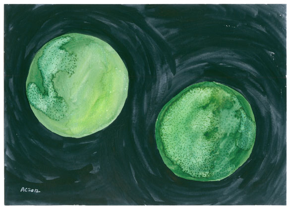
Binary Green by Amy Crook
Two green planets orbit each other in a mysterious, swirly blue-black sky. This binary system has continents dotted with sparkling salt crystals, perhaps the cities of some alien race.
I have three flower-shaped ceramic palettes of Japanese watercolors. One is earth tones, reds and oranges. One is blues, purples and a nice solid black. The last one is greens and yellows and a matte blue-black that you can see making the swirly night above. I had my water brushes out the other night with the green palette, and this piece was one of the results, along with the tentacles from Tuesday. (There’s also a pair of bookmarks no one will see until I get to 7 and declare another Bookmark Week.)
I really like the effect I’m getting with judicious use of the saturated salt solution, dripping it onto damp watercolor and making mysterious geographies as the two interact. I think I’ll take my planets to Endgame this month and give the skies a rest, so look out for that post as well.
Binary Green, 7″x5″ Japanese watercolor and salt on paper.
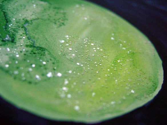
Binary Green, detail 1, by Amy Crook
Above you can see the sparkling salt on the upper left planet’s surface, where below we have the darker shapes glittering from the surface of the lower right planet.
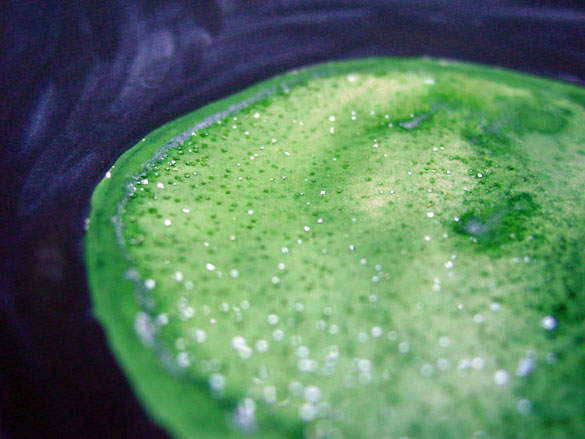
Binary Green, detail 2, by Amy Crook
And finally, I’ve put it in a frame (sans glass), so you can imagine it sitting on your desk at work, giving you dreams of distant worlds during your coffee breaks.
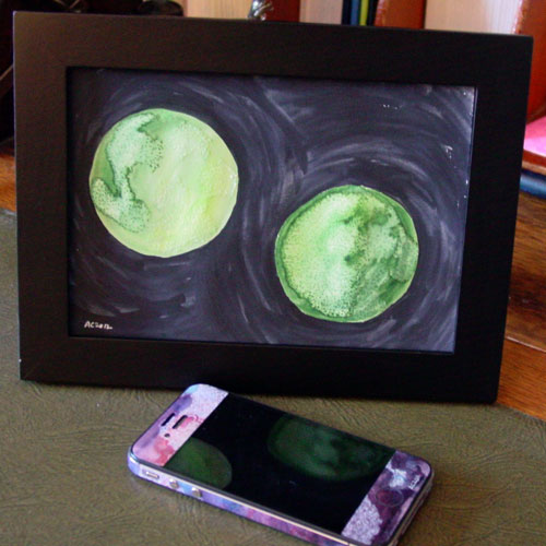
Binary Green, framed art by Amy Crook
Categories: Abstract and Just Plain Weird, Daily Art, Series and Books
Tags: balls, for sale, green, planet, salt, watercolor
A is for Arabesque
Thursday, July 12th, 2012
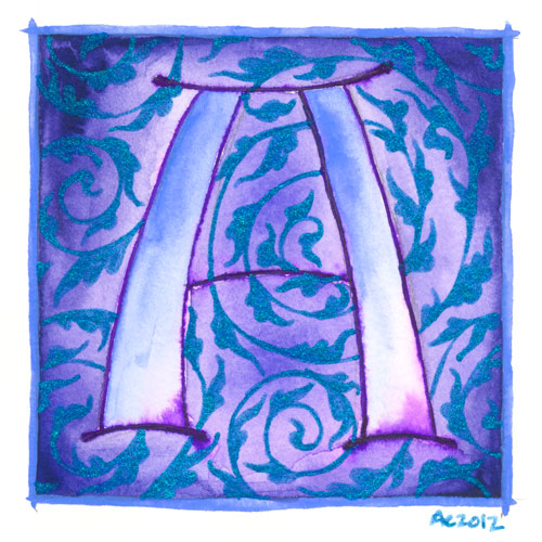
A is for Arabesque, calligraphic illumination by Amy Crook
I’ve begun a new series, though this one I can guarantee has a specifically limited lifespan. I’ve decided to do an illuminated alphabet, using pen and ink for the lines, watercolor for the fills, and glitter gel pen in lieu of gold leaf.
The first in my series is, of course, A, the awesomest letter in the alphabet. A is for Amy who fell down the stairs, after all, at least according to Gorey. A is also for arabesque, in this case referring to the graceful design motif, usually of acanthus leaves, used to decorate all sorts of things from calligraphy to mosques. My blue glittery acanthus are spiraling in the background of this grand periwinkle A. I’ve decided to do each letter with some sort of design or typographical motif represented, so let’s hope I can find something for that other end of the alphabet where things get tricksy.
B and C are already chosen, anyway.
I’m planning to post these once a week, so it will take six months for the series to be done, give or take a few weeks off for bookmarks or Sharpie art.
A is for Arabesque, 5″x5″ watercolor, pen and ink and glitter gel pen on paper.
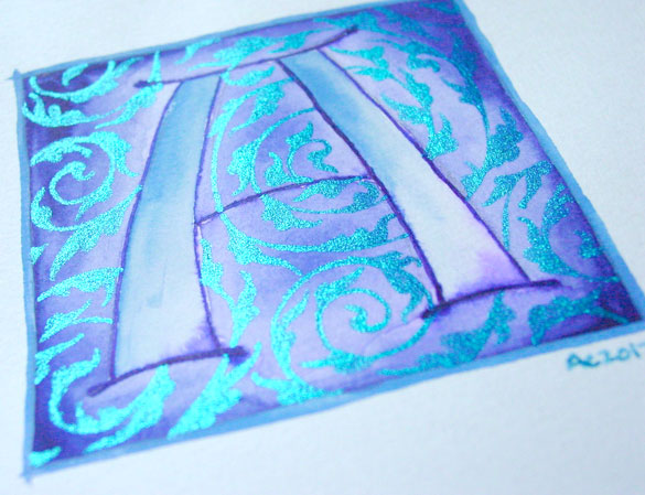
A is for Arabesque, detail, by Amy Crook
Above, you can see the sun catching the glitter and making it shine much brighter than the paper (which really is white, I swear). Below, I’ve got it tucked into a frame and hanging out with the J on the shelf with some of my many, many books.
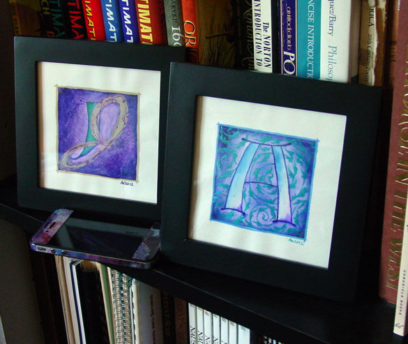
A is for Arabesque & J is for Juxtapose, framed art by Amy Crook
Categories: Daily Art, Illuminated Alphabet, Series and Books, Whimsical and Strange
Tags: alphabet, blue, calligraphy, for sale, glitter gel pen, illumination, pen and ink, periwinkle, purple, watercolor
1 Comment »
« Or Head Back That Way
 More Art This Way »