Sherlock in Grey
Posted on March 10th, 2012

Sherlock in Grey
by Amy Crook
I wanted a tall, thin piece of Sherlock art to put on my giveaway bookmarks for my Etsy shop (sometimes I slip them into the larger orders as a freebie), and nothing I already had quite fit the bill. So, I drew this guy! He’s done with one of my nifty Japanese brush pens that’s black on one side and grey on the other — I’m always using up the black and leaving a ton of grey, so sometimes pieces like this can help me use up some of the extra. I self-indulgently drew in his red buttonhole, though I’m not sure anyone but me will notice it when it’s printed out half the size.
I also used him on my Sherlock gift tags, complete with characteristic sarcasm.
Sherlock in Grey, 5.5″x8.5″ pen and ink on paper.
Categories: Daily Art, People, Figures and Faces, Series and Books, Things I'm a Fan Of
Tags: grey, pen and ink, red buttonhole, sherlock
1 Comment »
Positive Space
Posted on March 9th, 2012
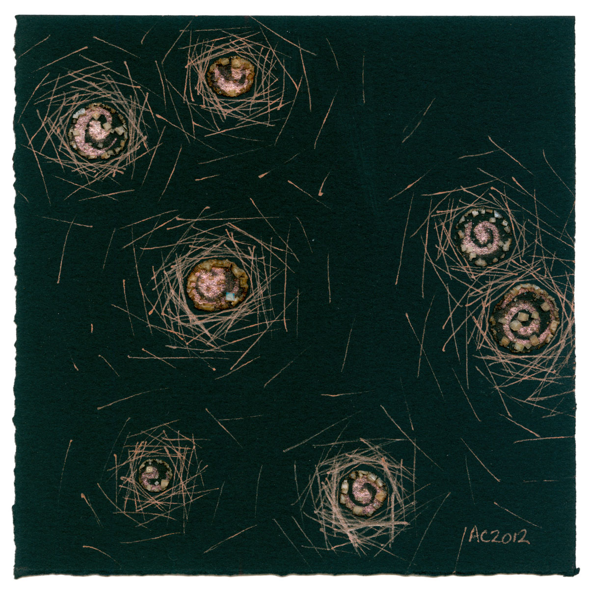
Positive Space, abstract art by Amy Crook, $333
The inverse (and slightly smaller) companion to yesterday’s piece, Positive Space uses coppery paint and copper-colored glitter gel pen on black paper to create a halo of light around the spiral “stars.” I had actually created the salt pools on this one at the same time I did Monday’s Moonglow. I have two little pots of iridescent paint I got as samples, and I tend to use them on pieces at the same time, though rarely the same piece.
I liked the effect of Negative Space so much, however, that I took this work in progress and used the same technique to make a not-quite-mirror image. I like that they’re not exactly the same — the halos on this one tend to be bigger and scatter wider, and of course they’re different sizes. A bit like last week’s Spirals Trio, thematically linked but not matchy-matchy.
Positive Space, 5″x5″ mixed media on paper, $333 framed, with free shipping.
Randomly, if you ever get frustrated with the term “mixed media,” just check out the tags at the bottom of the post. I try to list all the media I’ve mixed down there.

Positive Space, detail, by Amy Crook
The sunlight reflects beautifully off the copper-toned salt, ink and paint in the detail photo, above. Below, you can see the painting with my iPhone for scale. To see it beside its friend, check out yesterday’s post.

Positive Space, framed art by Amy Crook
Categories: Abstract and Just Plain Weird, Daily Art, Series and Books
Tags: black paper, copper, for sale, glitter gel pen, iridescent, salt, that space pair, watercolor
Negative Space
Posted on March 8th, 2012

Negative Space, abstract art by Amy Crook, $333
I was messing about with some blue paints, trying to get them to impregnate the salt crystals better (heh), and I ended up with these 9 scattered blue pools in manganese blue hue (aka not-actually-manganese blue because real manganese blue pigment will kill you). I have a glitter gel pen in a complementary color, and I just started doodling with it around one of the pools. I’d just done a piece where the lines radiated outward (that you’ll see next week, I never said I posted them in the order I made them), and so I did a different sort of radiation.
I used to use this pattern to create a halo of sunlight against a darker blue sky, so the title came from the feeling that these were dark stars floating in a white sky somehow, radiating their negative light. I liked the idea so much I made a piece with copper on black paper, which you’ll get to see tomorrow.
Negative Space, 5″x7″ mixed media on paper, $333 with free shipping.

Negative Space, detail, by Amy Crook
Above you can see a close-up of the glittery gel ink and the sparkling salt pools taken in the sunlight. Below, you can see it in its frame with tomorrow’s art. I’m thinking of switching it out for a white frame to complete the contrast, we’ll see.

Negative Space and Positive Space, framed art by Amy Crook
Categories: Abstract and Just Plain Weird, Daily Art, Series and Books
Tags: blue, for sale, glitter gel pen, salt, that space pair, watercolor
1 Comment »
Salt and Watercolor
Posted on March 7th, 2012
From Visual to Physical Texture

Tentacle Deeps 9
I’ve seen a lot of artists who explore the same idea over and over, and I never thought I’d find anything I was interested in enough to stick with myself. I was all over the map, artistically, doing everything from bronze sculpture to oil painting, acquiring new materials like some people buy shoes (you know who you are).
Well, I’ve proven myself wrong! As you’ve probably noticed, I’ve been using the salt-and-watercolor technique for going on a year now, and creating a body of contemporary artwork that I’m totally in love with. The ability to create beautiful art out of something as mundane as salt just amazes me.
Today’s Words post is the short version of How it Happened.*

Burning Planet
Lots of people use salt to create texture in watercolor or silk paintings, so I decided to teach myself how. You can see a traditional use of the technique in Tentacle Deeps 9. I sprinkled salt onto the damp watercolor paint, and the salt drew the paint to it, creating the flower-like shapes in the background and the texture on the tentacles.
I experimented with just how damp the paint needed to be to get the effect I wanted. In Burning Planet, the paint was actually too wet, and the salt partially dissolved into the paint. As it dried, the salt re-crystallized with the darker red and orange pigments trapped inside — the crystals even sparkle in the sunlight. I was fascinated.

Water Lilies 1
With Water Lilies 1, I continued to play around trying to make bigger crystals. The turquoise ink dilutes to a lovely pale blue which is sadly fugitive (the color fades in strong sunlight, and eventually the flowers will be totally white). This was the first time I tried the eyedropper technique I’ve been perfecting ever since, and I fell in love with the strange little pools of salt that formed. They’re a little fragile, but they add a 3D quality to the paintings that’s just plain cool.
I’m a big fan of entropy and randomness (except when it comes to housework, bleh), especially when I can control the parameters.

Rain Crow, detail
I always enjoy the way purple hair dye fades, first the blues and then the reds, going from deep purple to a light reddish-brown over a few months. I like board games where there’s an element of chance to throw a wrench in your strategy, like die rolls or card draws. This salt-and-watercolor technique is like that, too.
For instance, on Rain Crow I got the coolest effect where a crow-shaped tower of salt grew right up out of the crow’s eye, entirely by chance.

Jellyfish Deeps
I’ve tried a bunch of different things with it since then.
For Salted Squid 1, I made a squid-shaped puddle of salt, ink and water, which dried as an even coat of crystals rather than in the cup shape I get from the single droplets.
Something about the paper I used for Modern Snow creates gorgeous snowflakes, an effect I haven’t been able to duplicate with any other paper.
In Jellyfish Deeps, the water refused to bead up and instead made strange-shaped, shallow pools on top of the watercolor wash.

Modern Snow
I’ve even used a naturally black paper to create pieces like Moon Dark, which makes the salt crystals stand out pale and stark against the page.
I’ve also made a couple of bookmarks, and I used my Horizon Bookmark to read a book just to make sure it would stand up to the abuse.
My newest toys are iridescent paint and sparkly gel ink pens, and you’ll see them featured in all three of the painting posts this week (Monday, Thurs. & Fri.). I don’t know how long this “salt phase” will last, but I’m looking forward to finding out!
*If you’ve read the Star Trek book that’s a reference to, I love you, fellow nerd. Live long and prosper!
PS – If you click on the salt tag below, you can see every salt painting I’ve posted (as long as I remembered to tag it).
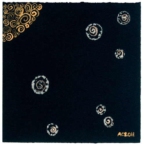
Moon Dark

Salted Squid
Categories: Daily Art, Words Words Words
Tags: how it happened, salt, technique, watercolor
Tentacle Deeps 28
Posted on March 6th, 2012

Tentacle Deeps 28 by Amy Crook
You can’t have these tentacles, they’re sold! A friend of mine came over to hang out, asked if he could peek in the Big Drawer of Art, and went home with this piece (he left a check behind, yay!).
This paper is interesting, it’s not really meant for watercolors, I don’t think. It’s very absorbent, almost too much so, and it buckles quite a bit when it’s wet. On the other hand, the interesting particulates in the paper shine through the watercolor, giving an impression of distant lights, whether stars or some underwater bioluminescence isn’t clear. I liked the effect so much I started another one in a different shade of blue.
It’s also bigger than my usual tentacles. I’ve been trying to vary my paper sizes more lately (though 5″x7″ is still the dominant size), so I tore this paper down to two 8″x10″ pieces. I guess sometimes size does matter.
Tentacle Deeps 28, 8″x10″ watercolor on paper, nfs (sold).

Tentacle Deeps 28, detail, by Amy Crook
Nifty shot of tentacles is nifty. Here, have a wallpaper. Below, you can see the tentacles in my frame with my iPhone, though my friend took the original home all naked to put in a frame he already had. Big tentacles are big!

Tentacle Deeps 28, framed art by Amy Crook
Categories: Angels, Cthulhu, and Other Myths, Daily Art, Free Wallpapers, Series and Books, Tentacles
Tags: nfs, sold, tentacle deeps, tentacles, watercolor
Moonglow
Posted on March 5th, 2012
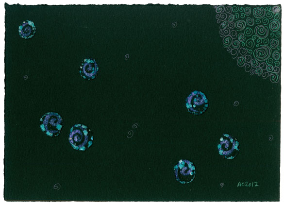
Moonglow by Amy Crook
Sparkly green and purples sit suspended in deep, rich black. For some reason it reminded me of one of my favorite oil paint colors, even though it’s not at all the same shade of purple, but I still named the piece Moonglow after the paint.
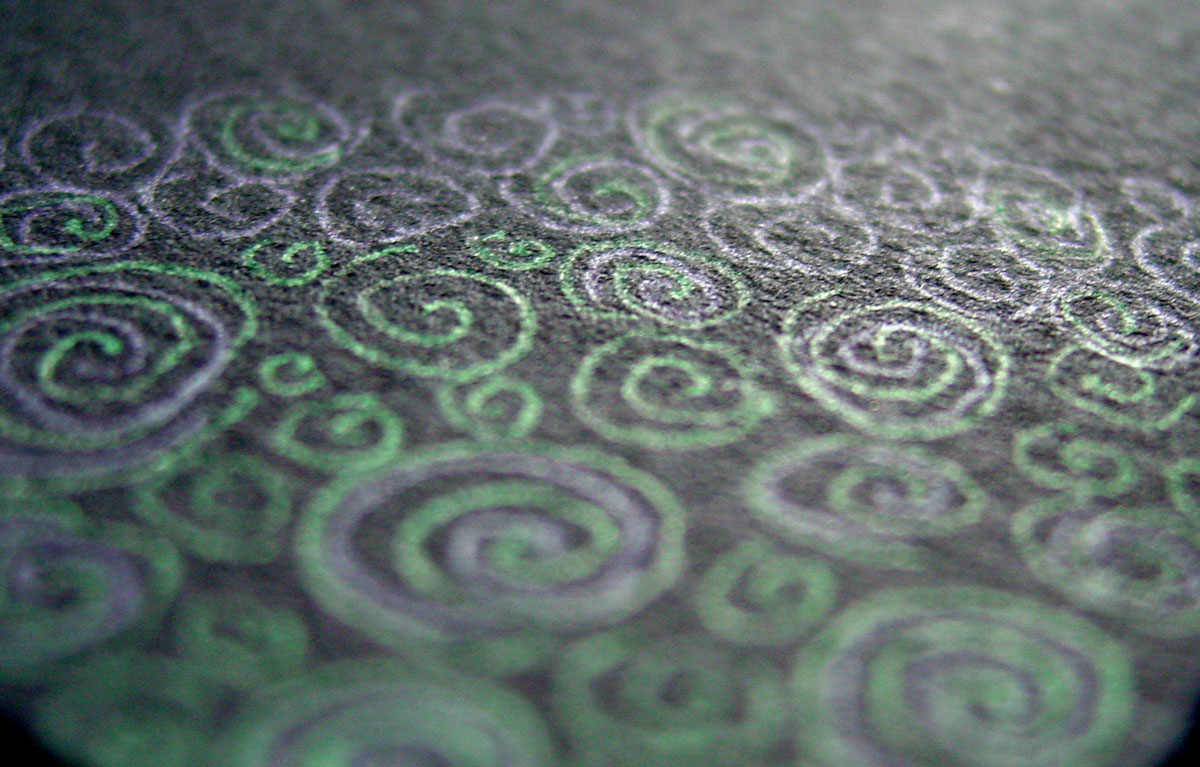
The watercolor paint I used in the salt pools separated, with the green pigment all going into the salt and leaving the sparkly violet swirls attached to the paper for a very nifty effect. I carried it through with purple and green glitter gel pen, adding smaller spiral stars and drawing in the eerie, barely-there moon.
I’ve totally embraced my sparkly side, too, and bought more glittery pens in Japantown as well as some pearlescent paints. Expect to see more shiny!
Moonglow, 7″x5″ iridescent watercolor, salt and glitter gel pen on Arches cover black paper.
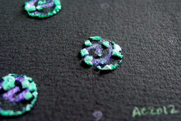
Moonglow, detail 1, by Amy Crook
The first detail photo, above, totally exaggerates the separation of the paint, the sunlight making the salt practically glow while the purple spirals catch the light. The second one, below, shows the play of green and purple gel pen in the moon. Spirals!
Moonglow, detail 2, by Amy Crook
Categories: Daily Art, Flowers, Trees and Landscapes, Series and Books
Tags: black paper, for sale, glitter gel pen, green, iridescent, moon, salt, violet, watercolor
1 Comment »
Grinning Whatever
Posted on March 4th, 2012

Grinning Whatever sketch by Amy Crook
I have no idea what he is, but he’s one of my favorite coloring book doodles in a while. He’s just so happy! And fuzzy! And evil!
Categories: Daily Art, Zombies, Skulls, and Other Morbid Things
Tags: coloring book, doodle, nfs, pen and ink, sketch
2 Comments »
« Or Head Back That Way
 More Art This Way »