Posts Tagged ‘glitter gel pen’
K is for Greek Key
Thursday, October 4th, 2012

K is for Greek Key, calligraphic illumination by Amy Crook
It’s a bit cheating to use the Greek Key pattern for K, but it was the option that appealed to me the most. It’s hard to do kerning with only one letter, after all!
I ended up designing my own Greek Key in Illustrator, printing it, and using my lightbox to copy it in blue glitter gel pen onto the K. All the tools of the modern age are getting put to use as I explore the historic art of calligraphic illumination.
K is for Greek Key, 5″x5″ pen & ink, Japanese watercolor, and glitter gel pen on paper.
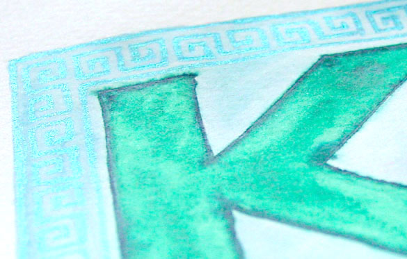
K is for Greek Key, detail, by Amy Crook
Between the color and the glitter, I had a really hard time photographing this piece. The Key pattern blends into the soft blue background to the camera, but of course your eye immediately catches the light. Below, you can see it in a frame, spelling out the word I said when I realized I didn’t have a framed photo for it.
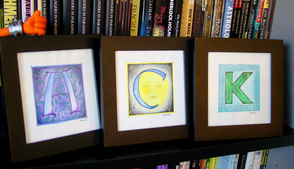
K is for Greek Key, framed art by Amy Crook
(with A is for Arabesque and C is for Counter)
Categories: Daily Art, Illuminated Alphabet, Series and Books, Whimsical and Strange
Tags: alphabet, blue, calligraphy, for sale, glitter gel pen, green, illumination, pen and ink, watercolor
The Stars Are Right 4
Friday, September 21st, 2012
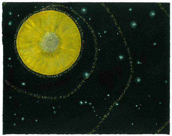
The Stars Are Right 4 by Amy Crook
A baleful yellow planted like a great eye stares out from the cold depths of space, sending golden chanting out into the void in a mysterious ancient language. The surrounding stars are a shimmery green, adding to the surreal feeling of the piece. This piece would a nice touch of eerie Lovecraftian horror to any office or home. Well, for certain values of nice, anyway.
The Stars Are Right 4, 10″x8″ Japanese watercolor and glitter gel pen on Arches cover black paper.
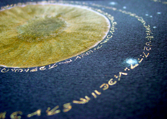
The Stars Are Right 4, detail, by Amy Crook
Above you can see the shiny gold glitter “lettering” and iridescent green starnext to the eye-like yellow planet. Below, I’ve put it in a frame and let it loom over my comparatively wee iPhone for your visual reference.
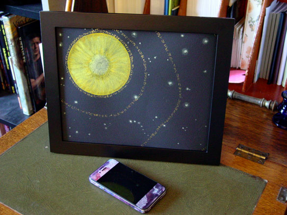
The Stars Are Right 4, framed art by Amy Crook
Categories: Angels, Cthulhu, and Other Myths, Daily Art, Flowers, Trees and Landscapes, Series and Books, Things I'm a Fan Of
Tags: black paper, cthulhu, for sale, glitter gel pen, gold, japanese watercolor, planet, stars, stars are right
J is for Juxtapose
Thursday, September 20th, 2012

J is for Juxtapose, calligraphic illumination by Amy Crook
I wasn’t sure how well I could manage Juxtaposition, but I’m really happy with the contrasts and superimpositions in this piece, from the colors of subtle buff titanium with bright purple and rich teal, to the way the dark purple ink outline of the neat lower J bled through into the messy top letter. The light purple glitter strips in the upper left blend very differently with the background than the dark inked spirals in the lower right, too.
J is for Juxtapose, 5″x5″ mixed media on paper, nfs (sold). If you’d like a J of your own, you can find out how to commission one here.
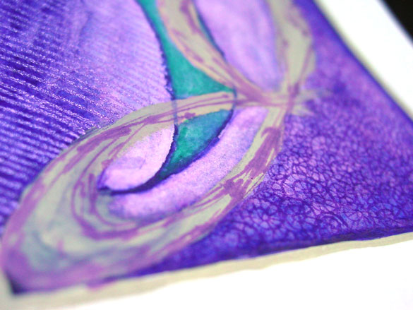
J is for Juxtapose, detail, by Amy Crook
Above, you can see the shine of purple glitter and a close-up of many of the various overlapping styles. Below, the J is hanging out with the A, which shares a similar color scheme but a nicely different feel.
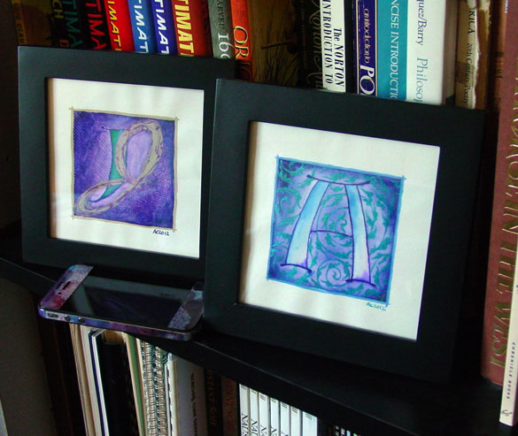
A is for Arabesque & J is for Juxtapose, framed art by Amy Crook
Categories: Daily Art, Illuminated Alphabet, Series and Books, Whimsical and Strange
Tags: alphabet, buff titanium, calligraphy, glitter gel pen, illumination, nfs, pen and ink, purple, sold, spirals, teal, watercolor
1 Comment »
I is for Impressionism
Thursday, September 13th, 2012

I is for Impressionism, calligraphic illumination by Amy Crook
This one was an interesting challenge, because it’s definitely outside of my usual painting style. The first go was determined to stay firmly at the ass point, but this one came together once I gave it a little more love. I think the bright shine of silver on it is what really makes the piece.
I is for Impressionism, 5″x5″ Japanese watercolor and glitter gel pen on paper.
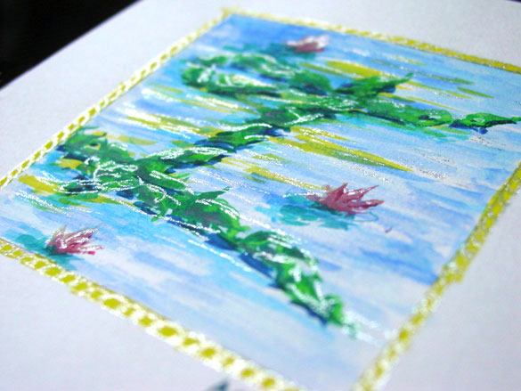
I is for Impressionism, detail, by Amy Crook
Above you can see the silver highlights shining on the page. Below, you can see it in a frame on a bookshelf saying, “HI!” with last week’s H.
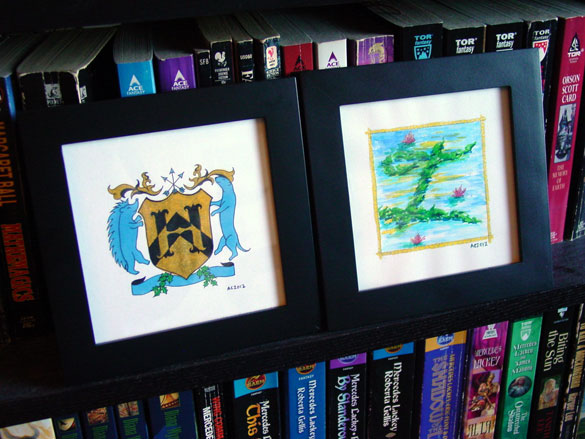
H is for Heraldry & I is for Impressionism, framed art by Amy Crook
Categories: Daily Art, Illuminated Alphabet, Series and Books, Whimsical and Strange
Tags: alphabet, blue, calligraphy, for sale, glitter gel pen, green, illumination, pen and ink, silver, watercolor, yellow
1 Comment »
H is for Heraldry
Thursday, September 6th, 2012
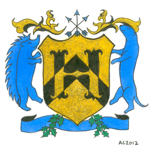
H is for Heraldry, calligraphic illumination by Amy Crook
I have to admit, when deciding on the colors and symbols for this letter with the help of Google, I also enlisted certain fannish friends. That’s how I ended up with Hedgehog Rampant and Otter Rampant as the creatures, making the H secret fan art on top of everything else.
The symbology of the elements of this particular shield are, at least according to Google and artistic intention (which I’m given to understand the latter is more important, anyway):
- Gold/Yellow (Or): generosity
- Blue (Azure): strength, loyalty
- Black (Sable): constancy, grief
- Chevron on the shield: protection, faithful service
- Otter: one who lives life to the fullest
- Hedgehog: provident provider
- Arrows: military readiness
- Holly: truth
H is for Heraldry, 5″x5″ mixed media on paper, nfs (sold). If you’d like an H of your own, you can find out how to commission one here.
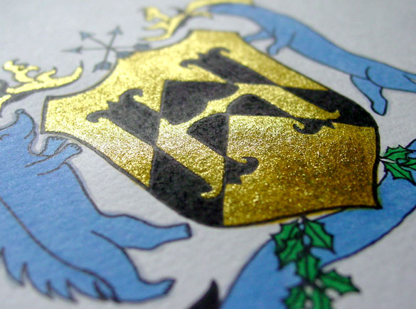
H is for Heraldry, detail, by Amy Crook
Although the glitter looks a bit anemic in the scan, when it catches the light it’s really a lovely bright gold with a nice layer of golden yellow beneath it to add richness. Below, you can see how it looks framed and hanging out on my bookshelf with a little sneak preview of next week’s letter. (HI!)

H is for Heraldry & I is for Impressionism, framed art by Amy Crook
Categories: Daily Art, Illuminated Alphabet, Series and Books, Things I'm a Fan Of, Whimsical and Strange
Tags: alphabet, black, blue, calligraphy, copic marker, glitter gel pen, gold, heraldry, illumination, nfs, pen and ink, sherlock, sherlock holmes, sold
2 Comments »
G is for Gothic
Thursday, August 30th, 2012
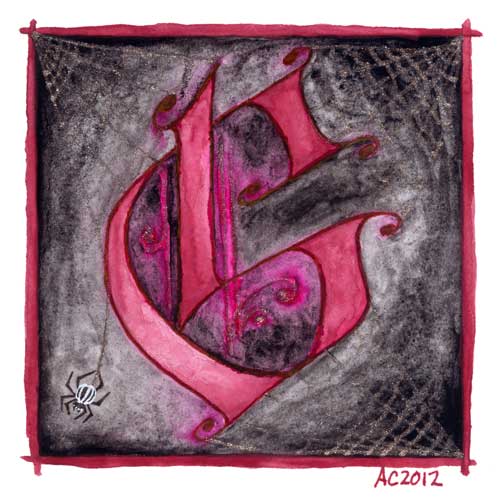
G is for Gothic, calligraphic illumination by Amy Crook
I have to admit, I went for the pun a bit here, combining the Gothic capital with my own Goth sensibilities. The silver spiderwebs are half-seen until they catch the light, and the burgundy G floats in murky gloom, hanging out with the stripey little spider responsible for its extra decoration.
G is for Gothic, 5″x5″ pen & ink, Japanese watercolor, and glitter gel pen on paper.

G is for Gothic, detail, by Amy Crook
Above, you can see the silver details shining in the bright summer sunlight. Goths in hot weather, anyone? Below, it’s hanging out on a little shelf with the C and my collection of Endless pewter figurines.

G is for Gothic & C is for Counter, framed art by Amy Crook
Categories: Daily Art, Illuminated Alphabet, Series and Books, Whimsical and Strange
Tags: alphabet, black, calligraphy, for sale, glitter gel pen, goth, illumination, pen and ink, red, silver, spiderweb, watercolor
4 Comments »
Cassiopeia
Monday, August 27th, 2012
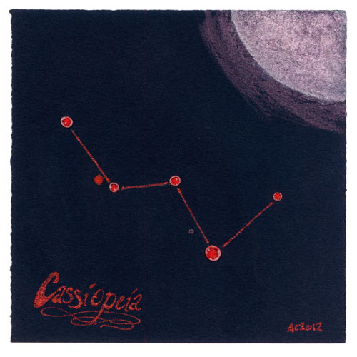
Cassiopeia by Amy Crook
I have been thinking I might want to do some more ordered skies, rather than just the random dots I usually paint, but to be honest when I look up at the stars I mostly see… random dots. Thanks to the power of Google, however, I’ve brought you Cassiopeia done up like a prog rock album cover from the ’70s complete with groovy, glittery calligraphy. Fortunately, I know someone who loves the colors, the constellation and prog rock, so they know what they’re getting for Christmas.
The perks of hanging out with an artist, right?
Cassiopeia, 5″x5″ mixed media on paper, nfs.
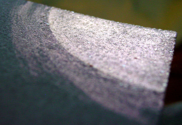
Cassiopeia, detail, by Amy Crook
There’s actually a fine layer of sparkly salt crystals mixed in with the iridescent red paint and the whiter glow of the moon on this, which you can only see in the sun from certain angles. This whole piece blends minimalism with bling in a way that amuses me greatly, so I’m glad it’s going to someone that’s already making grabbyhands at it.
Categories: Daily Art, Flowers, Trees and Landscapes
Tags: black paper, calligraphy, constellation, glitter gel pen, iridescent, japanese watercolor, moon, nfs, salt
« Or Head Back That Way
 More Art This Way »


