Posts Tagged ‘commission’
Custom Sherlock Bookmarks
Wednesday, October 16th, 2013
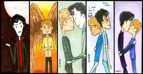
5 Sherlock bookmarks, commission art by Amy Crook
Yay, more Sherlock bookmarks! I did these as tests for the elaborately colored 6-panel comic (and print!) I’m posting next week, as part of a commission for one of my darling patrons. Some of them reflect the comics and some not so much, but they were all a test for our rainbow color scheme.
What, you say, you didn’t know I did commission bookmarks? Well, I do now! You might be asking yourself how these are different than regular fan art commissions, and so I’ll tell you, because I’m nice that way.
- They’re $15 each, flat, no matter what’s on them.
- You tell me what you want, I draw and send. No sketches, no previews.
- Color vs black and white is up to my discretion.
- It’ll be on whatever bookmark-like scrap of paper I have to hand.
- This applies to fan art comics only, no portraits or watercolors or any of that fancy jazz.
- They tend to be a lot faster than a regular commission.
- Email me if you want one! (Okay, that’s the same.)
The ones above are all on drawing paper scraps rather than thicker watercolor paper or cardstock, but I know the recipient (hi!) won’t be using them to mark books. If you’re a framer vs a book marker, that’s something to let me know during the email.
5 Sherlock Bookmarks, 2″x5″ pen & ink and Copic markers on paper, nfs (commission).
Categories: Angels, Cthulhu, and Other Myths, Completed Commissions, People, Figures and Faces, Series and Books, Things I'm a Fan Of
Tags: commission, copic marker, john watson, nfs, parody, pen and ink, sherlock, sherlock bbc, sherlock holmes, sold, watson
Diddy Wah Diddy Illustrations
Monday, September 30th, 2013
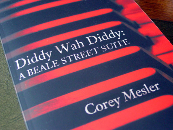
Diddy Wah Diddy by Corey Mesler, with interior illustrations by Amy Crook
This spring & summer I had the privilege to illustrate a literary novel! It’s been a really wonderful experience working with the editor, Jason, to add interior illustrations* to Corey’s richly-textured novel of Beale Street, Memphis, and the mythology of the blues.
Corey’s prose is full of rich character, and it was really easy to find images to go with it. Jason chose a scribbled black-and-white style of mine for the illustrations, and I did 9 images total, sprinkled throughout the book. He’d pick a story and have me read through it, then either ask for something specific, or something that went well with the story. I tried to keep everything as loose as a good blues jam, and capture the feel of each story.
The whole novel fits together to tell how a community went from its height of mythic glory, dipped down, and started building itself back up again. Everything is steeped in the language of the era and the feel of the blues, and I hope you’ll head on over to Ampersand Books and give it a shot!
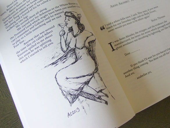
illustration from Diddy Wah Diddy
Above, you can see a woman chilling at the bar, enjoying a legendary cocktail, helping to set the scene for the book. Below, I chose the author’s favorite of the group. I’ll let you read the book to find out how the werewolf ended up in the jar.
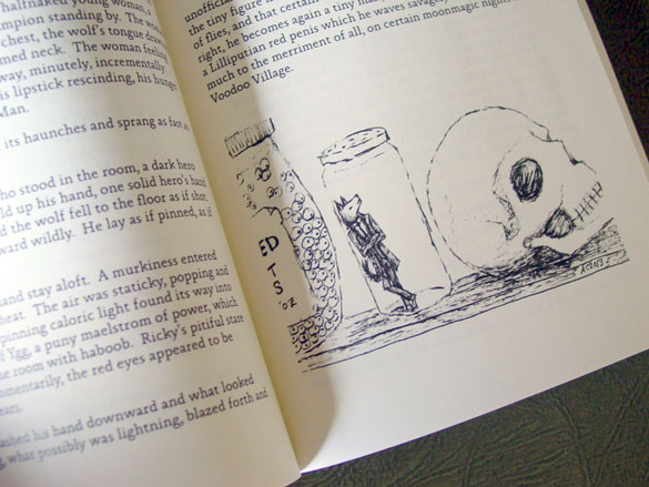
another illustration from Diddy Wah Diddy
If you’ve got a project that you think needs my illustrator’s touch, I’ve got info here about how you can hire me.
*Their designer did the cover, which is rich and red and beautifully sets the mood for the prose within.
Categories: Completed Commissions, People, Figures and Faces, Series and Books, Zombies, Skulls, and Other Morbid Things
Tags: all rights reserved, book illustration, commission, illustration, pen and ink
1 Comment »
J is for Journey
Tuesday, September 24th, 2013
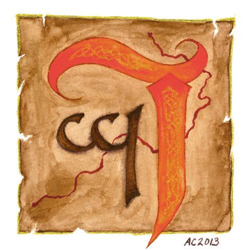
J is for Journey, commissioned illuminated capital by Amy Crook
Predictably, one of the first letters in my Illuminated Alphabet to sell was the J is for Juxtapose. After a lot of wembling and waffling, I’ve finally completed another J for a wonderful patron who commissioned one. He was trying at first to stick to the typographical theme of the finished alphabet, but in the end it just wasn’t working with the elements he wanted.
Instead, I snuck off and finished up the sketch this way, knowing that he’s got a love of maps and using the requested orange for the main capital. The smaller letter is in Tengwar, one of Tolkien’s invented alphabets, and a letter long-beloved by my patron. The squiggly red map-line was added near the end, though usual the glitter gel pen was saved for the very last. The faux Celtic decorations on the J were added in freehand, and you can see them better in the below photo, along with a clearer idea of the orange color behind them, which my scanner tended to oversaturate.
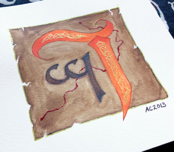
J is for Journey by Amy Crook
Categories: Completed Commissions, Things I'm a Fan Of, Whimsical and Strange
Tags: alphabet, commission, glitter gel pen, nfs, pen and ink, watercolor
2 Comments »
Words Wednesday: Interview with Tara Swiger
Wednesday, August 7th, 2013
Tara Swiger is an author, maker, and Starship Captain. She leads explorations into your mission, your marketing, and your enthusiasm…for teeny tiny art-y businesses (like mine!). Currently she’s putting together a very cool course called Explore You to help you boldly go.

Tara’s gotten two very different illustration projects from me, and she’s agreed to tell you how it went and what she’s doing with her art.
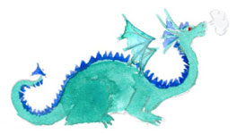 Q: Why did you decide to get commissioned art?
A: I think my first piece of commissioned art was the Starship*…and I got it because I wanted something to symbolize the space I was creating. A custom illustration made it seem so much more real (and professional!)
The second piece was a map for my Map Making Guide. I knew I wanted something really nice but don’t have the skills to create one myself! I wanted to create a better product, so I needed to bring in someone with better skills!
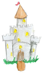 Q: How do you incorporate these illustrations into your business?
A: I use the Starship in the header of the actual Starship (a community site/forum), in my emails, and in a few ads!
The map illustration is part of the actual product of the map-making guide…so my customers use them to create maps of their goals!
Q: What did you hope an illustration would add to your projects?
A: My business is metaphor-friendly, but when those metaphors represent actual things (the community, the Guide) I need something other than words — I need the pictures to illustrate what I’m talking about! I felt that custom images would make it more professional and “put together” than anything I could make.
 Q: How did the process work from your end?
A: It was so easy! I gave Amy a few ideas and she got it right away! I was so surprised, because I was super-nervous, but Amy made it easy!
Q: Have you had any unexpected awesome from your art?
A: Amy sent the original sketch of the Starship and it hangs in my hallway with all my favorite pictures! I love what it stands for (this amazing community of support I’ve created) and that I’m reminded of it every day!
 Thanks for taking the time to share, Tara!
If you’re interested in commissioning an illustration for your own business, you can check out the details here.
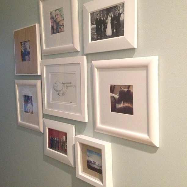
*Starship Craftybiz by Amy Crook for Tara Swiger, all rights reserved
Stylin’ on her wall at home with her Instagrammed life!
Categories: Completed Commissions, Daily Art, Words Words Words
Tags: all rights reserved, commission, tara swiger, words
Flowers for Bilbo
Friday, July 26th, 2013
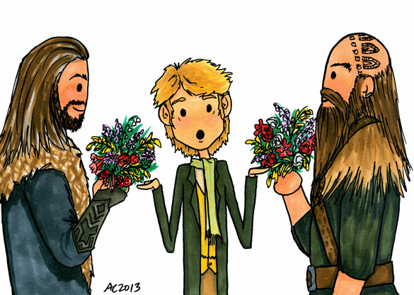
Flowers for Bilbo, a Hobbit parody commission by Amy Crook
“Tears, Gandalf. Tears and murder.”
Yes, this is related to a fic. No, I’m not going to tell you where to find it. Just be amused by poor Bilbo getting courting bouquets by two infamous dwarves, Dwalin and Thorin. Don’t worry, I’m sure it all turns out all right in the end, no murder required.
Flowers for Bilbo, 7″x5″ pen & ink and Copic marker on paper, nfs (sold).

Flowers for Bilbo, detail, by Amy Crook
Above, you can see Bilbo’s worried expression and pink blush, and some of my carefully-researched flowers. I had to look up what most things actually looked like, though I did know how to draw Lily of the Valley already. Below, you can see it hanging out in a temporary frame, looking spiffy before it gets shipped off to its new home.

Flowers for Bilbo, framed art by Amy Crook
Categories: Completed Commissions, Daily Art, People, Figures and Faces, Series and Books, Things I'm a Fan Of, Whimsical and Strange
Tags: bilbo baggins, commission, copic marker, dwalin, dwarf, hobbit, nfs, pen and ink, sold, thorin
Interview with Jo Van Every
Wednesday, July 10th, 2013
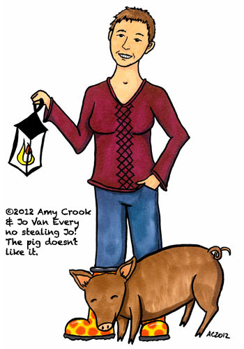 Jo Van Every is a sociologist, PhD, publications and all. She sees things differently because of that. She also asks questions that can help you see things in different ways. She’s learned that this way of seeing can help move projects forward. If you’re feeling stuck and frustrated in your academic career, she might be able to help.
Over the past couple of years, Jo has commissioned several illustrations to use with her academic consulting practice. She’s here to talk about what she got and why.
Q: Why did you decide to get commissioned art?
A: I recognized that images can add a lot to blog posts, presentations and other work that I do. However, I struggled with finding suitable images. Commissioning art seemed like a good way to get images that really fit what I was trying to do.
 Q: How do you incorporate these illustrations into your work?
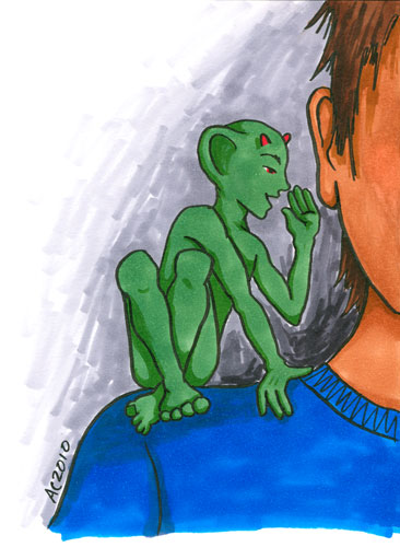
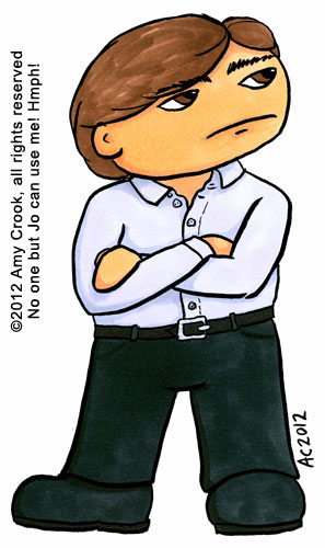
A: I think the first illustration I commissioned was a gremlin. I started out using it in blog posts but then I realized that the un-inked version could be used with clients as a colouring page. Later illustrations, like the fairy godmother were commissioned with that in mind. I’ve used them for workshop exercises and in one-on-one work with clients. Having cartoon-ish illustrations and colouring pages can help clients articulate ideas that may not be developed enough to go in a grant proposal, for example, but that help me help them write better grant proposals.
 Q: What did you hope an illustration would add to your ittybiz?
A: My initial hope was that they would help me communicate better because I was using both images and words. As I used them more, the illustrations have added fun and playfulness to the work I do, too. One of the things I want to do for my clients is help them reduce the stress they feel around their work and fun is one way to achieve that goal. I decided to commission an image of myself for my about page to really foreground that sense of fun.
 Q: How did the process work from your end?
A: I am a very word-y person. One reason I struggle with finding suitable images is because I have trouble articulating what I really want. I worried that it would be hard to communicate what I really wanted. The process was actually much easier than I expected. You helped me figure out what I wanted and sent a few sketches with some questions to help me clarify my ideas. Sometimes I took a while to respond because I didn’t feel confident that I knew what to say and you gently nudged me along. I would recommend that people build that into their timelines. I really needed time to look at the sketch and then ponder it in the back of my mind for a bit before I could comment on it.
 Q: Have you had any unexpected awesome from your cartoons? How do clients respond they first see the illustrations?
A: I must admit that I was worried that my clients, many of whom are university professors, would find them too silly. I have been surprised at how well they respond. Some of my clients went out and bought coloured pencils so they could colour in colouring pages I sent them! Others described to me in words how they saw the image in colour in their head.
The other awesome thing is that although I mostly use digital versions of the illustrations, you sent me inked originals. I have framed these and have them on the wall of my office where they inspire me daily.
Thanks so much for answering my questions Jo, it’s always delightful talking to you!
If you’re interested in commissioning an illustration for your own business, you can check out the details here. Each of Jo’s illustrations only took 1 hour of billable time.
If you’re interested in a cartoon of yourself (or someone else in your life) there’s a Be A Cartoon special just for that!
Categories: Daily Art, Words Words Words
Tags: commission, jo vanevery, words
3 Service Dogs
Saturday, June 29th, 2013
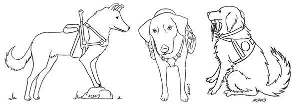
3 Service Dogs by Amy Crook for Action Leashes
commission – all rights reserved
After I put these guys on my illustration commissions page, I totally forgot about posting them properly, oops! This trio of doggies were for a coloring book about service animals, and you can see they’re sporting a variety of service harnesses as examples. I have to admit, I found it harder to realistically draw dogs than I do to draw stick-figure humans, but once I got my eyes used to the idea, they came out quite clearly.
3 Service Dogs, 3 5″x7″ pen & ink drawings on paper, nfs (commission). All rights to this art are reserved for the client – no stealing the doggies!
Categories: Completed Commissions, Daily Art
Tags: all rights reserved, commission, pen and ink
« Or Head Back That Way
 More Art This Way »


