Posts Tagged ‘pen and ink’
Squidtini
Tuesday, October 25th, 2011
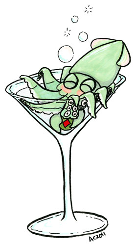
Squidtini by Amy Crook
My friend, G, is a big fan of both gin and squid, so one night I drew up this little guy with her in mind. He’s even made friends with the olive, which he’s got clutched in his feeder tentacles, though the gin’s given him a bit of a blush on his fins and cheeks. This little squid is sloshed!
Squidtini, 5″x7″ pen and ink and Copic markers on paper.
I think it would make a great invitation to a New Year’s dinner party, so I made cards for my Etsy shop.
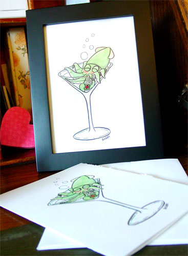
Squidtini, framed, by Amy Crook
Categories: Daily Art, Sea Creatures and Other Animals, Tentacles, Whimsical and Strange
Tags: card, copic marker, etsy, for sale, martini, pen and ink, squid
Sherlock bookmark 2
Saturday, October 22nd, 2011
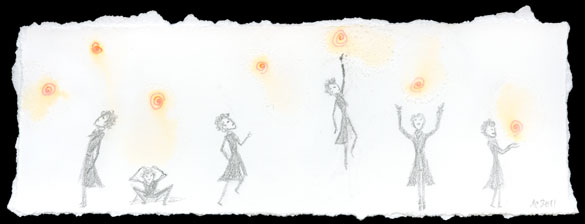
Sherlock Bookmark 2 by Amy Crook
I was experimenting with some new paper and salt, and after tearing down a 8″x8″ square for another piece I was left with this strip. I made my usual spirals, except this time I kept them all along the top edge rather than scattered over the whole page. They didn’t form proper salt pools, but I did like the will-o-the-wisp quality that was left, with just a few tiny salt crystals and the soft swirls of ink like a glowing light.
In a fit of 2am whimsy, I pencilled in a half-dozen little Sherlocks, first examining, then chasing, and finally catching his very own will-o-the-wisp.
Sherlock Bookmark 2, 8″x2.75″ mixed media on paper, nfs (sold).
You can see the salt crystals much better in this detail photo, and some of the teeny tiny detail in the little Sherlocks.
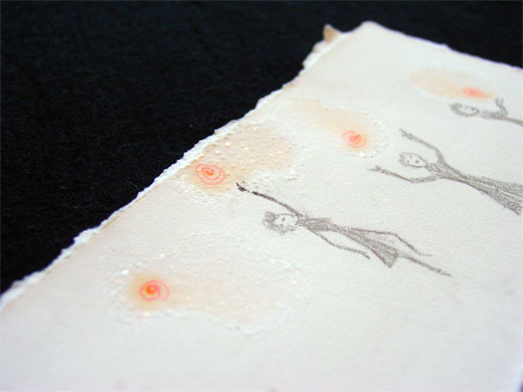
Sherlock Bookmark 2, detail, by Amy Crook
Categories: Angels, Cthulhu, and Other Myths, Daily Art, People, Figures and Faces, Series and Books, Things I'm a Fan Of
Tags: bookmark, nfs, pen and ink, pencil, salt, sherlock, sketch, sold
Radial Symmetry 2
Friday, October 21st, 2011

Radial Symmetry 2 by Amy Crook, $242
This time I mixed two different colors, a deep forest green and a lighter, seafoam green. The darker green hides in the black paper somewhat, but the raised texture is more pronounced there, too, since the paint was applied in thick beads. I keep thinking there’s a name for this sort of radial pattern, especially one created with beads, but I couldn’t find it by googling.
Radial Symmetry 2, 5″x5″ mixed media on paper, $242, framed, with free shipping.
My scanner had a really hard time with the subtle colors in this piece, but you can see a better representation of both the shiny green shapes and the soft, velvety black paper.

Radial Symmetry 2, detail, by Amy Crook
I’ve photographed the piece in its frame with my iPhone for scale. I think this piece would look great as part of a wall grouping, along with other art, prints and photos in similar simple black frames.

Radial Symmetry 2, framed, by Amy Crook, $222
Categories: Abstract and Just Plain Weird, Daily Art, Series and Books
Tags: black paper, for sale, gouache, pen and ink, radial symmetry, salt
Radial Symmetry 1
Thursday, October 20th, 2011

Radial Symmetry 1 by Amy Crook, $222
I got some lovely new Japanese gouache paints for my birthday, and I decided to see how they’d work on the black paper. I used double spirals inside these salt circles to give the salt more pigment, which also left darker, warmer centers where the water distributed the pigment into the paper. I used a single color of paint on this, and I found that once it dried, the color stays very consistent no matter how thickly the paint was mixed, but that the thicker paint left rounded, bead-like shapes on the paper.
I think of these a bit like beaded decorations, or possibly flowers with their warm orange centers and pale periwinkle petals. I like to imagine the piece adding a little touch of unexpected loveliness to someone’s life, tucked into a bookshelf or sitting on someone’s desk at work.
Radial Symmetry 1, 5″x5″ mixed media on paper, $222, framed, with free shipping.
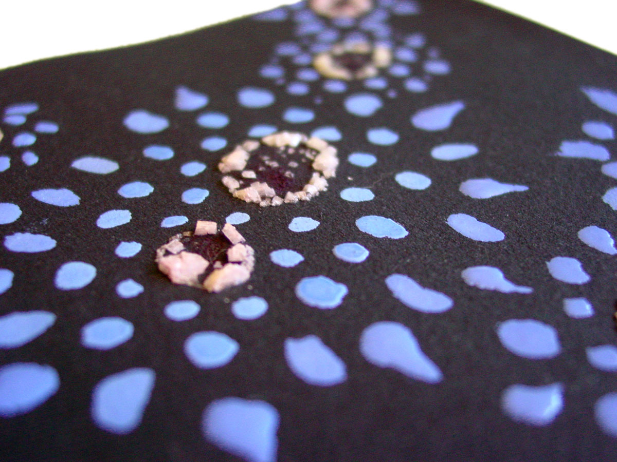
Radial Symmetry 1, detail, by Amy Crook
The salt on these isn’t as sparkly, probably because of the matte black behind them, but I love the way the paint makes soft, glossy swells on the paper. It looks great in a simple black frame, which makes the colors really pop. You can see them reflected in my iPhone for scale, below.

Radial Symmetry 1, framed, by Amy Crook, $222
Categories: Abstract and Just Plain Weird, Daily Art, Series and Books
Tags: black paper, for sale, gouache, pen and ink, radial symmetry, salt
Cthulhu’s Gift
Wednesday, October 19th, 2011
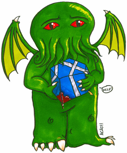
Cthulhu’s Gift by Amy Crook
I’ve been working on holiday cards again this week, and Cthulhu really wants you to like his gift. I decided to make a rather generic gift for the original, and then I drew a page of holiday dingbats — including a delightfully gruesome spike bow of a sort I’ve actually bought and put on gifts myself (minus the blood).
Cthulhu’s Gift, 5″x7″ pen and ink and Copic markers on paper.
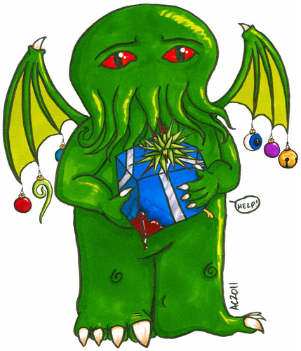
Cthulhu’s Holiday Gift by Amy Crook
The original is, of course, the first version, since this one exists courtesy of Photoshop, but I find I’m rather fond of his baubles. I want a tentacle glass ornament!
This is what he looks like in a frame, though the original won’t be framed unless the buyer requests it for an additional fee.

Cthulhu’s Gift, framed, by Amy Crook
Categories: Angels, Cthulhu, and Other Myths, Daily Art, Tentacles, Things I'm a Fan Of, Zombies, Skulls, and Other Morbid Things
Tags: copic marker, cthulhu, for sale, holiday, lovecraft, pen and ink, tentacles
Five 5
Tuesday, October 18th, 2011

Five 5 by Amy Crook
This paper completely absorbed the water before any of the salt could even dissolve, making mysterious swirls of ink surrounding each spiral. I went back in and created the crosshatched figure, and once it was most of the way done, I turned it on the side and found that it looked rather like a creepy, Lovecraftian figure. I used water to blur the ink and add significant shape to the shoggoth, the pattern of dots turning the fifth spiral into a part of the figure like an eye on a stalk.
Five 5, 3.5″x2.5″ mixed media on paper, nfs (but available for trading!).
I find it interesting how all the ink on this piece, except for the signature, is blurred and softened, giving the whole piece has a creepy, surreal feeling. Happy Halloween season!

Five 5, detail, by Amy Crook
If you’re an artist who makes ATCs of your own, and are coveting this one, let me know!
Categories: Abstract and Just Plain Weird, Daily Art, Series and Books
Tags: aceo, atc, five series, lovecraft, pen and ink, salt, shoggoth
Five 4
Monday, October 17th, 2011
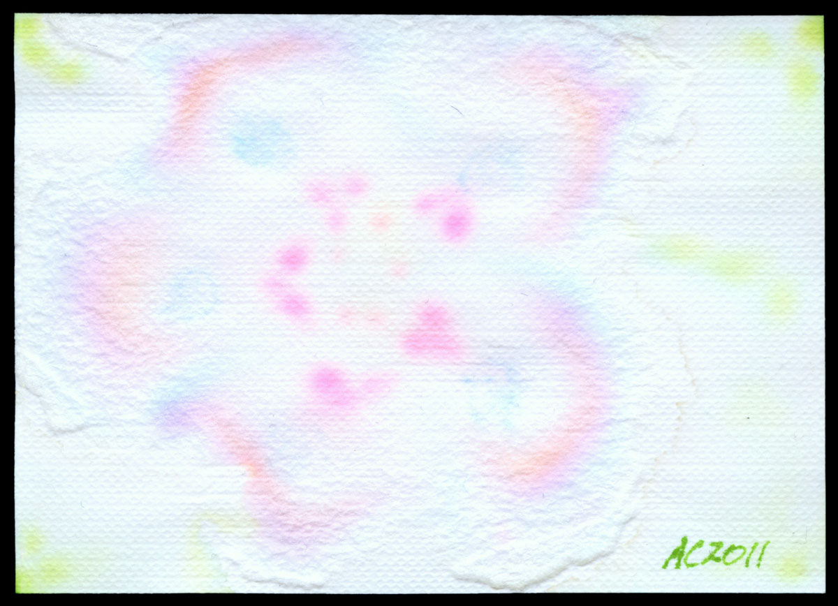
Five 4 by Amy Crook
This paper absorbed the water slowly, but still too fast for the salt to do its usual thing. Instead, it formed this mysterious flower-like shape inside the paper — this is actually what started as the back of the paper. The ink left ghostly rainbows of dye in the paper as it separated into its component colors. I went back in and added more ink and water both, which leaves us with a subtle embossed flower surrounded with the gentle green of new leaves.
Five 4, 3.5″x2.5″ mixed media on paper, nfs (but available for trading!).
This detail shot really makes the pink I dotted into each petal glow, and you can just see the five golden stamen I put in the center. I love that this card has so much detail hiding in the extremely subtle play of color and texture.

Five 4, detail, by Amy Crook
If you’re an artist who makes ATCs of your own, and are coveting this one, let me know!
Categories: Abstract and Just Plain Weird, Daily Art, Series and Books
Tags: aceo, atc, five series, pen and ink, sakura, salt
« Or Head Back That Way
 More Art This Way »